Table of Contents >> Show >> Hide
- Why Cream Paint Colors Work So Well
- How to Choose the Right Warm Cream Paint
- 25 Warm and Cozy Cream Paint Colors Worth a Look
- Sherwin-Williams Creamy SW 7012
- Sherwin-Williams Alabaster SW 7008
- Sherwin-Williams Steamed Milk SW 7554
- Sherwin-Williams Dover White SW 6385
- Sherwin-Williams White Flour SW 7102
- Sherwin-Williams Kestrel White SW 7516
- Sherwin-Williams Navajo White SW 6126
- Benjamin Moore White Dove OC-17
- Benjamin Moore Swiss Coffee OC-45
- Benjamin Moore Natural Cream OC-14
- Benjamin Moore Acadia White OC-38
- Benjamin Moore Marble White OC-34
- Benjamin Moore Gentle Cream
- Benjamin Moore Linen White
- Benjamin Moore Vanilla Milkshake
- Farrow & Ball Tallow No. 203
- Farrow & Ball Cream No. 44
- Farrow & Ball Farrow’s Cream No. 67
- Farrow & Ball Au Lait
- Behr Swiss Coffee 12
- Behr Antique White 23
- Glidden Pearls and Lace PPG1074-1
- Glidden Country Cream 40YY 72/164
- PPG Boston Cream 50YY 77/173
- HGTV Home by Sherwin-Williams Vanillin
- How to Use Cream Paint Colors in Different Rooms
- Experience: What It Is Really Like Living With Warm Cream Paint Colors
- Final Thoughts
- SEO Tags
If stark white feels a little too “new dentist office” and beige feels like it is trying too hard to relive 2004, cream paint colors are the happy middle ground. They are soft, welcoming, flattering in natural light, and surprisingly versatile. A good cream can make a modern room feel warmer, a traditional room feel fresher, and a small room feel brighter without turning it into a glowing marshmallow.
That is why warm cream paint colors keep showing up in designer roundups, paint-brand favorites, and cozy-home wish lists. They play beautifully with wood furniture, brass fixtures, stone counters, linen curtains, and woven textures. They can lean buttery, peachy, greige, or barely-there ivory, which means there is no single “best” cream paint color. There is only the one that behaves best in your room, under your light, with your flooring, and next to that sofa you are definitely not replacing just because the paint changed.
Why Cream Paint Colors Work So Well
The reason cream paint colors are so easy to live with is simple: undertones do the heavy lifting. Some creams have yellow warmth, some have pink softness, some have beige depth, and some borrow a whisper of gray to stay calm and modern. That flexibility lets them work in farmhouse kitchens, minimalist bedrooms, classic dining rooms, coastal living rooms, and even moody libraries that need a softer contrast on trim or ceilings.
Cream is also one of the most forgiving neutrals. It reflects light better than deeper beiges, feels softer than pure white, and usually looks richer with layered lighting at night. In other words, cream does not panic when the sun goes down. It simply gets cozier.
How to Choose the Right Warm Cream Paint
Check the light first
North-facing rooms can make cream look flatter or grayer, so a warmer option with yellow or peach undertones often helps. South-facing rooms already get warm light, so a quieter cream with greige or subtle beige undertones can keep things balanced.
Match the undertones in the room
If you have warm wood floors, brass hardware, or tan upholstery, creamy whites with golden or beige undertones usually feel harmonious. If your room has cooler stone, black accents, or modern finishes, a cleaner cream with less yellow can look more tailored.
Always sample on the wall
Paint chips lie. Not maliciously, but still. A cream that looks soft and dreamy online can suddenly read lemon custard at 4 p.m. in your living room. Test swatches on more than one wall and look at them morning, afternoon, and evening before committing.
25 Warm and Cozy Cream Paint Colors Worth a Look
Sherwin-Williams Creamy SW 7012
As the name politely screams, Creamy is a classic warm off-white with soft yellow warmth. It is bright enough to feel fresh but cozy enough to keep a room from looking sterile. Use it in living rooms, hallways, or traditional spaces that need an easy, all-purpose neutral.
Sherwin-Williams Alabaster SW 7008
Alabaster is one of those colors that keeps getting invited back because it behaves itself. It is warm, balanced, and peaceful without going too buttery. It works beautifully in bedrooms, open-plan homes, and trim packages where you want softness instead of sharp contrast.
Sherwin-Williams Steamed Milk SW 7554
Steamed Milk is creamy and comforting with a gentle peachy warmth. It feels especially pretty in bedrooms, dining rooms, and lower-light spaces where a crisp white would look chilly. This is the shade for people who want softness without drifting into obvious yellow.
Sherwin-Williams Dover White SW 6385
Dover White has a sunlit personality. It is warmer and more traditional than many off-whites, which makes it ideal for kitchens, breakfast nooks, and homes with classic millwork. Pair it with warm woods, antique brass, or terracotta for a welcoming, lived-in look.
Sherwin-Williams White Flour SW 7102
White Flour is perfect when you want a creamy white that still reads mostly white. It is subtle, polished, and easy to decorate around, especially in modern or transitional interiors. Think of it as the neutral for people who want cozy without going full biscuit.
Sherwin-Williams Kestrel White SW 7516
Kestrel White has a soft pink undertone that gives it a snug, flattering feel. It is especially charming in living rooms and bedrooms where you want the walls to feel warm and slightly cocooning. Add wood, stone, and rattan, and it really starts showing off.
Sherwin-Williams Navajo White SW 6126
Navajo White is a richer, more obviously creamy option with a stronger yellow cast. If your style leans traditional, rustic, or Southwestern, this one can be a star. It is warm, familiar, and excellent for rooms that want personality without a bold color statement.
Benjamin Moore White Dove OC-17
White Dove is famous for a reason. It is a clean classic white with enough softness to feel warm, which makes it one of the most versatile creamy whites on the market. It works on walls, trim, cabinets, and ceilings, especially when you want a calm, timeless backdrop.
Benjamin Moore Swiss Coffee OC-45
Swiss Coffee is warm, mellow, and endlessly popular. It does not feel stark, and it tends to flatter a wide range of materials and styles. It is especially useful in open spaces where you want one color to connect the kitchen, dining area, and living room without drama.
Benjamin Moore Natural Cream OC-14
Natural Cream leans a little more greige than some traditional creams, which makes it a smart choice for people who want warmth without obvious yellow. It bridges warm and cool palettes well, so it plays nicely with both oak floors and black metal accents.
Benjamin Moore Acadia White OC-38
Acadia White has crisp cream undertones that keep it bright and airy. In sunrooms, living rooms, and south-facing spaces, it can feel almost glowing in the best way. This is a strong pick when you want freshness with a cozy edge.
Benjamin Moore Marble White OC-34
Marble White has muted cream tones and a slightly antique character. It feels elegant rather than flashy, which makes it lovely for dining rooms, older homes, and spaces with vintage furniture. If you want the room to whisper instead of shout, start here.
Benjamin Moore Gentle Cream
Gentle Cream is warm, rich, and inviting, with that classic bisque quality that looks beautiful beside wood tones. It suits entryways, formal sitting rooms, and traditional interiors where you want a little more depth than an off-white can offer.
Benjamin Moore Linen White
Linen White is relaxed and easygoing, like the paint version of a well-washed duvet. It has a buttery softness that feels casual and welcoming, especially in bedrooms and family spaces layered with neutral textiles and natural textures.
Benjamin Moore Vanilla Milkshake
Vanilla Milkshake has a muted, softened quality that works in many lighting conditions. A touch of gray keeps it from feeling sugary, so it is a strong option for modern homes that still want warmth. It is calm, polished, and easy to style.
Farrow & Ball Tallow No. 203
Tallow is a light cream that reflects light beautifully, which makes it a strong candidate for darker rooms and homes that need an overall wash of warmth. Its subtle pink and yellow pigments help it feel warm but still fresh, never heavy.
Farrow & Ball Cream No. 44
Cream No. 44 is more complex and grounded than many bright creams. With yellow ochre and darker balancing notes, it has a lived-in, slightly historic mood that works beautifully in traditional rooms, paneled spaces, and homes full of patina and texture.
Farrow & Ball Farrow’s Cream No. 67
Farrow’s Cream is gentle, traditional, and wonderfully inviting. It does not feel too dark or too pale, which makes it a natural fit for cabinetry, paneling, and cozy kitchens. If you love a home that looks charming instead of trendy, this one deserves attention.
Farrow & Ball Au Lait
Au Lait is a contemporary cream that warms a room without leaning strongly yellow. It is ideal if you want that cozy cream effect in a more updated, less rustic way. Use it with crisp white trim, warm oak, or soft plaster textures.
Behr Swiss Coffee 12
Behr’s Swiss Coffee is a warm white with beige undertones and a soft yellow influence, giving it a true creamy base. It is a long-running favorite because it feels bright and welcoming at the same time. It works well on both walls and trim in busy family homes.
Behr Antique White 23
Antique White has a nostalgic softness that feels right at home in kitchens, dining rooms, and relaxed traditional spaces. It is gentle and warm without being too sweet, making it a great backdrop for wood, wicker, and vintage-inspired details.
Glidden Pearls and Lace PPG1074-1
Pearls and Lace is a soft cream with beige warmth and a refined personality. It works on walls or trim and can move between modern and traditional rooms without missing a beat. If you want subtle warmth with a polished finish, it is a smart choice.
Glidden Country Cream 40YY 72/164
Country Cream is a soft yellow-leaning cream with a sage undertone. That little twist makes it especially useful with olive greens, earthy browns, and nature-inspired palettes. It is a warm, cheerful option for kitchens, casual dining spaces, and sunny corners.
PPG Boston Cream 50YY 77/173
Boston Cream is a light, subdued sunny cream with a hazel undertone. It feels breezy and warm, especially in kitchens or breakfast areas. Pair it with navy, wood, or woven textures for a classic look that feels cheerful without turning loud.
HGTV Home by Sherwin-Williams Vanillin
Vanillin is an off-white with warm undertones that stays soft and versatile. It gives you enough pigment to feel cozy while still acting like a neutral backdrop. That makes it a useful pick for nearly any style, from modern farmhouse to updated traditional.
How to Use Cream Paint Colors in Different Rooms
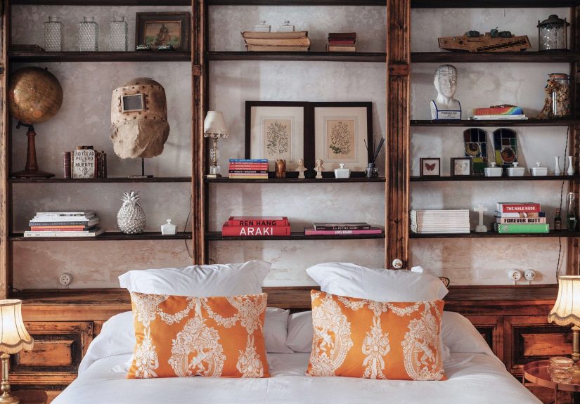
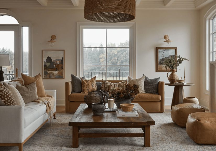
Living rooms
For living rooms, look for creams with beige, pink, or greige undertones. They tend to flatter upholstery, wood coffee tables, and layered lighting. Kestrel White, Swiss Coffee, Pearls and Lace, and Au Lait are all strong choices.
Kitchens
Kitchens love creams that feel clean but not cold. White Dove, Behr Swiss Coffee, Boston Cream, and Farrow’s Cream all work well with brass hardware, natural oak, butcher block, or stone counters. If your cabinets are staying white, use a cream on the walls to soften the room.
Bedrooms
Bedrooms benefit from creams that lean softer and quieter, especially in evening light. Alabaster, Tallow, Linen White, and Steamed Milk create the kind of atmosphere that says, “put your phone down and go to sleep already.”
Traditional vs. modern spaces
Traditional homes often look best in richer creams such as Navajo White, Gentle Cream, Cream No. 44, and Antique White. Modern homes usually prefer cleaner creams like White Flour, White Dove, Natural Cream, and Vanillin, which keep things warm without looking too vintage.
Experience: What It Is Really Like Living With Warm Cream Paint Colors
There is a funny thing that happens when people switch from stark white to cream: the room suddenly starts acting like a home. Edges feel softer. Furniture looks more expensive. Wood tones stop fighting for attention and start making sense. Even the throw pillows seem calmer, as if they finally got the memo.
In real life, warm cream paint colors tend to be more flexible than people expect. During the day, they catch natural light and keep a room open and airy. At night, especially with lamps instead of overhead lighting, they turn mellow and cozy. That day-to-night shift is a huge part of their charm. A bright white can look crisp at noon and harsh by dinner. Cream usually does the opposite. It settles in.
They are also easier to decorate around than trendier colors. You do not have to reinvent the whole room. Existing beige sofas, walnut dressers, vintage rugs, black picture frames, brass sconces, and linen curtains all tend to look better against cream. Instead of making every object stand at attention, cream smooths out the visual noise. That is especially helpful in rooms with a lot of mixed materials.
Another real-world advantage is that cream paint colors are forgiving. On walls, they often hide everyday imperfections better than icy whites because the warmth softens shadows. They can make builder-grade trim look more intentional. They can make a dark hallway feel less sad. They can even rescue a room with awkward natural light, though that still requires testing samples before you commit. Cream is generous, not magical.
One of the biggest lessons people learn with cream paint is that undertones matter more than the label. A shade called “white” may read cream. A shade called “cream” may look almost beige. A color that appears perfect online can turn peach, yellow, or gray once it hits your walls. That is why the best experience usually comes from sampling two or three shades side by side, then living with them for a day or two. Annoying? Yes. Worth it? Also yes.
And finally, cream paint ages well. It does not chase every micro-trend, yet it never feels boring when styled thoughtfully. Add warm wood for a rustic mood, black accents for modern contrast, brushed brass for elegance, or woven textures for that cozy collected look everyone wants and pretends happened “effortlessly.” Cream is not flashy. It is better. It is dependable, flattering, and endlessly useful, which is exactly what most rooms need.
Final Thoughts
The best warm cream paint colors do not just make a room lighter. They make it kinder. They soften hard edges, improve the way natural materials look, and create the kind of atmosphere people actually want to spend time in. Whether you lean classic, modern, rustic, coastal, or somewhere between “minimalist” and “my dog owns this sofa,” there is a cream paint color here that can make your room feel more finished, more inviting, and much easier to love.
If you are stuck between a few options, start with the mood you want first. Fresh and quiet? Try White Dove, White Flour, or Vanillin. Rich and traditional? Look at Navajo White, Gentle Cream, or Cream No. 44. Cozy and balanced? Creamy, Alabaster, Swiss Coffee, and Tallow are all excellent places to begin.