Table of Contents >> Show >> Hide
- Table of Contents
- Quick Snapshot: The 7 “Outdated” Cabinet Colors
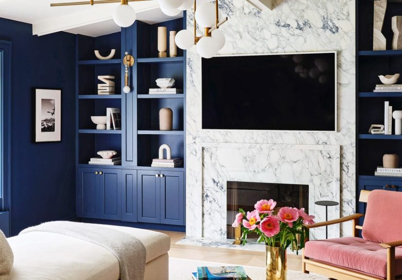
- 1) Navy Blue Cabinets
- 2) Emerald Green Cabinets
- 3) Plain Stark White Cabinets
- 4) Cool “Safe” Gray Cabinets
- 5) Dark Espresso Brown Cabinets
- 6) High-Gloss Cherry / Red-Toned Wood Cabinets
- 7) Yellow Cabinets (Especially Tuscan Mustard)
- Designer-Approved Cabinet Color Alternatives That Feel Current
- Fast Updates If You Can’t (or Won’t) Repaint Cabinets
- Real-World Lessons From Cabinet-Color Makeovers (About )
- FAQ: Outdated Kitchen Cabinet Colors
- Conclusion
Kitchen cabinets are the main character of your kitchenlike, they literally take up the most visual real estate.
So when a cabinet color starts to feel “dated,” it can make the whole room read like a time capsule (sometimes charming,
sometimes… aggressively Pinterest-2016).
Important disclaimer before we roast any paint swatches: “outdated” doesn’t mean “ugly,” and it definitely doesn’t mean
“you must renovate immediately and eat ramen for six months.” It simply means designers are seeing certain cabinet colors
hit peak saturationoverused, tricky to pair with today’s finishes, or a little too tied to a specific era.
Below are seven kitchen cabinet colors designers often flag as outdated right now, plus what to do insteadwhether you’re
repainting, refacing, or just trying to make what you have look intentional (the highest form of interior design).
Quick Snapshot: The 7 “Outdated” Cabinet Colors
- Navy Blue (the default “moody” choice that got overbooked)
- Emerald Green (jewel-tone drama that can feel overly “trend-forward”)
- Plain Stark White (bright, clinical, and sometimes a little flat)
- Cool Gray (the famous “safe gray” that reads builder-grade fast)
- Dark Espresso Brown (heavy, light-absorbing, and often undertone-tricky)
- High-Gloss Cherry / Red-Toned Wood (shiny and era-stamped)
- Yellow (Tuscan Mustard) (the early-2000s theme kitchen encore)
2) Emerald Green Cabinets
Emerald green cabinets can be stunninglike boutique-hotel-lobby stunning. The issue is that emerald became a shorthand
for “high design” in social media interiors. Once a “statement” becomes the predictable statement, designers start itching
for something subtler.
Why designers say it reads dated
- Jewel-tone peak: Saturated emerald can feel tied to a specific wave of trend kitchens.
- Hard edges: Bright emerald can clash with popular warm metals and creamy stones if undertones aren’t perfect.
- One-note drama: If everything else is neutral, emerald can look like a costume, not a palette.
Try this instead
- Olive, moss, or forest green for depth with less “look at me.”
- Muddy greens (grayed, earthy greens) that feel lived-in rather than staged.
- Green as an accent (island, pantry, or lower cabinets) while uppers stay warm neutral.
If you already have emerald cabinets
Make it feel less “trend moment” and more “tailored” by adding warmth: a wood hood, wood shelves, or warmer-toned
countertops (cream veining, beige stone, or butcher block). Avoid icy whitesthey can make emerald look sharper.
3) Plain Stark White Cabinets
White cabinets are a classic, but stark whiteespecially in a glossy finishcan read cold, flat, and a little clinical.
Designers are increasingly nudging homeowners toward softer whites and warmer neutrals that still feel bright, but not like a dentist’s office.
Why designers say it reads dated
- Sterile effect: Bright white can flatten a kitchen, especially with minimal texture.
- High contrast looks harsh: Stark white against black hardware can feel graphic in an “era-stamped” way.
- Warmth is trending: Kitchens are moving toward cozy, nuanced palettes.
Try this instead
- Creamy off-white (warmer and more forgiving).
- Soft “bone” or “ivory” that reads neutral, not yellow.
- Warm greige if you want a whisper of color without committing.
If you already have stark white cabinets
Add depth with texture: a stone backsplash with subtle veining, warmer wood tones, ribbed glass inserts, or even a
slightly warmer wall paint. Also: change the bulbs. Bad lighting can make white cabinets look icy no matter what.
4) Cool “Safe” Gray Cabinets
Gray cabinets became popular because they felt modern, neutral, and easy. The problem is the same reason: they became
the default. Cool grays (especially with blue or violet undertones) can feel builder-grade fast, and they fight with
today’s warmer metals, woods, and stones.
Why designers say it reads dated
- “Millennial gray” fatigue: The all-gray era is strongly associated with flips and quick refreshes.
- Undertone chaos: Gray’s undertones can clash with countertops, floors, and even daylight direction.
- Warm palettes are back: Warmer neutrals read more timeless right now.
Try this instead
- Warm greige (a gray-beige hybrid that plays nicer with wood).
- Mushroom and taupe (soft, cozy, and surprisingly sophisticated).
- Soft clay neutrals that feel earthy rather than icy.
If you already have gray cabinets
Before repainting, test the undertone fix: warm up the space with a backsplash that has cream tones, switch to warmer
hardware (antique brass, bronze), and consider a warmer wall color. Sometimes gray cabinets look dated because everything around them is cold.
5) Dark Espresso Brown Cabinets
Espresso cabinets were the “luxury upgrade” in many 2000s and early-2010s homesdeep, dramatic, and paired with busy granite.
Today, espresso can feel heavy, especially in kitchens without a lot of natural light. And if the undertone leans red, it can veer into “dated fast.”
Why designers say it reads dated
- Light absorption: Dark espresso can swallow light and make kitchens feel smaller.
- Red undertones: Many espresso finishes skew warm-red, which reads older than richer, neutral browns.
- Association with busy granite: Not always fair, but the pairing is common enough to trigger the vibe.
Try this instead
- Walnut or smoked oak stains (rich, modern, and more dimensional).
- Chocolate browns that are deeper and more neutral than espresso.
- Two-tone cabinetry (dark lowers, light uppers) to keep depth without the cave effect.
If you already have espresso cabinets
Make them feel intentional with contrast and warmth: creamy backsplash tile, warmer counters, and layered lighting.
Swap dated hardware for something simple and sculptural. And if you have high-contrast floors, consider a runner to soften the visual breaks.
6) High-Gloss Cherry / Red-Toned Wood Cabinets
Cherry and red-toned wood cabinetry had its momentespecially when “formal kitchen” was the goal. Add a glossy finish,
raised-panel doors, and ornate hardware, and you’ve got an instantly identifiable era. Designers today lean toward calmer,
more natural wood tones or painted finishes with softer sheen.
Why designers say it reads dated
- Red undertones feel traditional-fast: They can read formal or heavy in today’s relaxed kitchens.
- High gloss amplifies the era: Shine can make wood look more “display case” than “lived-in.”
- Clashes with popular materials: Red-toned wood can fight with certain whites, grays, and cool stones.
Try this instead
- Neutral brown stains (walnut, chestnut, cocoa) that feel modern.
- Matte or satin finishes for a calmer, contemporary look.
- Painted lowers + wood uppers if you want warmth without the red-toned takeover.
If you already have cherry cabinets
You can often modernize without painting: reduce the “red read” by choosing wall paint and backsplash colors that
complement (think warm off-whites, soft putty, muted greens). Replace shiny brass with aged brass, bronze, or black
(depending on your counters), and keep decor minimal so the wood looks like a choicenot a leftover.
7) Yellow Cabinets (Especially Tuscan Mustard)
Yellow can be joyful and freshwhen it’s done with restraint. The yellow that designers often call outdated is the
bold, golden, Tuscan-inspired mustard that dominated early-2000s themed kitchens, often paired with faux-finish walls
and busy stone. That specific shade tends to time-stamp a space quickly.
Why designers say it reads dated
- Theme-kitchen association: The shade can feel overly “Tuscan villa,” even in a suburban split-level.
- Overpowering on large surfaces: Cabinets are a lot of yellow real estate.
- Hard to pair: Mustard undertones can clash with cool counters and certain woods.
Try this instead
- Soft butter yellow (lighter, airier, and more modern).
- Warm cream if you want sunshine without the saturation.
- Yellow as an accent (tile, stools, art, or a pantry) instead of full cabinetry.
If you already have yellow cabinets
Treat yellow like a statement and simplify everything else: neutral counters, quiet backsplash, streamlined hardware.
If the yellow feels too loud, switching to a softer bulb temperature and adding natural textures can make it feel more intentional and less “set design.”
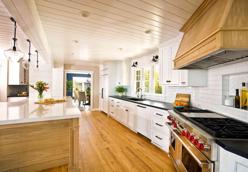
Designer-Approved Cabinet Color Alternatives That Feel Current
If you want your kitchen cabinet color to feel updated without chasing micro-trends, designers repeatedly return to
two big ideas: warmth and nuance. Think colors with depthshades that play nicely with natural wood,
warm metals, and stone, and that don’t scream a specific year.
Top “safe but not boring” cabinet colors
- Creamy whites: Soft off-whites that read welcoming rather than stark.
- Mushroom, taupe, and putty: Warm neutrals that add dimension and hide scuffs better than bright white.
- Earthy browns: Walnut-like stains or paint colors that ground the space without feeling heavy.
- Mossy greens: Olive/forest tones that feel organic and tailored.
- Muddy pastels: Toned-down “dusty” colorsmore sophisticated than candy pastels.
If you’re the cautious type, the easiest win is a warm neutral on cabinets, then personality in the island, lighting,
backsplash, or pantry. That gives you a kitchen that feels current without betting your entire budget on one bold shade.
Fast Updates If You Can’t (or Won’t) Repaint Cabinets
Sometimes repainting isn’t in the cardsand honestly, that’s fine. You can change the way a cabinet color reads by adjusting
everything around it. Think of it like styling an outfit: the same jeans look different with different shoes.
High-impact, lower-effort upgrades
- Swap hardware: Modern pulls instantly update dated finishes. Go simple, not fussy.
- Update lighting: Warm bulbs and layered lighting can transform how color reads.
- Change the backsplash: A new backsplash can “recontextualize” cabinets (yes, that’s a real design word).
- Add warmth with textiles: Runners, Roman shades, and stools soften “cold” cabinet colors.
- Edit the countertop clutter: Cleaner counters make cabinets feel more intentionalregardless of color.
If your cabinets are a dated color, the goal isn’t to hide themit’s to make them make sense with the rest of the room.
Harmony beats trendiness every single time.
Real-World Lessons From Cabinet-Color Makeovers (About )
If you’ve ever spiraled at 1:00 a.m. comparing “warm white” paint swatches that all look identical until you put them on the wall,
you’re not alone. The most common experience homeowners report during kitchen updates isn’t “joy” or “creativity”it’s
“Why do these cabinets look green now?” So here are a few real-world patterns that show up again and again when people
try to escape outdated kitchen cabinet colors.
Lesson #1: The undertone matters more than the color name. People repaint “safe gray” cabinets and are shocked
when the kitchen suddenly feels warmer and newereven though the new paint is still technically neutral. That’s because
many older grays lean blue-violet, especially under cool LED lighting. When homeowners switch to mushroom, taupe, or warm greige,
the cabinets stop fighting the floors and counters. The kitchen doesn’t look “colored.” It looks intentional.
Lesson #2: One change can rehabilitate “dated” cabinets. Honey oak is the perfect example. In a lot of homes,
the oak isn’t the problemthe problem is the supporting cast: yellow-beige walls, busy granite, and shiny brass knobs.
Homeowners who keep the oak but swap the hardware, soften the wall color, and choose a calmer backsplash often end up with a
kitchen that feels warm and updated without a full repaint. The cabinet “color” didn’t change; the story around it did.
Lesson #3: Stark white isn’t timeless if the room lacks texture. Many people expect white cabinets to be the
forever answer, then wonder why the kitchen feels flat in photos (and oddly chilly in person). The fix is rarely “more white.”
It’s texture: a warmer off-white, a backsplash with variation, wood accents, or even a slightly aged metal finish. The experience
most homeowners describe is, “Once we warmed it up, the whole kitchen finally felt like a home and not a showroom.”
Lesson #4: Trend colors age fastest when used everywhere. Navy and emerald can be gorgeous, but homeowners who put
those shades on every cabinet often say they loved it for a yearand then it started to feel like they were living inside a
design mood board. The people happiest long-term tend to use bold color strategically: an island, lowers, a pantry, or a coffee bar.
That way, if tastes shift, you’re repainting a smaller zonenot your entire personality.
Lesson #5: The best kitchens aren’t “on trend”they’re balanced. In remodel stories, the most satisfying outcomes
usually share the same formula: warm neutral cabinetry, at least one natural material (wood or stone), layered lighting, and a
few moments of color that feel personal. The kitchen reads current because it’s cohesivenot because it’s chasing whatever went viral last week.
FAQ: Outdated Kitchen Cabinet Colors
Are white kitchen cabinets out of style?
White cabinets aren’t “out,” but stark, bright white can feel colder and flatter than the warmer off-whites
designers are using now. If you love white, choose a creamy, softer white and add texture so the room doesn’t feel sterile.
What cabinet colors look most timeless?
Timeless tends to mean nuanced neutrals (cream, taupe, mushroom, warm greige) and natural wood tones
with modern stains (like walnut). These colors flex across styles and are less likely to scream a specific era.
How do I update outdated cabinet colors without painting?
Start with hardware and lighting, then consider a backsplash update. You can also warm up the palette with wall paint,
rugs, and wood accents. Small changes can dramatically shift how cabinet color is perceived.
What’s the biggest mistake people make with cabinet color trends?
Choosing a color because it’s popular, not because it works with their fixed finishes (floors, counters, lighting).
A “trend” can look timeless in the right contextand dated instantly in the wrong one.