Table of Contents >> Show >> Hide
Some cities preserve the past behind velvet ropes. Los Angeles prefers to give it better lighting, a cleaner frame, and a really good wall color. That, in a nutshell, is the charm of “Antiquities by Way of LA.” The phrase suggests more than old things arriving in Southern California. It describes a design attitude: historical material filtered through sunshine, looseness, curiosity, and just enough polish to make a centuries-old idea feel completely at home in a modern room.
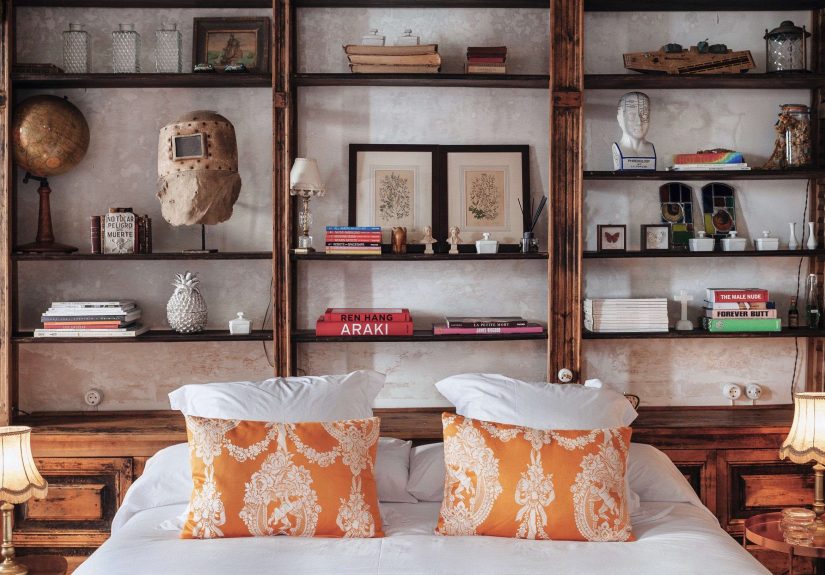
At the center of that mood is the kind of art that turns scholarship into style. Think old maps, botanical studies, educational charts, architectural plans, and geometric plates that once belonged to classrooms, archives, or eccentric collectors. In another setting, these pieces could feel stern, dusty, or museum-only. In Los Angeles, they are often edited into something lighter and more approachable. They still carry history, but they no longer insist on speaking in a hushed voice. They have relaxed. They have, if we are being honest, found better real estate.
What “Antiquities by Way of LA” Really Means
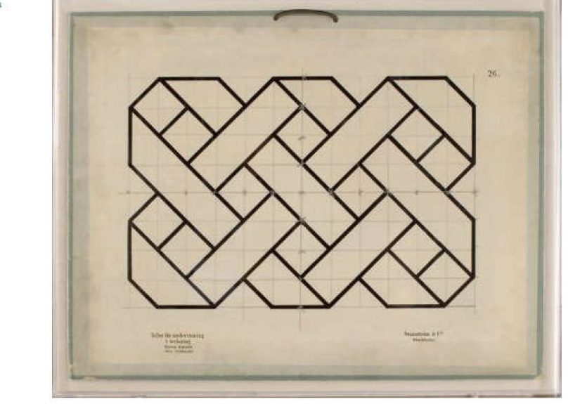
The title originally points to a design-world fascination with antiquarian material reinterpreted by a Los Angeles studio sensibility. The best-known example is Natural Curiosities, a brand tied to British-born collector Christopher Wilcox, who brought an archive-heavy eye for old maps, botanical prints, and historic documents to LA and turned that instinct into wall art with broad decorative appeal. One of the most memorable expressions of that idea is the Jean Baptiste series, based on late 19th-century line studies that explore geometry’s relationship to the natural sciences.
That concept lands because it sits at the crossroads of several long-running design loves. America never really stopped admiring botanical illustration. Collectors never stopped buying antique maps. Designers never stopped borrowing from scientific diagrams, old engravings, and formal studies of nature. What Los Angeles adds is a new frame of mind. Instead of treating these images as relics, LA treats them as living visual language. A chart can be art. A map can be mood. A botanical can be both science and flirtation.
And yes, that is a very LA trick: taking something academically respectable and making it look effortlessly cool. Not in a sloppy way. In a “this 19th-century geometry plate now lives beside a travertine console, a sculptural lamp, and a bowl of lemons that absolutely cost more than they should” kind of way.
The Natural Curiosities Effect
The Natural Curiosities approach helps explain why the phrase has stayed memorable. The brand’s broader archive includes old maps, vintage photography, blueprints, posters, and nature-based material, but the Jean Baptiste works are especially telling. They are orderly without feeling cold. Their line work is precise, but the overall effect is meditative rather than mathematical. In smaller formats, the collection reads like an intimate found object. In larger framed presentations, it becomes an architectural statement.
That dual personality is part of the appeal. Antique-derived work often succeeds when it feels both intellectual and decorative. A botanical plate can satisfy the collector who loves historical process and the homeowner who just wants the wall to stop looking empty. A geometric study can nod to science, folk art, and even modernist abstraction all at once. That is not confusion. That is range.
Retailers and showrooms have also helped push this look from niche to mainstream luxury. Pieces inspired by antique documents and studies now appear not only in collector circles, but in curated interiors, upscale retail environments, and edited online catalogs. Once the market proves that antique maps and educational plates can live comfortably next to contemporary furniture, the design public follows. Suddenly, the “old document on the wall” is no longer a quirky one-off. It becomes a vocabulary.
Why Maps, Botanicals, and Scientific Plates Still Work
They Make a Room Feel Layered
Designers keep returning to maps and botanical prints because these forms instantly add narrative. Abstract art can supply emotion. Antique-derived art supplies memory, even when the viewer does not know the exact history. A map implies travel, geography, and worldview. A botanical print suggests observation, patience, and the long tradition of illustrating the natural world. A classroom geometry plate hints at knowledge, order, and the beauty of systems. That is a lot of storytelling from one frame.
Modern interiors often need that layer. A room filled only with new objects can feel as if it was assembled in one long, very expensive Saturday. Add an antiquarian element, and the space suddenly feels slower, deeper, and more believable. Better Homes & Gardens has repeatedly pointed to vintage maps, antique book pages, and botanicals as a way to create walls that feel collected rather than generic. That distinction matters. “Collected” feels personal. “Generic” feels like a waiting room with better upholstery.
They Balance Modern Architecture
Antique-inspired works are especially effective in modern homes because they soften hard edges without turning the room sentimental. This is where LA shines. The city has long embraced clean-lined houses, airy renovations, and rooms with strong architectural bones. Against plaster walls, steel windows, walnut cabinetry, or linen upholstery, an old map or antique-style study provides friction in the best way. It adds delicacy to strength. Precision to softness. History to openness.
Architectural Digest has highlighted interiors where antique European maps, period documents, and historical references give contemporary rooms a richer emotional temperature. That pairing works because old paper carries a visual grain that many new pieces lack. Even a reproduction based on antique source material can preserve some of that irregularity: faded tones, disciplined line work, off-white fields, odd labels, hand-drawn charm. In design, perfection is often boring. Patina is the plot twist.
They Carry the Art-and-Science Magic
Botanical illustration remains so compelling because it lives in two worlds at once. It is artistic, but it is also observational. The Library of Congress defines botanical illustrations as depictions of plants or plant life, often created to document specimens. Smithsonian materials likewise emphasize the role of botanical art in scientific understanding and the way illustrators helped translate nature into knowledge. That art-and-science overlap gives botanical and natural-history-inspired wall art unusual depth.
The same is true of antique maps and scientific charts. A world map is not just decoration; it is a record of how people once organized information. A geology or botany chart is not just pretty geometry; it is evidence of how visual learning worked. Even when a contemporary buyer hangs these pieces for aesthetic reasons, the original logic is still present. The work feels grounded because it once had a job.
The Los Angeles Filter
If antiquities arrive in New York, they might become moody. If they arrive in San Francisco, they might become literary. In Los Angeles, they tend to become spacious. The city’s design culture has a gift for making old things feel breathable. Historic references are not buried under clutter or ceremony. They are given room to stretch out.
This helps explain why antique maps, botanicals, and document-based works thrive in Southern California interiors. Sunlit walls reveal detail. Pale plaster loves aged paper. Neutral rooms allow intricate line work to register without shouting. And because LA design often borrows from travel, Mediterranean ease, European antiques, and California modernism all at once, antiquarian material does not feel out of place. It feels like a missing ingredient.
Los Angeles retail and design culture has reinforced this taste for years. Local and local-adjacent design stories have featured vintage maps, botanical prints, old-world references, and historical paper goods as part of a larger “collected but not cramped” sensibility. Even when the objects are reproduced, the fantasy is the same: a room assembled over time, by someone curious enough to care what was printed, drawn, or charted before the present moment showed up with its giant smart TV and emotional support water bottle.
How to Bring the Look Home
Start With One Category
Do not mix antique maps, butterflies, sea charts, botanical engravings, celestial diagrams, and architectural blueprints all at once unless you are very confident or very committed to chaos. Pick one family first. Maps create travel energy. Botanicals bring softness. Geometric studies feel cerebral and restrained. Old educational plates bridge the gap between art and artifact. A room does not need every historical reference ever printed.
Use Frames That Respect the Source
Neutral mats, slim wood frames, acrylic box presentations, and linen backings all work because they honor the paper without turning it theatrical. The frame should support the material, not cosplay as Versailles. One reason the LA version of antiquarian style feels fresh is that presentation stays edited. The old thing is the star. The frame is stage crew.
Mix Old Content With New Furniture
The contrast is where the sparkle happens. Antique-derived art looks especially strong above contemporary case pieces, streamlined sofas, plastered fireplaces, and sculptural lamps. If everything in the room is old, the piece may disappear into the chorus. If the room is too slick and too new, the art becomes the one adult at a teenage party. You want conversation, not a hostage situation.
Think in Grids or Pairs
Maps and scientific studies often look best when organized. A triptych, a pair, or a grid can make even eclectic source material feel intentional. House Beautiful and Better Homes & Gardens regularly point to grouping and rhythm as the difference between a gallery wall and a visual traffic jam. Antiquarian material already contains detail. The arrangement should bring calm, not a headache.
Common Mistakes to Avoid
The biggest mistake is treating antique-inspired art as costume. A room should not look like a fake study in a period drama unless that is truly your dream and you own several smoking jackets. The second mistake is choosing pieces only because they seem “vintage.” Age alone does not create beauty. Choose imagery that genuinely earns your attention. A world map with unusual coloring, a botanical plate with elegant line quality, or a geometry study with mesmerizing repetition will outlast trend-chasing every time.
The third mistake is ignoring context. Antiquities by way of LA is not about stuffing a room with old-looking things. It is about editing history into contemporary life. The look succeeds when the space feels calm, intelligent, and lightly worldly. Not dusty. Not fussy. Definitely not “my apartment was decorated by the gift shop of a natural history museum after three espressos.”
Why This Look Endures
Antiquarian imagery survives because it solves a modern problem: how to make a home feel informed, personal, and warm without relying on obvious clichés. Maps, botanicals, and educational studies do that brilliantly. They connect beauty to knowledge. They make walls feel inhabited by ideas, not just objects. They give a room history without demanding a full renovation or a trust fund backed by an 18th-century estate.
“Antiquities by Way of LA” endures because the phrase captures a lasting design truth. The past does not have to be preserved exactly as it was in order to remain meaningful. Sometimes it becomes more useful when translated. Los Angeles, for all its reputation as a city obsessed with the new, has been surprisingly gifted at that translation. It knows how to take old paper, old studies, and old-world references and let them breathe in the present.
That is the real appeal. Not nostalgia. Not trend. Not even luxury, though luxury certainly helps. It is the pleasure of living with images that carry evidence of curiosity. In a culture that moves fast and forgets faster, there is something satisfying about hanging a piece on the wall that says: someone once looked closely at this world. Maybe you should, too.
Experiences Related to “Antiquities by Way of LA”
The experience of this aesthetic is hard to understand until you see it in person. Photos help, of course, but antiquarian-inspired art really earns its keep when you stand a few feet away and notice how much quieter it feels than trendier wall decor. I think that is why the look sticks with people. It does not beg for attention. It slowly takes over the room.
Imagine walking into a bright Los Angeles interior on a mild afternoon. The windows are open. The light is clean, almost creamy, not harsh. Across the room there is a framed geometric study, something that might once have lived in a classroom or an archive. From a distance, it reads as abstract art. Up close, it reveals tiny decisions: delicate lines, unusual spacing, a field of off-white rather than pure white, maybe a little tonal unevenness that gives it life. Suddenly the room feels smarter without becoming stuffy.
Then your eyes move to another wall. There is a map, not oversized, not screaming “travel theme,” just sitting there with quiet confidence. It gives the space a sense of orientation. Not just geographic orientation, but emotional orientation. A map on the wall says someone in this home likes discovery, memory, routes, old names, and the strange poetry of borders. It creates atmosphere in a way that mass-produced slogan art never could. No offense to cheerful typography, but “Gather” has never once delivered the layered dignity of a faded chart.
One of the most memorable parts of experiencing this style is the tension between age and freshness. Antiquarian material can be deeply old in spirit, yet the room around it feels current. That combination is satisfying because it mirrors real life. Most of us are not living in a perfect period house or a white-box gallery. We live somewhere in between. Our homes contain memory and update, inheritance and impulse, hand-me-down and online order. Antiquities by way of LA reflects that mixed reality better than many stricter design styles do.
There is also a tactile fantasy involved. Even when you are looking at a framed reproduction rather than a one-of-a-kind antique, you still register paper, fiber, margin, line, and age-coded detail. It makes you want to lean in. That is a different kind of luxury from shiny finishes or oversized scale. It is slower luxury. A whisper instead of a drum solo.
I also think the experience works because it gives people permission to be interested in things. Not just décor, but actual subjects. Plants. Geography. mathematics. history. Exploration. Illustration. Old printing methods. Educational systems. Decorative collecting. You do not need a graduate degree to enjoy any of that, but you do need curiosity, and curiosity is one of the most attractive things a room can communicate.
That may be the secret sauce. This look is not just pretty. It is interested. And rooms that seem interested in the world tend to feel more alive. They feel as though conversations happen there. Books get opened there. Someone has opinions about maps there. Maybe someone makes espresso badly but enthusiastically there. Maybe someone has been known to explain linen backing at a dinner party when nobody asked, and honestly, that is part of the fun.
In the end, the experience of “Antiquities by Way of LA” is less about buying a certain type of frame and more about creating a certain kind of mood. It is the mood of history made breathable. Scholarship made stylish. Beauty made a little brainier. You walk into a room shaped by that sensibility and feel two things at once: calm and intrigue. That is a rare combination. And that is why this look, even after years of design turnover and trend churn, still has a pulse.