Table of Contents >> Show >> Hide
- How Color Behaves in a Bedroom (and Why “Simple Beige” Sometimes Turns Peach at Night)
- The Easy Color Blueprint: The 60-30-10 Rule (No Calculator Required)
- Paint Finish Matters More Than People Think
- Use LRV to Avoid Accidental Caves (or Accidental Operating Rooms)
- 12 Bedroom Color Schemes That Actually Work
- 1) Soft Blue + Warm White + Natural Wood
- 2) Sage Green + Cream + Matte Black
- 3) Greige + Crisp White + Linen Beige
- 4) Navy + Taupe + Gold
- 5) Dusty Rose + Warm Gray + Walnut
- 6) Terracotta + Ivory + Olive
- 7) Charcoal + Soft White + Cognac Leather
- 8) Blue-Green (Aqua/Teal) + Sand + White
- 9) Warm White + Soft Black + One “Real Color” Accent
- 10) Lavender Gray + Cream + Light Oak
- 11) Forest Green + Off-White + Antique Brass
- 12) Monochrome Neutrals (Sand → Camel → Chocolate)
- Quick Matchmaker: Choose a Scheme Based on Your Room
- Common Bedroom Color Mistakes (and How to Avoid Them)
- Real-World Experiences: What People Learn After Painting Their Bedroom (The Extra Stuff That Makes the Result Better)
- Conclusion
Your bedroom is basically your body’s “low power mode.” It’s where you recover, reset, and (ideally) stop scrolling at a time that is not legally classified as “tomorrow.”
So yesyour bedroom color scheme matters. Not because paint has magical powers, but because color affects how a room feels: airy or cozy, calm or energizing, crisp or cave-like.
The good news? You don’t need an interior design degree. You just need a plan that accounts for light, undertones, and a couple of tried-and-true color combos that rarely disappoint.
How Color Behaves in a Bedroom (and Why “Simple Beige” Sometimes Turns Peach at Night)
Step 1: Decide what you want the room to do
Before you pick a color, pick a vibe. Most bedroom schemes fall into a few mood buckets:
- Sleep-first calm: soft blues, blue-greens, gentle greens, warm off-whites, muted grays.
- Cozy cocoon: deep navy, forest green, charcoal, chocolatey browns, and warm clay tones.
- Fresh and bright: crisp whites, light greiges, pale sages, watery aquas, and sun-washed neutrals.
- Romantic/dramatic: moody plums, inky blues, deep reds (used carefully), and high-contrast neutrals.
Step 2: Read the room’s lightliterally
A paint color is basically a professional shape-shifter. The same shade can look calm and creamy at 10 a.m., then suddenly lean greenish or pinkish at 9 p.m.
That’s because light temperature changes throughout the day, and different bulbs (warm vs. cool LEDs) push color around.
Also, room direction matters: north light tends to feel cooler and flatter; south light is warmer and brighter; east light is crisp in the morning; west light warms up later in the day.
Translation: always test paint in your bedroom, not in your imagination.
Step 3: Understand undertones (the “secret flavor” in paint)
Undertone is the subtle hue underneath the main colorlike how “gray” can secretly be blue-gray, green-gray, or purple-gray.
In bedrooms, undertones matter because you spend hours in the room under low light. If you pair warm woods with a cool gray, or a pink-leaning beige with a yellow-leaning white, the mismatch can feel “off” even if you can’t explain why.
A quick trick: compare two similar swatches side-by-side. Undertones show up fast when they have a rival.
The Easy Color Blueprint: The 60-30-10 Rule (No Calculator Required)
If picking a palette makes you freeze like a buffering video, use the 60-30-10 rule:
- 60% = the dominant color (usually walls or large surfaces)
- 30% = a secondary color (bedding, curtains, rug, upholstered pieces)
- 10% = an accent color (art, pillows, throws, lampshades, a bench, hardware)
This keeps your room from becoming either (a) a color explosion or (b) a beige waiting room.
It also helps you commit: you don’t have to love your accent color enough to marry itjust enough to invite it over for dinner.
Paint Finish Matters More Than People Think
Paint sheen affects how color looks and how forgiving your walls are. In bedrooms, the sweet spot is usually:
- Ceiling: flat (hides imperfections, reduces glare)
- Walls: matte or eggshell (soft look, still cleanable)
- Trim/doors: satin or semi-gloss (durable, crisp contrast)
A higher sheen reflects more lightwhich can be great for trimbut it can also spotlight every bump in drywall like it’s auditioning for a documentary.
If your bedroom walls aren’t perfectly smooth, a velvety matte finish is your best friend.
Use LRV to Avoid Accidental Caves (or Accidental Operating Rooms)
LRV stands for Light Reflectance Value, usually on a 0–100 scale. Higher LRV colors reflect more light (brighter feel). Lower LRV absorbs more light (moodier feel).
You don’t have to obsess over numbers, but LRV helps when a room feels too dark or too stark.
As a rough guide:
- High LRV (light): great for small bedrooms, low natural light, or if you want “airy.”
- Mid LRV (balanced): easiest to live with; works in most bedrooms.
- Low LRV (dark): cozy and dramatic; best with thoughtful lighting (lamps, sconces, warm bulbs).
12 Bedroom Color Schemes That Actually Work
Below are bedroom color schemes you can adapt to almost any stylemodern, traditional, coastal, farmhouse, maximalist, minimalist, and “I just want it to feel nice.”
For each scheme, you’ll get: the mood, what to pair it with, and specific examples (including popular paint families).
1) Soft Blue + Warm White + Natural Wood
Mood: classic calm, “deep breath” energy.
Why it works: blue reads restful without feeling cold when you pair it with creamy whites and warm wood tones.
- Try: a muted blue (think “cloudy sky,” not “sports team mascot”).
- Pair with: warm white trim, oak or walnut nightstands, linen bedding.
- Accents: brass, woven textures, soft stripes.
2) Sage Green + Cream + Matte Black
Mood: spa-like, grounded, quietly modern.
Why it works: sage is a “new neutral” that plays well with almost everythingespecially warm whites and darker contrast elements.
- Try: dusty sage walls or a sage accent wall behind the bed.
- Pair with: creamy bedding, natural wood, black picture frames or a black metal bed.
- Accents: greenery, ceramics, soft tan leather.
3) Greige + Crisp White + Linen Beige
Mood: clean, timeless, hotel-suite calm.
Why it works: greige (gray + beige) gives you warmth without turning yellow and softness without going icy.
- Try: a light greige with subtle warmth.
- Pair with: bright white trim, beige textiles, and layered textures (knit throw, boucle pillow, wool rug).
- Accents: wood tones, soft black details, brushed nickel.
4) Navy + Taupe + Gold
Mood: moody but polishedlike a tailored blazer for your bedroom.
Why it works: navy brings depth; taupe keeps it livable; gold warms everything up.
- Try: navy on the bed wall or color-drench the whole room if you want a cocoon.
- Pair with: taupe bedding, cream curtains, warm wood.
- Accents: brass lamps, vintage frames, warm bulbs.
5) Dusty Rose + Warm Gray + Walnut
Mood: soft, flattering, grown-up romantic (not “kid’s room pink”).
Why it works: dusty rose is muted and cozy, and warm gray keeps it grounded.
- Try: blushy walls with gray-beige bedding.
- Pair with: walnut furniture and creamy whites.
- Accents: antique brass, burgundy touches, textured rugs.
6) Terracotta + Ivory + Olive
Mood: warm, earthy, “sunset but make it interior.”
Why it works: clay tones feel cozy; ivory prevents heaviness; olive adds sophistication.
- Try: terracotta on a single wall or in a half-wall treatment.
- Pair with: ivory walls/trim and olive bedding or art.
- Accents: woven baskets, wood, black metal.
7) Charcoal + Soft White + Cognac Leather
Mood: dramatic and cozy, like your bedroom is whispering, “No meetings here.”
Why it works: charcoal is bold but more forgiving than pure black; soft white keeps contrast elegant.
- Try: charcoal walls with a lighter ceiling, or use “color capping” by painting the ceiling a related tone.
- Pair with: white bedding, warm wood, tan leather bench.
- Accents: linen curtains, warm lighting, minimal clutter.
8) Blue-Green (Aqua/Teal) + Sand + White
Mood: breezy, coastal, and cheerful without screaming “beach souvenir shop.”
Why it works: blue-green feels fresh; sand tones keep it relaxed; white adds crispness.
- Try: a faded turquoise or “misty teal” rather than neon.
- Pair with: sandy rugs, white bedding, light wood.
- Accents: seagrass, soft stripes, brushed brass.
9) Warm White + Soft Black + One “Real Color” Accent
Mood: modern, uncluttered, quietly confident.
Why it works: warm white makes the room glow; black adds structure; one accent color keeps it personal.
- Try: warm white walls and a black bed frame.
- Pick one accent: olive, navy, rust, or muted mustard.
- Accents: art and textiles do the heavy liftingno need for five competing colors.
10) Lavender Gray + Cream + Light Oak
Mood: soothing, slightly dreamy, surprisingly neutral.
Why it works: lavender-gray reads calm and soft, especially with creamy whites and pale woods.
- Try: a barely-there purple-gray that looks like “dusk” rather than “grape soda.”
- Pair with: cream bedding and rattan or oak textures.
- Accents: brushed nickel, soft blues, gentle patterns.
11) Forest Green + Off-White + Antique Brass
Mood: rich, cozy, boutique-hotel level comfort.
Why it works: deep green feels protective and calm; off-white keeps it from becoming a cave.
- Try: green on all walls for a cocoon, or keep the ceiling lighter if your room is small.
- Pair with: off-white bedding and warm woods.
- Accents: brass sconces, vintage rugs, art with warm tones.
12) Monochrome Neutrals (Sand → Camel → Chocolate)
Mood: sophisticated, warm, and extremely “I have my life together” (even if you don’t).
Why it works: using one color family in multiple depths gives you depth without chaos.
- Try: sand walls, camel textiles, chocolate accents.
- Pair with: layered texture: boucle, linen, wool, wood grain.
- Accents: black details for contrast, or brass for warmth.
Quick Matchmaker: Choose a Scheme Based on Your Room
If your bedroom is small
Light-to-mid tones (warm whites, pale greiges, soft sages) help keep the room open. You can still go darkjust balance it with lighter bedding, mirrors, and layered lighting.
A smart move: keep the ceiling lighter than the walls if you want height, or paint ceiling and walls the same color if you want a wrapped, cozy feel.
If your bedroom doesn’t get much natural light
Choose colors with enough brightness to avoid “gray dungeon” energy. Warm undertones often feel better in dim rooms than cool grays.
Add lighting in layers: overhead + bedside lamps + one more source (floor lamp or wall sconces).
If you share the room
Pick a “neutral hero” (greige, warm white, muted green) for the walls, then let each person’s style show up in the 30% and 10% layersbedding, art, and accents.
This is how you avoid compromising into a color that nobody actually likes.
Common Bedroom Color Mistakes (and How to Avoid Them)
- Skipping testing: small paint chips lie. Use larger samples and view them morning, afternoon, and night.
- Ignoring undertones: warm-with-warm and cool-with-cool usually looks most intentional.
- Going too matchy: if everything is the same intensity, the room can look flat. Add contrast (light + dark, matte + shine, smooth + textured).
- Choosing sheen last: sheen changes how color reads. Pick the finish with the room’s use and wall condition in mind.
- Forgetting the “soft stuff”: bedding, curtains, and rugs are part of the color schemenot afterthoughts.
Real-World Experiences: What People Learn After Painting Their Bedroom (The Extra Stuff That Makes the Result Better)
Here are the kinds of experiences homeowners and renters commonly report after they actually live with a new bedroom color schemeespecially during that first week when you keep walking in just to stare at the walls like they’re a new pet.
1) The same color can look “right” and “wrong” in one day
A soft gray-green might look perfect at noon, then lean unexpectedly minty at night under warm bulbs. This isn’t failureit’s physics.
The fix is simple: test your top contenders on multiple walls and check them under the lighting you use most (including bedside lamps).
People who do this first usually feel calmer after painting, because they’re not blindsided by the “why is this beige suddenly pink?” moment.
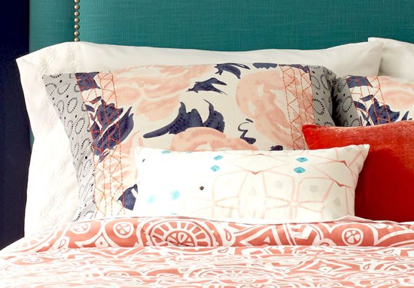
2) Bedding is the secret co-designer
Many people paint first and shop textiles laterand then wonder why the room feels unfinished. In real bedrooms, the bed is a huge visual surface.
If you choose a cool wall color (blue, blue-green, gray), pairing it with warm textures (cream quilts, oatmeal linen, warm wood) often makes it feel more welcoming.
If you choose a warm wall color (terracotta, warm taupe, creamy white), crisp whites and deeper accents (navy, olive, charcoal) keep it from feeling muddy.
The most “put together” bedrooms usually have at least three textures layered on the bed: sheets + a quilt/duvet + a throw.
3) Dark colors don’t automatically make a room feel smaller
People are often surprised that a deep navy or forest green can feel cozier rather than crampedespecially if the room has decent lighting and lighter bedding.
A common experience is that dark walls reduce visual noise, which can make the space feel calmer (and sometimes more expensive-looking).
The key is balancing darkness with brightness: light bedding, lighter rug, reflective accents (brass, glass), and warm bulbs.
4) “One bold wall” works best when it’s truly intentional
Accent walls get a bad reputation because they’re often chosen as a half-commitment: “I’m scared of color, but I’m also bored.”
In real rooms, an accent wall looks best when it has a clear jobframing the bed, highlighting architectural detail, or anchoring a gallery wall.
People who pick the bed wall (headboard wall) and repeat that color in at least two other places (a pillow + artwork, or a rug pattern + lamp base) usually get the most cohesive result.
5) The “finishing” choices matter as much as the paint
Real bedrooms feel polished when paint is treated as the background and the rest is tuned to match:
swapping harsh cool bulbs for warm ones, repeating a metal finish (brass or black) consistently, and choosing curtains that either blend with walls (calm) or contrast on purpose (drama).
A surprisingly common experience: the room feels better after adding two lamps and one textured rug than after changing the wall color again.
In other words, don’t repaint out of panictry styling first.
The best bedroom color schemes aren’t just “pretty.” They’re functional: they support rest, reduce clutter visually, and make the room feel like a place you actually want to land at the end of the day.
Choose a palette that fits your light, respect undertones, test before committing, and remember: the goal is not to impress the internet. The goal is to sleep.
Conclusion
A great bedroom color scheme is a mix of mood + light + balance. Start with how you want the space to feel, use the 60-30-10 rule to keep decisions simple,
and pick paint finishes that make your walls look betternot shinier. Whether you lean airy (soft blue + warm white), grounded (sage + cream), or moody (navy + taupe),
the “right” palette is the one that looks good in your bedroom at the time you actually live in it: early morning, late night, and all the in-between moments.