Table of Contents >> Show >> Hide
- What “True Blue” Really Means (And Why It’s Harder Than It Sounds)
- The Fastest Way to Choose a True Blue That Won’t Betray You
- Paint Finish Matters More With Blue Than You Think
- The “True Blue” Shortlist: Designer-Loved Blues That Work in Real Homes
- Room-by-Room: Where True Blue Looks Best (And What to Pair It With)
- How to Test Blue Paint the Smart Way (So You Don’t Repaint Twice)
- Color Pairing That Makes True Blue Look Expensive (Even If Your Sofa Isn’t)
- Common “True Blue” Mistakes (So You Can Avoid Them Like a Pro)
- TRUE BLUE in Real Life: of “Been There, Painted That” Experiences
- Conclusion: Your True Blue Checklist
If your home had a “default setting,” it might be white walls and good intentions. And if your home had a
personality upgrade, it would probably be true blue: confident without being loud, classic without being
boring, and flexible enough to look great in a beachy bungalow or a modern condo that owns exactly one houseplant.
But “blue” is not one color. It’s a whole mood rangefrom “gentle coastal sigh” to “I run a yacht club now.”
This guide is about landing on the right true blue for your rooms, your light, your floors, and your
tolerance for repainting (which, if you’re human, is low).
What “True Blue” Really Means (And Why It’s Harder Than It Sounds)
In paint terms, true blue usually means a blue that feels balancednot noticeably green (teal),
and not noticeably purple (periwinkle/indigo). The catch? Your room will absolutely try to sabotage you.
Morning light, warm bulbs, shadowy corners, and reflective surfaces can all yank a “perfect blue” into a different personality.
That’s why designers and paint pros obsess over three things: undertones, light, and
LRV (Light Reflectance Value). If those sound like the villains in a home-improvement superhero movie, you’re not wrong.
Undertones: The Sneaky Background Music of Paint
Two blues can look identical on a tiny paint chip, then look wildly different on your wall. One might lean gray (more subdued),
one might lean green (more coastal), one might lean violet (more dramatic). True blue is about minimizing those “side quests.”
LRV: The Number That Predicts “Why Does This Feel So Dark?”
LRV is a 0–100 scale that tells you how much light a color reflects. Lower numbers generally read darker.
Higher numbers read lighter. Translation: if you’re painting a low-light room, LRV matters more than your optimism.
The Fastest Way to Choose a True Blue That Won’t Betray You
- Start with your room’s light.
- North-facing rooms skew cooler; blues can look icier or grayer.
- South-facing rooms skew warmer; blues can look richer and slightly softer.
- West-facing rooms get warmer late-day light; blues can deepen dramatically at sunset.
- Match blue to fixed finishes. Your floors, stone, tile, and big furniture are the “non-negotiables.”
Blue should harmonize with those, not fight them like siblings in the backseat. - Pick your “blue intensity.” Do you want:
- Airy blue (fresh, open, easy on the eyes)
- Mid-tone true blue (classic, energizing, still livable)
- Deep blue / navy (dramatic, cozy, very intentional)
- Test like a pro. Paint a large sample and view it across the day. A tiny chip is a liar with great PR.
- Choose the right sheen. Sheen changes how blue readsespecially at night under lamps.
Paint Finish Matters More With Blue Than You Think
Blue is sensitive to shine. The glossier the finish, the more light bounces around, and the more the color “moves” depending on
angles and time of day. That can be gorgeousor it can be exhausting if you wanted calm.
Quick Sheen Picks
- Flat/Matte: Great for hiding wall texture; sophisticated, modern look. Can show scuffs in busy areas.
- Eggshell: A popular sweet spot for wallssubtle glow, better cleanability.
- Satin: Durable and wipeable; can highlight wall imperfections more than eggshell.
- Semi-gloss: Ideal for trim, doors, cabinetsvery cleanable, very reflective.
The “True Blue” Shortlist: Designer-Loved Blues That Work in Real Homes
Below are blues frequently recommended by major paint brands and home design authorities, plus popular designer favorites. Think of this
as your “start here” listthen narrow based on your lighting and vibe.
1) Mid-Tone Classic Blues (The Heart of TRUE BLUE)
- Benjamin Moore Van Deusen Blue (HC-156): A classic, confident blue that reads traditional but not stuffy.
- Benjamin Moore Santorini Blue (1634): Bright and livelygreat when you want blue to feel crisp, not heavy.
- Sherwin-Williams “historic” and mid-tone blues (various): If you want a blue with timeless energy, explore their historic-inspired options.
- HGTV-featured Sherwin-Williams blues: Editorial picks often include vivid “statement” blues that still feel usable in a room.
2) Deep Blues & Navies (Still “True Blue,” Just in a Tuxedo)
- Sherwin-Williams Naval (SW 6244): A modern navy that works for accents, cabinetry, and bold rooms.
- Benjamin Moore Hale Navy (HC-154): A maritime classic that designers reach for again and again.
- Designer-recommended navies from editorial roundups: Great if you want drama without going full black.
3) Light Blues (True Blue’s “Weekend Outfit”)
- Benjamin Moore Palladian Blue (HC-144): A light, airy blue that can read spa-like (and yes, light can shift it).
- Soft blue-grays: These are ideal if you like blue but want it to behave like a neutral most of the time.
4) Trend-Adjacent Blues That Still Feel Timeless
- Valspar Encore (Color of the Year 2025): A deep, romantic blue that’s bold but livable.
- Curated “best blues” collections (online swatch kits): Helpful for narrowing choices when you’re overwhelmed by 8,000 blues.
Pro tip: If you’re nervous about blue, start with a deep navy on a smaller surface (like built-ins or a powder room),
or go light blue in a bedroom to test-drive the vibe.
Room-by-Room: Where True Blue Looks Best (And What to Pair It With)
Living Room: True Blue as the “Grown-Up Neutral”
Mid-tone blues and blue-grays can act like a neutral backdrop with more personality than beige. If your living room gets a lot of daylight,
you can go deeper without it feeling like a cave. If it’s darker, choose a blue with a higher LRV or a softened (slightly grayed) tone.
Pair it with: creamy whites, warm woods, camel leather, brass accents, textured linen, and natural fiber rugs.
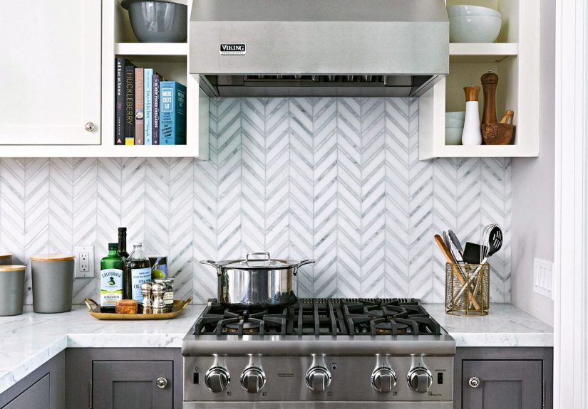
Kitchen: Blue Cabinets Are Basically a Love Language
Blue kitchens keep showing up in design inspiration for a reason: blue can feel clean, calm, and elevated. Deep navy cabinets look sharp with
white counters and warm metal hardware. Mid-tone true blues can feel cheerful and fresh, especially in kitchens with good natural light.
Pair it with: white or off-white walls, wood shelving, matte black or aged brass hardware, and stone with subtle warmth.
Bedroom: The Calm Zone
Blue is famously soothing, and it excels in bedroomsespecially softer true blues and blue-grays. If your bedroom is north-facing, avoid blues that are
already very cool; they can look chilly. In that case, choose a slightly warmer blue (or pair with warmer textiles).
Pair it with: warm whites, oatmeal linens, soft grays, and wood tones. Add layered textures so the room feels cozy, not cold.
Bathroom: Spa Blue Without Going Full “Hotel Lobby”
In bathrooms, moisture and lighting matter. Many people prefer satin or semi-gloss for durability, but walls can still be eggshell depending on ventilation.
Lighter blues make small bathrooms feel airy, while deep blues turn powder rooms into a “wow” moment.
Pair it with: crisp white tile, warm mirrors/frames, and mixed metals for dimension.
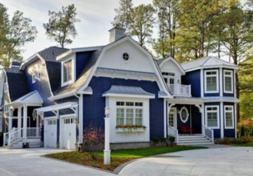
Exterior & Front Door: True Blue That Boosts Curb Appeal
Blues can read darker outside than you expect, especially in shade. If you want a true-blue door that pops, test it in outdoor light and
consider how your brick/stone undertones will influence it.
How to Test Blue Paint the Smart Way (So You Don’t Repaint Twice)
Step 1: Sample Bigger Than You Think
Use a large sample area (or a sample board you can move). Blue needs space to show you what it’s really doing.
Step 2: Check Morning, Noon, Night
Look at it with daylight and with your actual bulbs. Warm bulbs can make blue feel softer (or slightly greener). Cool bulbs can make it feel sharper.
Step 3: Put It Next to Your Whites
Your trim and ceiling whites will affect how the blue reads. A crisp white makes blue look cleaner. A creamy white makes it feel warmer and more relaxed.
Color Pairing That Makes True Blue Look Expensive (Even If Your Sofa Isn’t)
Blue plays well with a lot of colors, but it looks especially polished when paired with intentional supporting tones. Here are a few combinations that
consistently deliver:
- True Blue + Crisp White: clean, classic, high-contrast.
- True Blue + Warm Cream: softer, more lived-in, less “nautical.”
- True Blue + Greige/Taupe: modern, grounded, quietly sophisticated.
- True Blue + Natural Wood: instantly warmer and more welcoming.
- True Blue + Brass/Gold: elevated and a little glamorous.
- True Blue + Terra-cotta/Rust: bold, artsy, and surprisingly cozy.
The 60-30-10 Shortcut
If you’re building a palette from scratch, a simple guideline is: 60% main color (often walls), 30% secondary (furniture/rugs),
10% accent (decor). It’s not a lawmore like guardrails that keep your room from becoming an accidental circus.
Common “True Blue” Mistakes (So You Can Avoid Them Like a Pro)
- Choosing blue under store lighting. Store lighting is its own universe. Your home is a different planet.
- Ignoring undertones in floors and stone. If your floors are warm, a very icy blue can look disconnected.
- Going too dark in a low-light room. Deep blue can be gorgeous, but it needs light (or it becomes “midnight at 3 p.m.”).
- Using too shiny a sheen on imperfect walls. Satin and above can highlight bumps and patchworkespecially in raking light.
TRUE BLUE in Real Life: of “Been There, Painted That” Experiences
Let’s talk about what actually happens when people pick a true blue. Not the fantasy version where you paint once, angels sing, and the walls dry in 20 minutes.
The real versionthe one where you stare at a wet patch and whisper, “Is it… green?”
Experience #1: The “Tiny Chip Confidence” Trap. A very common storyline: someone falls in love with a blue chip that looks perfectly balancedclean,
classic, undeniably blue. Then it hits the wall and suddenly the room looks cooler than expected. The fix is usually simple: bring in warmer whites (trim, bedding,
curtains), add wood tones, and soften lighting. Blue didn’t “go wrong”it just needs supporting characters.
Experience #2: The Nighttime Plot Twist. People often test a blue during the day, feel great about it, then turn on warm lamps at night and the color
deepens dramatically. That can be cozy and luxe (especially with navy), but it can also feel heavier than intended. The workaround is to test under your
actual bulbsand, if needed, swap to bulbs with a slightly different temperature. (Yes, lighting is basically the remote control for paint.)
Experience #3: The “My Couch Made It Weird” Revelation. A blue that looks true on its own can shift next to a strong-colored sofa, rug, or artwork.
For example, a rug with teal notes can coax a “true blue” into reading greener, while a purple-toned throw can pull it toward indigo. Many people end up choosing
their final blue by holding the sample right next to the biggest existing item in the room. It’s not romantic, but it’s effective.
Experience #4: Blue Cabinets Are a Commitment (But a Rewarding One). Homeowners who go blue on cabinetry often say the first 48 hours feel
terrifyingbecause cabinets are a lot of surface area and blue is a strong personality. Then hardware goes on, counters get cleaned, and suddenly it looks
intentional, elevated, and “custom.” The trick: keep the rest of the palette calmsimple walls, warm metals, and one or two accent pieces that echo the blue.
Experience #5: The “One Room Bold, One Room Soft” Strategy. A smart approach that comes up again and again: use a deep true blue in a smaller,
high-impact space (powder room, office, built-ins), and use a lighter, airier blue in bedrooms or open living areas. That way you get the drama without living
inside a navy box all day. Balance, baby.
Experience #6: The Patience Payoff. True blue rewards people who sample properly. The difference between “I love it” and “why is it purple?” is often
one extra day of testing. Many folks end up painting sample boards, moving them around, and checking them beside trim colors. It feels tedious… until you realize
repainting is more tedious.
Experience #7: The Moment It Clicks. The best true-blue stories end the same way: the room feels calmer, cleaner, and more “finished.”
Blue has this talent for making a space feel consideredeven if the rest of your decor is an evolving collection of “I’ll deal with it later.”
When you pick the right true blue, it doesn’t just color the walls; it upgrades the whole vibe.
Conclusion: Your True Blue Checklist
True blue is one of the most timeless choices you can makeif you treat it like a decision, not a dart throw.
Remember: check undertones, consider LRV, test in your lighting, choose the right sheen, and build a palette that supports your blue.
Do that, and your walls won’t just be blue. They’ll be right.