Table of Contents >> Show >> Hide
- What a “Décor Detox” Really Means
- 17 Outdated Home Trends to Banish (And What to Do Instead)
- 1) Gray-Everything Rooms
- 2) Muddy Greige and Drab Taupe Overload
- 3) The All-White Room (Yes, Again)
- 4) Black-White-and-Gold Everything
- 5) Matchy-Matchy Furniture Sets
- 6) Tiny Rugs and “Floating Furniture” Layouts
- 7) Accent Walls That Look Like a Last-Minute Decision
- 8) Fluting and Ribbing on Absolutely Everything
- 9) Bubble Furniture and Cloud Sofa Clones
- 10) Checkerboard on Every Surface
- 11) Inspirational Word Art and Neon Quote Signs
- 12) “Instagram Accessories” Everyone Owns
- 13) Vanilla-Girl Beige and White Bouclé Overload
- 14) “Quiet Luxury” That Feels Like a Hotel Lobby
- 15) Maximalism Without Curation (a.k.a. Stylish Chaos)
- 16) Faux Plants Everywhere (and Fussy Plant “Statements”)
- 17) Showroom Kitchens and Hard-to-Reverse Trend Splurges
- How to Do a Décor Detox Without Starting Over
- Conclusion
- Experience Notes: What People Commonly Learn During a Décor Detox (Approx. )
If your home has started giving “2019 Pinterest board that never got a follow-up” energy, don’t panic. You do not need to bulldoze your living room or throw your favorite chair into the street. A smart décor detox is less about chasing every new fad and more about removing the stuff that makes a space feel overdone, impersonal, or stuck in a trend cycle.
In this guide, we’re doing a stylish little purge: 17 outdated home trends that designers are increasingly moving away fromplus what to do instead. The goal is simple: create a home that feels warm, modern, and actually like you. Think of it as spring cleaning, but for your design decisions.
What a “Décor Detox” Really Means
A décor detox doesn’t mean your home has to become minimalist, expensive, or boring. It means editing with intention. If a trend feels too everywhere, too fake, too hard to live with, or too tied to social media aesthetics, it may be time to let it go. In most cases, the better replacement is more personal, more durable, and a lot more timeless.
17 Outdated Home Trends to Banish (And What to Do Instead)
1) Gray-Everything Rooms
There was a time when gray walls, gray floors, gray sofas, and gray throws felt sleek and “safe.” Now? Many rooms end up looking flat, chilly, and a little sleepy. A heavy gray palette can drain warmth, especially in spaces with limited natural light.
Try instead: Warm neutrals and earthy tonesthink cream, mushroom, clay, soft olive, camel, and walnut. These tones still feel calm, but they bring comfort and depth instead of “corporate waiting room.”
2) Muddy Greige and Drab Taupe Overload
Greige isn’t automatically bad. The problem is when every surface gets the same muddy gray-beige treatment. Rooms start to look washed out, and nothing stands outnot the art, not the furniture, not even your personality.
Try instead: Saturated earth tones. Terracotta, ochre, richer olive, and warm stone shades give you a neutral foundation with more life. They play beautifully with wood, linen, and aged metal finishes.
3) The All-White Room (Yes, Again)
All-white interiors had a long reign because they photographed well and made spaces feel bright. But when every wall, sofa, curtain, and accessory is white or off-white, the room can feel sterile and oddly anonymous.
Try instead: Layered whites plus warm contrast. Keep your bright base if you love it, but add natural wood, a muted green, a rust accent, woven textures, and real artwork. The room will still feel freshjust not like a furniture showroom.
4) Black-White-and-Gold Everything
This combo can absolutely work in the right hands, but the overused version feels formulaic: black accents, white surfaces, random gold fixtures, done. It’s often high-contrast without much soul.
Try instead: Warm tonal layering. Espresso wood, walnut, cream, bronze, and one intentional saturated color (deep green, oxblood, or navy) create a richer, more grown-up look.
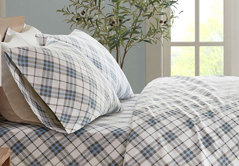
5) Matchy-Matchy Furniture Sets
If your bedroom set, dining set, and living room all came from the same page of a catalog, your home might feel too coordinated. Matching isn’t inherently wrong, but too much of it can make a space feel staged instead of lived-in.
Try instead: Curated contrast. Mix wood tones. Pair a modern lamp with a vintage chest. Use one “hero” piece that anchors the room, then layer in items that look collected over time. Personality beats perfection every time.
6) Tiny Rugs and “Floating Furniture” Layouts
A too-small rug is one of the quickest ways to make a room feel unfinished. When only the coffee table touches the rug and every chair is hovering around it, the whole layout looks accidental.
Try instead: Bigger rugs and stronger zoning. In living rooms, aim for at least the front legs of major seating to sit on the rug. If you want to be bold, try custom or nontraditional rug shapes instead of defaulting to a standard round or small rectangle.
7) Accent Walls That Look Like a Last-Minute Decision
The single painted wall had a huge moment, but many accent walls now feel like the room gave up halfway. A lone navy wall in a beige room can read more “rental workaround” than intentional design.
Try instead: Full-room cohesion. Color drenching can work in moderation, but so can soft tone-on-tone schemes, trim-painted ceilings, or wallpaper used thoughtfully across a whole zone. The key is commitment and balance, not one random dramatic wall.
8) Fluting and Ribbing on Absolutely Everything
Fluted islands, fluted vanities, fluted sideboards, fluted planters, fluted lamp bases… at some point, texture becomes a theme park. Overused fluting can feel repetitive, fussy, and hard to keep clean.
Try instead: Classic architectural detail. Raised paneling, subtle millwork, and better proportions create depth without screaming “trend.” If you still love fluting, use it once, not twelve times.
9) Bubble Furniture and Cloud Sofa Clones
Curvy furniture can be beautiful, but the copycat “puffy blob” versions are already feeling overexposed. When every piece looks inflated, rooms lose structure and can start to feel more novelty than design.
Try instead: Softer lines with real substance. Look for sculptural silhouettes, gentle curves, and solid materials. You want comfort and shapenot furniture that looks like it’s made of marshmallows.
10) Checkerboard on Every Surface
Checkerboard has had a wildly popular run, and in small doses it can still look graphic and fun. But when it appears on floors, pillows, trays, walls, and tile all at once, it quickly becomes costume-y.
Try instead: More nuanced geometric patterns. Try subtle stripes, grid textures, oval tiles with contrasting grout, or low-contrast geometrics that add rhythm without turning the room into a chess tournament.
11) Inspirational Word Art and Neon Quote Signs
We love a good pep talk, but walls covered in “Gather,” “Blessed,” or neon “Good Vibes Only” signs can make a home feel generic. If your décor literally has to explain your personality, it might be time to upgrade.
Try instead: Let art do the talking. Framed prints, original art, travel finds, family photos, or even one bold textile piece communicate much more than mass-produced typography ever will.
12) “Instagram Accessories” Everyone Owns
That blackened vase. That boucle stool. That same arch mirror you’ve seen in 400 apartment tours. None of these are bad on their ownbut when a room is made entirely of viral décor, it loses individuality fast.
Try instead: Pieces with patina and story. Vintage ceramics, thrifted frames, handmade objects, books you actually read, and souvenirs from places you love instantly make a home feel more grounded.
13) Vanilla-Girl Beige and White Bouclé Overload
The creamy-neutral, bouclé-heavy aesthetic is one of the most cited trends on the way out. The issue isn’t bouclé itselfit’s the identical, all-cream version of it, repeated in every room until everything looks like a minimalist dessert menu.
Try instead: Color and texture with intention. Keep bouclé if you love it, but use it in a richer tone or pair it with leather, wood, linen, and darker accents. Contrast gives the room a pulse.
14) “Quiet Luxury” That Feels Like a Hotel Lobby
Quiet luxury promised elegant restraint, but in many homes it translated to expensive-looking emptiness. Minimal spaces without story can feel polished, surebut not necessarily inviting.
Try instead: Warm minimalism with character. Use edited styling, but include meaningful objects, layered textiles, and materials that connect to placestone, wood, limewash, vintage brass. Calm is great; bland is not.
15) Maximalism Without Curation (a.k.a. Stylish Chaos)
On the flip side, the backlash to minimalism created a clutter problem. More isn’t automatically better. A room packed with patterns, trinkets, books, candles, and trendy objects can feel visually exhausting.
Try instead: Maximalism with meaning. If you love layered rooms, keep the layersbut edit them. Choose a color story, repeat a few materials, and leave visual breathing room so your best pieces can shine.
16) Faux Plants Everywhere (and Fussy Plant “Statements”)
Fake greenery can be useful, especially in dark corners, but too much artificial foliage makes a room feel staged. And some once-iconic plant choices now read more like a dated design shortcut than a true style move.
Try instead: One great statement plant or a small, believable mix. A large live plant in a beautiful pot often does more for a room than five fake stems and a dusty faux vine trying to colonize your bookshelf.
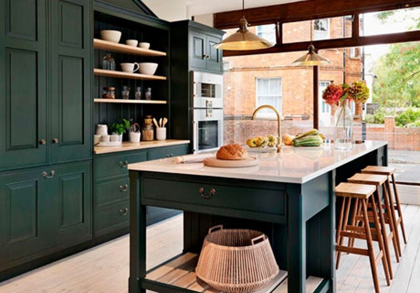
17) Showroom Kitchens and Hard-to-Reverse Trend Splurges
Ultra-pristine “show kitchens” and expensive trend commitments (like highly specific geometric tile everywhere or bold cabinet colors you’ll hate in two years) can age fast. Kitchens need to look good, yesbut they also need to work for real humans who cook, snack, spill, and exist.
Try instead: A practical, layered kitchen. Keep cabinetry classic or quietly warm, then bring personality through lighting, hardware, bar stools, art, or backsplash details that are easier to change later. The best kitchen trend is still functionality.
How to Do a Décor Detox Without Starting Over
The biggest mistake people make is assuming a design refresh requires a full replacement spree. It doesn’t. In fact, the most timeless rooms usually come from slower, smarter updates.
- Start with subtraction: Remove what feels redundant, trendy, or purely decorative.
- Keep what you love: A trend isn’t “wrong” if it genuinely makes you happy.
- Upgrade one layer at a time: Paint, lighting, textiles, art, and hardware can transform a room without major renovation.
- Buy fewer, better things: Quality and character age better than impulse decor.
- Aim for a lived-in look: The goal is a home that feels personal, not perfect.
Conclusion
A great décor detox isn’t about declaring war on trends. It’s about noticing which trends have overstayed their welcome in your home and replacing them with choices that feel warmer, more functional, and more you. If a room feels tired, you don’t need a miracleyou need editing, intention, and maybe one less beige bouclé chair.
Start small. Swap one rug. Retire one overdone accessory. Repaint one gray wall. Before long, your home will feel less like a trend archive and more like the best version of your real life.
Experience Notes: What People Commonly Learn During a Décor Detox (Approx. )
One of the most common experiences people have during a décor detox is realizing they don’t actually dislike their homethey’re just visually tired of it. That’s a huge difference. A lot of homeowners assume they need a full makeover when what they really need is a reset. Once they remove a few over-trendy items, clear crowded surfaces, and bring in warmer tones or better lighting, the room suddenly feels calmer and more expensive without a major budget.
Another common experience is “trend fatigue.” People often describe buying pieces because they saw them everywhere online, then feeling strangely disconnected from the finished room. It looks nice, but it doesn’t feel personal. This happens a lot with copycat accessories, all-neutral palettes, and matched sets. During a detox, many people are surprised by how much better their space feels when they add just one personal item back inan old framed photo, a handmade bowl, a travel souvenir, or a chair inherited from family. These pieces create emotional warmth that trend-driven décor usually can’t.
There’s also a practical lesson that comes up again and again: the most frustrating trends are the hardest to undo. Paint is easy. Pillows are easy. But trendy tile, ultra-specific cabinetry colors, and heavily themed built-ins can become expensive regrets. That’s why experienced renovators often say to keep permanent elements more timeless and save experimentation for flexible layers like art, textiles, and lighting. You still get creativityjust without the “why did I do this?” renovation spiral two years later.
People also learn that “timeless” doesn’t mean boring. In fact, the homes that age best are rarely plain. They usually have texture, contrast, and a little weirdness in the best way. A timeless room might have classic flooring, but then a bold lamp. It might have neutral walls, but dramatic curtains. It might mix a modern sofa with a vintage coffee table and handmade ceramics. The experience of building a room this way feels slower, but it often feels more satisfying because the space evolves with real life instead of trend cycles.
Finally, a décor detox teaches people to trust their eye. At first, many rely on “rules” from social mediawhat color is in, what shape is out, what fabric is over. But after editing a room and living in it for a few weeks, they start noticing what actually matters: comfort, flow, function, and emotional connection. That’s when design gets easier. You stop asking, “Is this trendy?” and start asking, “Does this belong in my home?” And honestly, that question leads to much better rooms.