Table of Contents >> Show >> Hide
- Quick Table of Contents
- Tip 1: Pick a consistent “museum” centerlinethen bend it (tastefully)
- Tip 2: Group pieces like a curator: treat clusters as one big artwork
- Tip 3: Respect the sun: light fades art, and it’s not being dramatic
- Tip 4: Choose wall color like it’s part of the framing
- Tip 5: Don’t decorate with fear: your home is allowed to have art
- Tip 6: Use scale and “visual pacing” to make rooms feel designed
- Tip 7: Frame like a conservator: let the artwork breathe
- Tip 8: Hang safely: hardware is the underrated hero
- Tip 9: Avoid the danger zones: bathrooms, radiators, and chaos climates
- Tip 10: Collect and display smart: budget art, rotation, and personal stories
- Wrap-Up: Your Home, Curated (Not Frozen in Time)
- Real-World Experiences: What It Looks Like to Apply These Tips at Home (Extra )
Hanging art sounds like a relaxing weekend projectright up until you’re holding a frame in one hand, a level in the other,
and questioning every life choice that led you to “modern minimalism” (aka: blank walls).
The good news: museums have been solving this problem for a very long time, and a curator’s mindset can make your home feel
instantly more intentionalwithout turning your living room into a silent, no-snacking gallery.
This guide is inspired by museum curator advice highlighted by Remodelista, then expanded with practical,
conservation-smart best practices used by major institutions and trusted home design resources.
The result: 10 tips you can actually usewhether you’re hanging a priceless painting, a $12 print, or a sentimental doodle
your little cousin insists is “post-abstract.”
Quick Table of Contents
- Pick a consistent “museum” centerlinethen bend it (tastefully)
- Group pieces like a curator: treat clusters as one big artwork
- Respect the sun: light fades art, and it’s not being dramatic
- Choose wall color like it’s part of the framing
- Don’t decorate with fear: your home is allowed to have art
- Use scale and “visual pacing” to make rooms feel designed
- Frame like a conservator: let the artwork breathe
- Hang safely: hardware is the underrated hero
- Avoid the danger zones: bathrooms, radiators, and chaos climates
- Collect and display smart: budget art, rotation, and personal stories
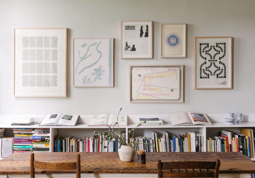
Tip 1: Pick a consistent “museum” centerlinethen bend it (tastefully)
Museums often hang work around average eye level, and many home design guides cite a “57-inch rule” for the center of a piece.
A museum curator’s advice lands in the same neighborhoodthink roughly 58–60 inches as a helpful starting point.
The magic isn’t the exact number; it’s the consistency. When your home has a steady visual rhythm, everything feels calmer.
(Yes, even the hallway where socks mysteriously migrate.)
How to use this in real life
- Start with one number (around eye level), then keep it consistent across a wall or room.
- Adjust for furniture: above a sofa or console, let the art “connect” to the furniture instead of floating in space.
- Respect the viewer: if your household is tall, short, or mostly made of teenagers who watch everything from the floor… adjust accordingly.
Tip 2: Group pieces like a curator: treat clusters as one big artwork
Gallery walls go wrong when each frame is treated like a solo star. Curators think in terms of relationships:
spacing, alignment, and the overall shape the group makes on the wall. A cluster should behave like one larger composition.
That means you choose the “center” of the entire grouping and build around it.
Layout tricks that save you from random-wall syndrome
- Mock it up first: painter’s tape rectangles on the wall can help you “see” the arrangement before you commit.
- Keep spacing consistent: a few inches between frames often looks polished and intentional.
- Anchor with a hero: start with the largest or boldest piece, then let smaller works orbit it.
Bonus: if you want the “collected over time” look, you can still keep a consistent centerline and spacing.
You’re building a gallery, not a crime scene investigation board.
Tip 3: Respect the sun: light fades art, and it’s not being dramatic
Light damage is real, cumulative, andannoyinglyirreversible. Works on paper (watercolors, prints, photos) are especially vulnerable.
If you love bright rooms, you don’t have to live like a vampire, but you do need strategy.
Smarter ways to display light-sensitive pieces
- Avoid direct sun on watercolors, photos, and delicate papers.
- Use UV-filtering glazing (like UV acrylic) when framing pieces you want to keep out longer.
- Rotate art: hang a favorite print for a season, then swap it with another and let it “rest” in darker storage.
- Control brightness: window coverings and room layout can reduce exposure without turning your home into a cave.
Think of it like sunscreen for your walls. You can still have fun outdoorsjust don’t bake your art like a cookie.
Tip 4: Choose wall color like it’s part of the framing
Museums often use carefully selected whites because lighting, artwork variety, and viewing conditions are engineered.
Homes are messier (in the best way). A slightly warmer neutral can make art feel more inviting and less “floating in a dentist’s office.”
The key is contrast: the wall color should support the work, not compete with it.
Easy color logic that works with most collections
- Warm neutrals flatter many frames (wood, brass, black metal) and reduce glare-y harshness.
- Darker walls can make bright prints and paintings popespecially if you keep lighting controlled.
- Patterned wallpaper can work, but use stronger frames and simpler mats so the art stays legible.
Tip 5: Don’t decorate with fear: your home is allowed to have art
One of the saddest “design mistakes” isn’t crooked framesit’s no art at all. Many homes stop at posters and family photos,
not because people don’t love art, but because they’re afraid of doing it “wrong.”
Here’s the curator mindset shift: a home collection is supposed to be personal.
What “real” home collections look like
- Some originals, some prints, some photos, some weird little objects you love for no logical reason.
- Pieces made by friends or local artists mixed with inherited items and travel finds.
- A few moments of surprise (because perfect symmetry is not a legal requirement for adulthood).
Tip 6: Use scale and “visual pacing” to make rooms feel designed
Great rooms usually have a mix of “close-up” pieces (small works that reward a nearer look) and “distance” pieces
(larger works that act as anchors). This combination creates pacing: the eye moves, pauses, then moves again.
Without it, walls can feel either too busy or weirdly empty.
Practical scale rules that don’t require an art history degree
- Let one big piece be the focal point in a room (over a sofa, on a long wall, or at the end of a hallway).
- Use smaller works in clusters where people naturally come closer (stairwells, reading nooks, entryways).
- Try hanging large pieces lower if they’re too tall for an eye-level centerlinelow-hung art can feel modern, relaxed, and more “lived in.”
Tip 7: Frame like a conservator: let the artwork breathe
Framing isn’t just decoration; it’s protection. Museums think about materials, spacing, and the long-term health of the object.
At home, you can adopt the same logic without turning your framing shop visits into a graduate seminar.
Start with a simple idea: the frame should complement the work, not out-shout it.
Conservation-smart framing moves
- Choose simple profiles (often wood) that don’t distract from the image.
- Float works on paper when appropriate so you can see the full sheet (including deckled edges or signatures).
- Keep space between art and glazing so the surface doesn’t touch the acrylic or glass.
- Use archival materials: quality mat board and backing reduce long-term discoloration risks.
Framing is also where budgets get spicy. Many collectors have experienced the classic moment:
“This print was $20… why is the frame acting like it has a mortgage?”
Tip 8: Hang safely: hardware is the underrated hero
The most stylish wall in the world loses its charm the second a frame takes a surprise dive.
Curators and installers plan for weight, wall material, and stability. You should tooespecially with anything larger than a small frame.
Safe hanging is not overkill; it’s the adult version of putting a lid on your smoothie.
Safer hanging habits
- Match hardware to weight: heavier pieces need anchors or studs, not optimism.
- Use two points of contact for many frames (two hooks or D-rings) to reduce tilting.
- Level as you go, then step back and check from across the room.
- Stabilize: wall bumpers or museum putty can help prevent shifting and protect walls.
Tip 9: Avoid the danger zones: bathrooms, radiators, and chaos climates
Museums obsess over stable conditions because temperature swings and humidity fluctuations can cause warping,
cracking, mold risk, and accelerated agingespecially for paper, photos, and mixed media.
At home, you don’t need a climate-controlled vault, but you should avoid the worst offenders.
Places your art should not live
- Bathrooms (high humidity) unless you’re using the right materials and accepting extra risk.
- Above radiators, near vents, or by active fireplaces where heat and airflow swing wildly.
- Exterior walls with moisture issues (or any wall that has ever made you say, “Is that… damp?”).
- Directly under pipes or spots prone to leaksbecause gravity is undefeated.
If you’re serious about preserving photos and works on paper, aim for a generally cool, dry, stable environment.
Your art wants fewer surprise weather events than your group chat.
Tip 10: Collect and display smart: budget art, rotation, and personal stories
A curator doesn’t just hang objects; they build meaning. Your home collection can do the same.
Start where you are, buy what you love, and display it in ways that tell your story.
Budget-friendly optionslike editioned printscan be a powerful way to collect contemporary work without waiting to win the lottery.
Collector habits that make your walls better over time
- Buy editioned works (prints, etchings, photographs) to support artists at more accessible price points.
- Plan for framing: treat framing as part of the “true cost” so you don’t end up with a beautiful print living in a drawer.
- Mix sources: local artists, friends, family-made pieces, and small finds can coexist beautifully.
- Rotate displays seasonally to refresh rooms and protect light-sensitive pieces.
In museums, rotation is normalsome objects are designed for shorter display periods. At home, rotation also keeps things fresh.
It’s like redecorating, but with fewer furniture-related back injuries.
Wrap-Up: Your Home, Curated (Not Frozen in Time)
The goal isn’t to make your house feel like a museumit’s to borrow the museum’s best habits:
consistent hanging height, thoughtful grouping, safe lighting, smart framing, and stable placement.
Do that, and your art will look better, last longer, and feel more like part of your life instead of “decor you bought in a panic.”
If you take only one idea: choose an eye-level centerline, group with intention, and protect works on paper from bright sun.
Everything else is just refining the vibe.
Real-World Experiences: What It Looks Like to Apply These Tips at Home (Extra )
Here’s what tends to happen when people actually put curator-style advice into practicemess, humor, and all.
First, there’s the “tape phase.” You start with painter’s tape outlines on the wall, and suddenly your living room looks like a
geometry class taught by a very enthusiastic raccoon. But the payoff is immediate: you can see whether the arrangement feels calm,
crowded, or oddly tilted toward the corner like it’s trying to escape.
Next comes the height revelation. Many people realize they’ve been hanging art too highoften because they’re thinking like
someone standing up straight in an empty room, not someone living with furniture, sightlines, and the natural “eye path” of daily life.
When the center of the piece drops closer to eye level, the room feels more grounded. It’s a surprisingly emotional upgrade:
you stop noticing the wall as “a wall with stuff,” and start noticing the artwork as… artwork.
Then there’s the light lesson, which usually arrives when a beloved print starts looking a little washed out.
That’s when “sunny corner” stops sounding romantic and starts sounding suspicious. People often respond by swapping locations:
the light-sensitive watercolor moves to a shaded hallway, while a sturdier canvas takes the brighter spot.
Some households build a habit of seasonal rotationspring brings out lighter prints, winter gets the moody photosso the walls change
without buying anything new. It’s one of the few home upgrades that feels both creative and responsible, like you’ve become the
curator of your own tiny institution (admission: free; gift shop: your browser history).
Framing experiences are their own saga. A common moment: you find an affordable print, feel triumphant, then realize the framing will
cost more than the art. Instead of giving up, people tend to get strategic: they standardize frame sizes, reuse frames, or choose a
consistent frame style for a whole series. Suddenly, the collection looks intentional, and the budget stops feeling like a prank.
Many also discover the difference between “pretty framing” and “protective framing”especially for photographs and works on paper.
The first time you see how clean a floated print looks, or how much nicer a piece appears when it isn’t pressed against the glazing,
it’s hard to go back.
Finally, the biggest change is psychological: people stop waiting for “perfect art” to start displaying what they already have.
A child’s drawing gets a real frame. A postcard from a trip becomes part of a small grid. A thrifted painting becomes the bold focal point
that makes the whole room feel more alive. The home becomes less like a showroom and more like a storyedited, not sterile.
That’s the curator secret: it’s not about owning the most expensive pieces. It’s about choosing, placing, and caring with intention.