Table of Contents >> Show >> Hide
- Why this problem is bigger than “getting lost”
- Why health care facilities are hard for older adults to navigate
- 1. The physical layout is often confusing
- 2. Signs and instructions are not designed for aging eyes and ears
- 3. Health literacy demands are still too high
- 4. Digital tools can create a second maze
- 5. Care transitions are full of cracks
- 6. Caregivers are essential, but systems do not always treat them that way
- 7. The built environment can increase fatigue, stress, and fall risk
- What better, age-friendly facilities do differently
- How clinicians, administrators, and caregivers can help right now
- Experiences related to the topic: what this looks like in real life
- Conclusion
Walking into a modern health care facility can feel a little like entering an airport designed by people who hate maps. There are parking decks with mysterious letters, check-in desks that moved last Tuesday, elevators that only stop on certain floors, and signs that somehow manage to be both abundant and unhelpful. For many older adults, this is not just annoying. It is exhausting, stressful, and sometimes risky.
That matters because older adults use health care services more often than younger populations, especially for chronic conditions, follow-up visits, medication management, surgery, rehabilitation, and preventive care. In theory, a hospital or clinic should be the place where people feel most supported. In practice, many facilities are built and run in ways that assume patients can see tiny print, hear every instruction, walk long distances, juggle paperwork, remember a dozen steps, and glide through digital tools without breaking a sweat. That is a big assumption. And frankly, it is often the wrong one.
The truth is simple: when health care facilities are difficult to navigate for older adults, the problem is not older adults. The problem is the system. Buildings, workflows, communication styles, and discharge routines are often designed for institutional efficiency first and human ease second. That design gap creates confusion before the visit, during the appointment, and long after a patient goes home.
Why this problem is bigger than “getting lost”
When people hear the phrase health care navigation, they often picture someone wandering a hallway looking for radiology. That is certainly part of it, but the issue is much broader. Navigation includes every step required to move through the health care experience successfully: finding the building, getting inside, checking in, understanding instructions, locating the right department, communicating with staff, making decisions, handling medications, arranging follow-up care, and getting home safely.
For older adults, each of those steps can become harder when normal age-related changes enter the picture. Vision may not be as sharp as it once was. Hearing can make overhead announcements sound like they were delivered through a blender. Balance issues or fatigue can turn a “short walk” into a serious obstacle. Memory and processing speed may be slower, especially when someone is sick, stressed, in pain, or sleep-deprived. Add a noisy lobby, rushed explanations, and a stack of forms written in bureaucratic hieroglyphics, and even a straightforward appointment can start to feel like a full-contact sport.
That is why older adults are not simply dealing with a “convenience” issue. They are often facing barriers to health care access, patient safety, and care continuity. If a person misses a lab on another floor, misunderstands a medication change, or leaves without knowing when to follow up, the consequences can travel far beyond one confusing afternoon.
Why health care facilities are hard for older adults to navigate
1. The physical layout is often confusing
Hospitals and large outpatient centers are complicated places by nature. Departments get added over time. Wings connect awkwardly. Parking garages are separate from main entrances. Signs are installed as patchwork solutions instead of part of a clear wayfinding plan. The result is a space that may make sense to staff who work there every day but feels like a maze to everyone else.
Older adults often need the simplest route, not the cleverest architecture. A facility may technically be accessible while still being difficult to use. A long walk from parking to registration, followed by another walk to imaging, followed by another hallway to the specialist’s office, can turn a routine visit into a draining endurance event. When the route includes poor lighting, visually busy walls, tiny room numbers, or too many decision points, confusion grows fast.
2. Signs and instructions are not designed for aging eyes and ears
Many facilities still rely on signage that looks like it was designed to save ink, not help people. Fonts are small. Contrast is weak. Medical jargon appears everywhere. Important directions are buried in blocks of text. Some signs assume patients already know terms like “ambulatory pavilion,” “infusion suite,” or “outpatient procedural services.” That is a lot to ask from someone who just wants the lab without needing a decoder ring.
Communication problems do not stop with signage. Front-desk instructions may be given too quickly. Overhead announcements can be muffled. Staff may speak while looking at a screen instead of the patient. For older adults with hearing loss, vision changes, cognitive impairment, or anxiety, the system can feel like it is whispering important information and then acting surprised when it gets missed.
3. Health literacy demands are still too high
Health literacy is not just about reading ability. It is about being able to find, understand, and use health information and services. That means forms, medication lists, insurance notices, appointment reminders, discharge instructions, and consent documents all matter. Too often, health care organizations hand patients complex information in language that sounds like it was written by a committee trapped in a copier room.
Older adults may be managing multiple diagnoses, several medications, and more than one specialist. When each part of the system communicates differently, patients are forced to do the translation work themselves. That is a heavy burden, especially for people who are already tired, worried, or sick.
4. Digital tools can create a second maze
Many facilities have moved parts of the care experience online: appointment scheduling, pre-registration, intake forms, portal messages, lab results, billing, maps, parking details, and telehealth instructions. Digital tools can be helpful, but only when they are easy to use. If not, they become a second maze layered on top of the physical one.
Older adults are often told to “just check the portal,” as though that solves everything. But portals may require passwords, verification codes, app downloads, browser updates, and navigation menus that make even tech-savvy people sigh dramatically. A patient may know how to text family, read news, and shop online, yet still struggle with a health system that hides critical information behind confusing labels and too many clicks.
This is especially tough when digital systems are treated as the default and human help is reduced. Self-check-in kiosks, QR codes, and app-based updates may streamline operations, but they can also quietly exclude people who need a simpler path.
5. Care transitions are full of cracks
One of the hardest moments in health care navigation is not arriving. It is leaving. A hospital discharge can look organized on paper while feeling chaotic in real life. Patients may go home with medication changes, activity restrictions, follow-up appointments, home care instructions, and warning signs to watch for. That is a lot for anyone to absorb. For an older adult recovering from illness or surgery, it can feel like being handed the keys to a moving car.
Transitions between hospital, rehab, skilled nursing, home health, primary care, and specialty care are especially vulnerable to misunderstandings. When information is incomplete, rushed, or poorly coordinated, older adults and caregivers are left to piece everything together. They become the fax machine, the project manager, and the safety net all at once.
6. Caregivers are essential, but systems do not always treat them that way
Family caregivers often help older adults schedule appointments, manage medications, ask questions, handle transportation, read instructions, and track follow-up care. In many cases, they are the invisible infrastructure holding the whole experience together.
Yet facilities do not always communicate clearly with caregivers or include them early enough. A daughter may not be in the room when discharge instructions are explained. A spouse may not know which medications changed. An adult son may have access to transportation but not portal messages. If caregivers are treated like extras instead of care partners, important details can slip away.
7. The built environment can increase fatigue, stress, and fall risk
For older adults with mobility limitations, arthritis, dizziness, neuropathy, or balance issues, the building itself can become a hazard. Long walks, slippery floors, limited seating, crowded waiting rooms, poorly marked restrooms, and awkward transfers between departments all add strain. Even when nothing dramatic happens, the experience can leave a person exhausted before the visit even begins.
Stress makes navigation worse. Pain makes navigation worse. Hunger, dehydration, and long wait times make navigation worse. By the time an older adult reaches the actual clinician, they may already be depleted. That is not a small detail. It affects the quality of the conversation, the ability to remember instructions, and the willingness to come back.
What better, age-friendly facilities do differently
There is good news here: this is a fixable problem. Health systems do not need magic. They need better design, clearer communication, and more respect for the realities of aging.
They simplify wayfinding
Better facilities use plain-language signs, larger fonts, strong contrast, logical naming, color-coded routes, and fewer unnecessary decision points. They place volunteers or navigators near entrances. They make the first five minutes easy, because those first five minutes set the tone for the whole visit.
They communicate like humans, not instruction manuals
Age-friendly care uses short explanations, plain English, teach-back, written summaries, and repeatable instructions. Staff face the patient, speak clearly, and confirm understanding instead of assuming it. The goal is not to deliver information. The goal is to make sure the information lands.
They design with the “4Ms” in mind
Strong organizations increasingly adopt age-friendly principles that focus on what matters to the patient, along with medication, mentation, and mobility. That approach helps facilities remember that older adults are not interchangeable. One person may prioritize staying independent at home. Another may care most about pain control, cognition, or walking safely after discharge. When care is built around those realities, navigation gets easier because the system stops fighting the patient’s life.
They keep caregivers in the loop
Better facilities ask early who helps the patient at home, who needs updates, who handles transportation, and who will manage medications after the visit. They make sure the right person hears the plan before the patient leaves. No scavenger hunt required.
They offer analog options alongside digital ones
Yes, portals are useful. So are paper maps, phone support, printed instructions, and a real human being who can answer a question without sending someone into a password spiral. The best systems do both.
How clinicians, administrators, and caregivers can help right now
Clinicians can slow down the last two minutes of every visit and ask the questions that matter most: Do you know where to go next? Do you know what changed? Do you know who to call? Administrators can walk their own buildings like first-time patients and notice what staff have learned to ignore. Caregivers can bring medication lists, write down questions, and ask for written instructions in plain language.
Facilities can also make practical improvements quickly: better signs, more seating, larger print, clearer discharge packets, staff training on communication, transportation guidance, and easier handoffs between departments. None of those steps are glamorous. All of them work.
Experiences related to the topic: what this looks like in real life
The examples below are illustrative composite experiences based on common patterns seen in real-world health care settings.
Imagine an older woman arriving at a hospital for a cardiology follow-up. Her son drops her off at the “main entrance,” except there are three entrances and all of them look reasonably main. She uses a walker, so the extra distance matters. Once inside, she sees signs for the Heart Center, Specialty Clinics, Pavilion B, and Registration North. Her appointment reminder says “Suite 420,” which would be helpful if the building had decided to explain where Suite 420 lives. By the time she reaches the desk, she is already tired, embarrassed, and apologizing for being late, even though the system set the obstacle course in the first place.
Now picture an older man being asked to check in using a kiosk. He can use a smartphone just fine for photos of his grandkids and weather updates, but this machine wants a birth date, an insurance scan, a signature on a glass screen, and a portal verification code sent to an email account he barely remembers. A staff member cheerfully says, “It’s super easy,” which is the sort of phrase that instantly makes a hard task feel worse. He eventually gets through it, but not before feeling as though he failed a test he never agreed to take.
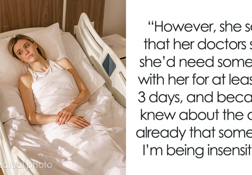
Then there is the discharge experience. A patient spends three days in the hospital, sees several clinicians, has medications adjusted, and is told to follow up with primary care, cardiology, and physical therapy. At discharge, she receives a packet thick enough to stop a small door. Her daughter arrives just after the nurse finishes reviewing instructions. At home, they discover one medicine was stopped, one dose changed, and one “continue as directed” instruction is vague enough to inspire a family debate. The next morning becomes a round of phone calls, portal messages, and guesses. Nothing about that is rare. It is the everyday reality of fragmented care.
Caregivers often describe the same emotional pattern: they do not mind helping, but they are forced to become detectives. They track appointments across different offices, repeat the same history at every visit, carry folders full of paperwork, and translate medical language into something practical. They worry about missing one detail that turns out to be important. Did the doctor mean start that medication today or after the lab? Was the follow-up in one week or one month? Is home health calling us, or do we call them? When the system is easy to navigate, caregivers feel supported. When it is not, they feel like unpaid air traffic controllers with no tower and no radar.
Older adults themselves often react with a mix of determination and reluctance. Many will push through confusion rather than ask for help because they do not want to feel like a burden. Others start dreading appointments that should be routine. Some postpone care, not because they do not value it, but because the process feels overwhelming. That is the hidden cost of poor navigation. It does not always show up as a dramatic event. Sometimes it looks like a delayed follow-up, a missed test, a medication mistake, or a quiet decision to avoid going back unless something gets really bad.
In other words, the experience of navigating health care as an older adult is often not just medical. It is physical, emotional, logistical, and deeply human. A better system recognizes that truth. It does not ask patients to be stronger than the building, smarter than the paperwork, or faster than the workflow. It meets them where they are and helps them move forward with dignity.
Conclusion
Health care facilities are difficult to navigate for older adults not because older patients are incapable, but because too many systems are still built around complexity. Confusing layouts, poor signage, rushed communication, digital barriers, and weak care transitions all create friction where there should be support. The solution is not to ask older adults to “keep up.” The solution is to build facilities and processes that are easier to understand, easier to move through, and easier to trust.
When hospitals and clinics become more age-friendly, everyone benefits. Care becomes safer. Caregivers are less overwhelmed. Staff spend less time correcting preventable confusion. And patients can focus on what actually matters: getting care, healing well, and maintaining independence for as long as possible. That is not a luxury. It is what a good health care system should do in the first place.