Table of Contents >> Show >> Hide
- What counts as a “failed design,” exactly?
- The greatest hits: categories of funny design fails
- Why do these fails happen?
- How to post your funniest failed design (and make it even funnier)
- A quick “design-fail checklist” (for spotting the good ones)
- Hey Pandas: post the funniest failed design
- Experiences: the funniest failed-design moments you’ll recognize
- Conclusion
You know that moment when you stare at something that was clearly designed by a human… and yet it feels like it was
built by a mischievous raccoon with a glue gun? That’s the sweet spot we’re celebrating today.
This is a call for the funniest failed design you’ve ever seen in the wildproducts, signs, apps, packaging,
home “improvements,” and anything else that made you laugh, sigh, or whisper: “Who approved this?”
“Failed design” doesn’t mean “ugly.” Sometimes it’s gorgeous. Sometimes it’s expensive. Sometimes it’s award-winning.
And sometimes it still makes you push the door that says PULL. A great design looks obvious in hindsight.
A bad design makes you feel like you messed up… even though the object is the one telling lies.
What counts as a “failed design,” exactly?
If it creates confusion, mistakes, or accidental comedy, it qualifies. The funniest fails usually share one thing:
they force people to stop and think about something that should be effortless.
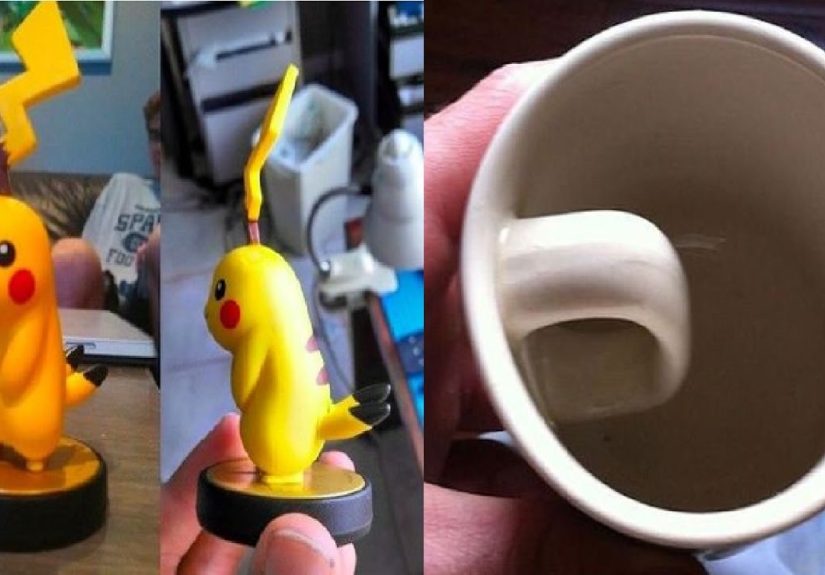
1) When the object lies to your hands
Some designs give your brain a confident suggestionand then punish you for trusting it. Think of:
- Doors with a big pull handle… that you’re supposed to push.
- Faucets where hot and cold are flipped (surprise: it’s lava).
- Stoves where the knob layout doesn’t match the burners (roulette, but with fire).
- Drawers with decorative “handles” that are not handles at all (a betrayal in brushed nickel).
The comedy comes from confidence. Your brain sees a cue, commits to it, and thenplot twistthe cue was a decoy.
2) When words betray everyone
Text-based fails are elite because they can be both tiny and catastrophic. Examples:
- Typos on official signs (bonus points if the sign is about “PROFESSIONALISM”).
- Awkward line breaks that create accidental new meanings.
- Spacing issues where letters cozy up and form an unintended word.
- Instructions that read like a riddle written by a time traveler.
If you’ve ever read a label twice and thought, “Wait… did they mean that?”you’ve met the genre.
3) When the context gets ignored
Great design respects reality: lighting, distance, motion, different bodies, different abilities, different levels of attention.
Failed design assumes everyone is standing still, fully awake, in perfect lighting, with perfect vision, and unlimited patience.
(So… nobody.)
- Wayfinding signs placed behind a plant like they’re playing hide-and-seek.
- Light gray text on a slightly different gray background (“minimalism” that becomes invisibility).
- Buttons so small you need tweezers, a prayer, and an apology to your thumb.
- Important warnings printed where no one naturally looks.
The greatest hits: categories of funny design fails
If you’re about to post your funniest failed design, here are the “top shelves” where the best ones live.
Use these as inspirationlike a museum, but louder and with more questionable signage.
Signage & wayfinding fails
Signs are supposed to reduce confusion. A truly legendary fail creates it. Look for:
- Contradictory directions (“This way” arrows pointing in opposite directions).
- Overly literal symbols that don’t match what people actually do.
- Poor placement (the sign appears after you needed it).
- Confusing hierarchy (the least important text is the biggest).
- Ambiguous arrows (diagonal arrows are the astrology of wayfinding).
The funniest ones make you feel like you’re in a scavenger hunt designed by chaos.
Packaging & label fails
Packaging has two jobs: help you understand what it is, and help you use it safely. When it fails, you get:
- Boxes that show one thing and contain another (expectations: shattered).
- “Open here” instructions that require opening somewhere else first.
- Allergens or warnings hidden like a plot twist.
- Text wrapped around curves so the key word disappears mid-sentence.
- Designs that prioritize aesthetics over legibility (beautiful, unreadable poetry).
Bonus points if you can capture the moment you realize you’ve been holding the box upside down for a full minute.
Digital UX fails (apps, websites, kiosks)
Digital fails are special because they can waste your time at the speed of light. Classic hits include:
- Pop-ups with a microscopic close button (“find the X” but make it stressful).
- Forms that erase your work after one mistake (emotional damage, but as a feature).
- Error messages that blame you without explaining what to do next.
- Dark patterns that trick you into subscribing, donating, or agreeing to something you didn’t mean.
- Controls that look tappable but aren’t (the “button-shaped disappointment”).
The funniest UX fails are the ones that turn a two-second task into a five-minute saga and a new personal philosophy.
Home & furniture fails
This is where comedy meets carpentry. Watch for:
- Cabinets that can’t open because the handle hits the wall.
- Light switches placed behind doors (a thrilling surprise every time).
- Toilets installed too close to something (suddenly you’re doing geometry at 6 a.m.).
- Shelves that look sturdy but bow dramatically under the weight of one paperback.
- Stairs that feel like a prank (uneven risers: your ankles have entered the chat).
Fashion & merch fails
Clothing fails often come down to placement and reading order. The funniest ones aren’t offensivethey’re just… tragic.
The design said one thing. The seam, fold, or zipper said another.
- Graphics that stretch into a new shape.
- Slogans broken across lines so the message changes entirely.
- Patterns that accidentally create “target zones” where no one wanted targets.
- Logos placed where gravity and posture will eventually remix them.
Why do these fails happen?
Most failed designs aren’t created by villains. They’re created by normal humans under deadlines, budgets, and group chats.
Here are a few common reasons the comedy is born.
The curse of knowledge
Designers and teams know what something is supposed to do, so they underestimate how confusing it looks to a first-time user.
If you already know the answer, every clue feels obviouseven the bad ones.
Too many cooks, one tiny label
Stakeholders add requirements like toppings: more legal text, more features, more brand voice, more “impact.”
Eventually the design becomes a crowded kitchen where nothing can move without bumping into something else.
“It looks cool” wins a small battleand loses the war
Aesthetic choices can accidentally erase function: low contrast, decorative fonts, clever-but-unclear icons,
trendy layouts that forget humans have eyes and time limits.
Testing gets skipped
Many fails could be caught by watching just a few real people use the thing. The moment someone hesitates, you learn.
The moment five people hesitate, you’ve found your headline.
How to post your funniest failed design (and make it even funnier)
If you want your post to land like a perfect punchline and help everyone understand the fail, here’s how to frame it.
Show the whole context
- Include the surrounding area so we see what the design is trying to do.
- Capture distancedoes it fail from far away, up close, or both?
- If it’s an app, show the screen before and after the mistake (the “how we got here”).
Describe what you expected vs. what happened
The funniest captions follow a simple formula:
“I thought it meant X… but it actually meant Y.”
That gap between expectation and reality is where comedy lives.
Add the “one small fix”
A great post doesn’t just dunkit diagnoses. Suggest a tiny improvement:
- “If the handle were a flat plate, people would push instead of pull.”
- “If the warning were larger and placed near the opening, nobody would miss it.”
- “If the button said ‘Cancel’ instead of ‘Close,’ fewer people would panic.”
Keep it kind
Laugh at the design, not the person using it. The best posts feel like a shared human moment:
“We have all been fooled by a confusing door.” That’s community comedy.
A quick “design-fail checklist” (for spotting the good ones)
Want to know if you’ve found a top-tier fail? If you answer “yes” to any of these, post it:
- Did it make you pause and re-read something that should be instantly clear?
- Did it cause a mistake that feels inevitable (not careless)?
- Did it require extra signs, labels, or instructions to compensate?
- Did it hide the most important information and shout the least important one?
- Did it ignore real-world conditions like lighting, distance, or accessibility?
- Did you watch someone else struggle with it (and instantly recognize the struggle)?
- Did it look “polished” but behave like a prank?
Hey Pandas: post the funniest failed design
Alright, your turn. Drop your funniest failed designphoto, screenshot, or story.
Tell us where you found it, what you tried to do, and what the design did instead.
Extra applause for posts that make us laugh and teach us something about how humans actually move through the world.
Experiences: the funniest failed-design moments you’ll recognize
To warm up your posting muscles, here are some painfully relatable “failed design” experiencesthe kind that happen in real life,
usually when you’re tired, in a hurry, and just trying to be a competent adult for five uninterrupted minutes.
If any of these sound familiar, congratulations: you are not alone, and the design was absolutely the problem.
The door that makes you question your education
You approach a glass door. It has a large, welcoming handle. Your brain says, “Pull.” You pull. Nothing.
You pull againharderbecause surely the first pull was too polite. Still nothing.
Behind you, a small line forms. You can feel the warmth of their silent judgment like a space heater.
You glance around for clues and discover a tiny sign that says PUSH.
The sign is placed at eye level, which is helpful, except your hand is already gripping the handle like it owes you money.
You push the door and it opens effortlessly, as if it was never the problem. You exit with dignity set to 3%.
That, friends, is a classic failed design: the object offered the wrong hint and then let society blame you for trusting it.
The “open here” package that is secretly an escape room
You buy a snack. The package has a neat little arrow that says “TEAR HERE.”
You tear. The tear goes diagonally into the middle of the brand name, leaving a jagged flap and zero access to food.
You try again from the other corner. Now you’ve created a second jagged flap. It’s like you’re crafting a paper crown for a very small,
very disappointed monarch. Eventually you use scissors, your keys, or raw determination.
When the package finally opens, it opens too much, launching crumbs like confetti.
You didn’t want a snack. You wanted a normal interaction with an object. But the design demanded drama.
The app button that’s basically a confidence test
You’re trying to do a simple thing: confirm an appointment, pay a bill, check in for a flightsomething modern life insists is “fast and easy.”
A pop-up appears with two buttons that look identical. One says “Continue,” the other says “Continue” in a slightly different shade.
Or worse: one says “Not now,” which sounds safe, but actually cancels the entire process.
You tap, and the screen refreshes. Did it work? There’s no confirmation. The app simply stares back like a cat.
You tap again. Now you’ve done the action twice. Somewhere, a system is generating two receipts and a third emotional support email.
Funny design fail rule: if users feel nervous doing a basic action, the interface is the problemnot their courage.
The sign that arrives five seconds too late
You’re walking through a building looking for “Lobby” or “Restrooms.”
You make a choice, because the hallway gives you no information and you are not blessed with prophetic powers.
You turn the corner andthere it isthe sign. Perfectly clear. Perfectly printed. Perfectly located… for the hallway you already chose.
It’s like receiving directions that begin with, “First, you should have started over there.”
You backtrack, pretending you were never lost and were simply enjoying the architecture.
If you can only see the sign after you’ve needed it, that’s not wayfinding. That’s a plot reveal.
The home upgrade that “almost” works
Someone installed a towel bar that collides with the cabinet door. Not by a lot. Just enough to make the cabinet door open to 82%,
like it’s stubbornly refusing to commit. Or a light switch behind a door, so you have to enter the dark room, close the door,
and then find the switch like you’re auditioning for a low-budget horror movie.
These fails are funny because they’re so close to success. One inch. One decision. One moment of looking at the room from a human angle.
And yethere we areliving inside a slapstick sketch written by measurements.
If you’ve lived any version of these moments (and you have), you already understand the joy of sharing funny design fails:
it’s not just laughter. It’s solidarity. It’s the comforting realization that sometimes you’re not “bad at life”
you’re just interacting with a design that forgot humans exist.
So go ahead: post yours. Give us the photo, the screenshot, the story, the caption.
We’ll laugh, we’ll learn, and somewhere out there, a future designer might move a sign six feet to the left.
Conclusion
The funniest failed designs aren’t funny because people are foolishthey’re funny because humans are consistent.
We follow cues. We trust what looks familiar. We expect clarity. When a design breaks those expectations, the results can be hilarious.
Share your best example, and if you’re the one designing things: test early, label clearly, and never make a door handle that lies.