Table of Contents >> Show >> Hide
- What a Heatmap Actually Shows (and What It Doesn’t)
- Before You Start: The 3-Minute Heatmap Prep Checklist
- Option A: Create a Website Heatmap Online in Under 15 Minutes (Fast Setup)
- Option B: Create a Heatmap Online in a Spreadsheet (Perfect for Reports)
- How to Read Heatmaps Without Lying to Yourself
- What to Do with Heatmap Findings (So It’s Not Just Pretty Colors)
- Troubleshooting: Why Your Heatmap Might Look Wrong (or Empty)
- Real-World Experiences: What Teams Learn After Their First 15-Minute Heatmap Setup
- Conclusion
Heatmaps are the closest thing digital marketing has to “night-vision goggles.” Instead of guessing where people
click, scroll, hover, or rage-tap like they’re trying to wake up their phone, you get a visual overlay of real behavior.
The best part? You can set up an online heatmap fastoften in under 15 minuteswithout touching anything scarier
than a copy-and-paste snippet.
This guide walks you through two quick paths:
(1) website heatmaps (click/scroll/attention) and (2) data heatmaps (spreadsheets and reports).
You’ll also learn how to read heatmaps correctly, because “big red blob” is not, by itself, a strategy.
What a Heatmap Actually Shows (and What It Doesn’t)
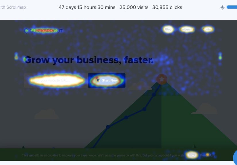
A heatmap is a color-coded visualization where “hotter” areas represent more activity or higher values.
Online, that usually means one of these:
- Click heatmaps: where users click (or tap) most often.
- Scroll heatmaps: how far down visitors scroll before they drop off.
- Move/attention heatmaps: mouse movement patterns (useful, but not mind-reading).
- Data heatmaps: tables where higher/lower values get shaded automatically.
What heatmaps don’t automatically reveal: intent, emotion, confusion, and context. A hotspot might mean
“people love this,” or it might mean “people are desperately trying to click something that isn’t clickable.”
(Heatmaps are honest. Humans are… optimistic.)
Before You Start: The 3-Minute Heatmap Prep Checklist
1) Pick one goal (seriously, one)
Heatmaps are best when you’re answering a specific question, like:
“Are people clicking the CTA?” “Do they scroll to pricing?” “Are they getting stuck on the form?”
If you try to solve your entire funnel in one heatmap, you’ll walk away with 27 tabs open and a strong desire to nap.
2) Choose the right page
Start with a high-impact page: homepage, top landing page, product page, pricing page, checkout step, or a blog post
with heavy traffic and conversions. Heatmaps love real volume.
3) Handle privacy and consent like an adult
Heatmap tools often include masking and privacy controls, but you still need to be intentional. Avoid capturing
sensitive information, and configure masking/filters where appropriate. If your site uses consent management,
make sure your setup respects it.
Option A: Create a Website Heatmap Online in Under 15 Minutes (Fast Setup)
If your goal is to see how people interact with a webpage, you’ll typically use a behavior analytics tool that
generates heatmaps after you install a tracking script (or deploy via a tag manager).
The 15-minute game plan
- Minutes 1–3: Create an account + add your website/project.
- Minutes 4–9: Install the tracking code (or add it via Google Tag Manager / your CMS integration).
- Minutes 10–12: Verify installation and confirm data is flowing.
- Minutes 13–15: Open the heatmap dashboard and set up your first page view or report.
Important reality check: you can create the heatmap setup in under 15 minutes, but meaningful insights depend on
traffic. If your site only gets a handful of visits per day, you’ll need more time for the picture to sharpen.
(Heatmaps are not psychic. They’re just very good at math and color.)
Step-by-step: Install a heatmap tracking code (the common method)
Most website heatmap tools follow the same basic flow:
- Grab the tracking snippet from your heatmap tool.
- Paste it into your site’s
<head>section (sitewide if possible). - If using a tag manager, add the script as a tag and publish.
- Verify installation inside the tool.
- Choose the page(s) you want to track and start collecting data.
Fast install with Google Tag Manager (GTM)
If your site is already running GTM, this is often the quickest path because you can deploy tracking without editing
theme files. The official guidance for tag/container snippets generally emphasizes placing the main script high in
the <head> for best performance and coverage.
Once you add your heatmap tag in GTM, publish the container, then use preview/debug tools to confirm it fires on the
right pages. This prevents the classic mistake of “We installed it!” followed by “Why is it empty?” followed by
“Oh. It was never published.”
Alternative installs: Shopify, WordPress, HubSpot, and other builders
Many heatmap vendors support one-click or near-one-click installs through app marketplaces or plugins. If you’re on
Shopify, for example, you can often install from the app store and connect your account, reducing setup time.
WordPress sites may use plugins or header injection tools. HubSpot users frequently add scripts via site header
settings.
Option B: Create a Heatmap Online in a Spreadsheet (Perfect for Reports)
If by “heatmap” you mean “color-shaded data table” (like performance by day/hour, campaign by region, or product
demand by category), you can create one in minutes using conditional formatting.
Google Sheets heatmap in 5 minutes
- Select your data range (usually just the numbers, not headers).
- Go to Format → Conditional formatting.
- Choose Color scale (not “Single color”).
- Set the min/mid/max values and colors (or use defaults).
- Click Done, then admire your instantly more readable dataset.
This is especially useful for quick insights like:
“Which content categories perform best?” “What days have the highest conversions?” “Where are refunds spiking?”
It’s the same idea as website heatmapsturn patterns into something your brain can process in one glance.
Excel Online heatmap (similar concept)
Excel’s conditional formatting color scales work the same way: select data, apply color scales, and you’ve got a
heatmap-style view for dashboards and stakeholder-friendly reporting.
How to Read Heatmaps Without Lying to Yourself
Heatmaps are powerful, but they’re also easy to misread. Use these rules to stay on planet Earth:
Rule 1: Check sample size before you celebrate (or panic)
A handful of sessions can create dramatic-looking hotspots. Give the heatmap time to collect enough interactions,
especially if you plan to redesign anything major.
Rule 2: “Lots of clicks” can mean “lots of confusion”
Repeated clicks on non-clickable elements often signal friction. Users may think an image is a button, a headline is
a link, or the pricing table is interactive. This is where session recordings (or user testing) help you understand
what the heatmap can’t: the “why.”
Rule 3: Pair heatmaps with at least one other method
Heatmaps answer “where,” but not “why.” Pair them with:
- Session replays: see hesitations, loops, and dead-ends.
- Funnel analytics: confirm the drop-off point matches what you’re seeing visually.
- On-page surveys: ask users what they came for (and if they found it).
- A/B testing: prove your fix is actually a fix.
Rule 4: Segment whenever possible
A blended heatmap can hide the truth. New visitors behave differently than returning visitors. Mobile behavior is not
desktop behavior. Paid traffic often behaves differently than organic. If your tool supports filters, use themyour
future self will thank you.
What to Do with Heatmap Findings (So It’s Not Just Pretty Colors)
Turn hotspots into CRO actions
- Hot clicks on non-clickable items: make the element clickable, or redesign it so it stops
pretending to be clickable. - CTA ignored: test a new placement, stronger contrast, clearer value prop, or a more specific
CTA (“Get pricing” beats “Submit”). - Scroll drop-off above key info: move critical content higher, reduce fluff, tighten layout, or
add in-page navigation. - Rage clicks near form fields: simplify validation, reduce required fields, improve error messages.
Mini example: Pricing page clarity
Suppose your scroll heatmap shows most visitors never reach the FAQ, but your support team keeps answering the same
pricing questions. Two smart fixes to test:
- Add a short “common questions” strip near the top (above the fold).
- Insert a comparison table that answers the biggest plan confusion in 10 seconds.
Then measure the result: conversions, checkout starts, demo requests, and reduced support tickets. Heatmaps start the
conversation; outcomes finish it.
Troubleshooting: Why Your Heatmap Might Look Wrong (or Empty)
No data showing up
- Tracking code not published (especially common with GTM).
- Script installed on only one template instead of sitewide.
- Ad blockers or privacy settings reducing tracking volume.
- Very low traffic (you may just need time).
Heatmap looks “off” after a redesign
Heatmaps are page-specific. If you significantly change layout, you may need a fresh collection period. Otherwise,
you’re comparing behavior on yesterday’s page with today’s design, which is like reviewing a restaurant based on
someone else’s leftovers.
Single-page apps (SPAs) and dynamic content
SPAs can require additional configuration so page changes are tracked correctly. If your site uses dynamic rendering,
confirm your tool supports it and that you’re tracking the right virtual pageviews.
Real-World Experiences: What Teams Learn After Their First 15-Minute Heatmap Setup
After teams set up their first online heatmap, a few “surprising but common” patterns tend to show upregardless of
industry. First, people usually discover that visitors don’t read pages like a novel. They skim like they’re speed-running
a video game, looking for the next obvious checkpoint: pricing, proof, and next steps. That’s why scroll heatmaps
often reveal a painful truth: the lovingly crafted section your team debated for two weeks sits below the point where
most users stop scrolling. The fix is rarely “add more content.” It’s almost always “move the right content up” and
“make the page easier to scan.”
Second, click heatmaps frequently expose “accidental design promises.” A big photo that looks like a button will get
clicked. A headline styled like a link will get clicked. Icons that suggest interactivity will get clicked. When those
clicks go nowhere, you’ll often see repeated clicking in the same spot. Some teams interpret this as excitementuntil
they watch a few session replays and realize it’s confusion. The practical takeaway is simple: either make the element
do the thing users expect, or restyle it so it stops implying it can do the thing. Your design system should not gaslight
your visitors.
Third, teams often experience the “mobile reality check.” On desktop, a call-to-action might be visible immediately.
On mobile, the same CTA might be pushed down by a tall hero section, cookie banner, sticky header, or an oversized
promo bar. Heatmaps help you see the impact in a way that’s hard to argue with in a meeting. It’s not opinion anymore;
it’s behavior. Many teams end up trimming hero height, tightening spacing, or adding a secondary CTA earlier on mobile
to reduce drop-off.
Fourth, once a heatmap is running, teams commonly want to track everything at onceevery page, every campaign, every
experiment. That’s how dashboards become junk drawers. The better experience is to treat heatmaps like a focused
diagnostic tool: pick one high-impact page, one audience segment, and one hypothesis. For example: “Paid traffic is
bouncingare they missing the value prop?” Then look for visual evidence (what’s clicked, what’s ignored, what’s not
seen), and turn that into one or two testable changes. When teams work this way, heatmaps become a reliable input to
conversion rate optimization instead of a weekly ritual of staring at colors and saying, “Huh.”
Finally, teams learn that the “15-minute setup” is the easy partthe real value comes from a simple loop:
observe → hypothesize → change → validate. Heatmaps are strongest at the observe stage, and they get
exponentially more useful when paired with funnels, replays, and experiments. The most successful teams treat heatmaps
as a question generator, not an answer machine: “Why are people clicking here?” “Why aren’t they scrolling?” “What
do they expect this element to do?” If you keep asking better questions, the heatmap keeps paying rent.
Conclusion
Creating a heatmap online in under 15 minutes is absolutely doable: choose the right heatmap type (website behavior
or spreadsheet data), install or apply the tool quickly, and start collecting real patterns. The win isn’t the heatmap
itselfit’s what you do next: fix misleading design cues, move key content higher, improve CTAs, and validate changes
with testing. Treat heatmaps like a flashlight, not a fortune teller, and they’ll keep helping you spot friction long
before it shows up in your conversion rate.