Table of Contents >> Show >> Hide
- Before You Start: Quick Gallery Wall Rules That Actually Help
- Step 1: Plan Your Gallery Wall (Theme, Frames, and a “Yes Pile”)
- Step 2: Measure Your Wall and Map the “Gallery Zone”
- Step 3: Build the Layout on the Floor (Then Mock It Up on the Wall)
- Step 4: Pick the Right Hanging Hardware (So Your Wall Doesn’t Betray You)
- Step 5: Hang in a Smart Order (Center Out, Level Often, Adjust Gently)
- Common Gallery Wall Mistakes (and How to Avoid Them)
- Gallery Wall Style Upgrades (Optional, But Very Fun)
- Real-World Experiences: What People Learn After Hanging a Gallery Wall
- The “it looked smaller on the floor” surprise
- Walls aren’t always straight (and it’s not your fault)
- The “I used the wire and now it’s crooked” saga
- Renters get creative (and it can still look high-end)
- Gallery walls evolveso leave yourself room to grow
- Kids, pets, and high-traffic areas change the plan
- The confidence boost is real
A gallery wall is basically your home’s highlight reel: family photos, favorite prints, ticket stubs you
swear you’ll frame “someday,” and that one weird illustration you love because it makes guests ask questions.
The problem? Hanging a gallery wall can feel like doing geometry while balancing on a chair.
The good news: you don’t need an interior design degree or a magical ability to eyeball straight lines.
With a simple plan, the right tools, and a few pro rules (that you’re absolutely allowed to bend),
you can hang a gallery wall that looks intentionalnot like your frames were tossed by a friendly tornado.
Below are five easy steps to create a clean, cohesive gallery wall layout, plus practical tips on
spacing, height, hardware, and avoiding the classic “why is that frame slightly tilted forever?” problem.
Before You Start: Quick Gallery Wall Rules That Actually Help
Think of these as bumper rails, not prison bars. They’ll keep your gallery wall looking balanced
while still letting your style show up.
Rule 1: Aim for eye level (a simple height guideline)
A widely used guideline is hanging art so the center of the main piece (or the whole arrangement)
lands around 57–60 inches from the floor. In other words: the “average eye level” zone.
If your gallery wall goes above furniture (like a sofa or console), you’ll usually shift the whole grouping
slightly lower so it feels connected to the piece beneath it.
Rule 2: Keep spacing consistent
Consistent spacing makes mixed frames look curated. A common sweet spot is about 2–3 inches
between frames. Go tighter for a bold, salon-style look. Go wider if you want everything to breathe.
Just pick a spacing and stick with it like it’s your favorite playlist on repeat.
Rule 3: Decide on a “vibe” (grid, row, or freeform)
- Grid: clean, modern, and very “I have my life together.”
- Row/ledge style: great above furniture and easy to expand later.
- Salon/freeform: artsy, collected, and forgiving if your frames vary a lot.
You can mix styles, but choose one main structure so your wall looks deliberate, not accidental.
Step 1: Plan Your Gallery Wall (Theme, Frames, and a “Yes Pile”)
The fastest way to get overwhelmed is to start hammering without a plan. The fastest way to feel confident
is to make a few decisions up frontespecially about what belongs on the wall.
Pick a simple unifier
Your gallery wall doesn’t have to match perfectly, but it should have at least one “thread” tying it together:
- Color story: black-and-white photos, warm neutrals, or bold primary colors.
- Frame family: all black frames, all wood tones, or a mix that repeats (like black + brass + oak).
- Subject: travel photos, kids’ art, vintage posters, landscapes, or “things I love that make people smile.”
Do a quick edit (yes, like a playlist)
Lay everything on the floor and create a “yes pile.” If a piece feels off-theme, too tiny, or visually noisy,
don’t force it. A gallery wall is a collection, not a clutter audition.
Choose an anchor piece
Most great gallery walls have a “main character”often the largest frame or the boldest piece.
You’ll hang around that anchor, which makes the whole process easier and keeps the wall from drifting upward
into the “why is everything near the ceiling?” zone.
Tools + supplies checklist
- Tape measure
- Pencil (or painter’s tape if you hate pencil marks)
- Level (a small one works; a longer one is even better)
- Painter’s tape / masking tape
- Stud finder (helpful for heavy frames)
- Picture hooks, nails, screws, or wall anchors
- Optional: removable hanging strips (great for renters or light frames)
- Optional: kraft paper or wrapping paper for templates
Safety note: if you’re using tools and you’re under 18, it’s smart to have an adult helpespecially with
drilling, anchors, or heavier frames.
Step 2: Measure Your Wall and Map the “Gallery Zone”
A gallery wall looks best when it lives inside a clearly defined areayour “gallery zone.”
That zone can be above a sofa, in a hallway, up a staircase, or around a TV. The key is to set boundaries
before you set holes.
Define the boundaries
Use painter’s tape to outline the width and height of the space you want the gallery wall to occupy.
This helps you avoid a layout that slowly spreads like ivy across the wall.
Choose your center point
If the gallery wall is on an empty wall, a classic approach is centering the overall arrangement around eye level
(often around 57–60 inches to the midpoint). If it’s above furniture, measure the furniture width and aim to keep
the gallery wall visually centered over it, usually with a comfortable gap above the furniture top so it feels connected.
Example: living room over a sofa
Let’s say your sofa is 84 inches wide. A good starting point is making your gallery wall about
two-thirds to three-quarters of the sofa width (roughly 56–63 inches), centered over the sofa.
That keeps it proportional without looking like tiny postage stamps floating above your seating.
Step 3: Build the Layout on the Floor (Then Mock It Up on the Wall)
This is where your gallery wall goes from “pile of frames” to “I can see the vision.”
You’ll arrange, adjust, and only then commit.
Arrange on the floor first
- Lay your frames inside the “gallery zone” shape you taped out (or recreate the zone on the floor with tape).
- Start with the anchor piece, then place medium pieces around it.
- Fill in with smaller frames last (they’re the accessories, not the outfit).
Keep spacing consistent
Use two fingers, a ruler, or a cut piece of cardboard as a spacing guide. Your future self will thank you
when everything looks neat and intentional.
Create paper templates (the “hang it perfectly” cheat code)
Trace each frame onto kraft paper or wrapping paper, cut it out, and label it (e.g., “8×10 landscape,” “11×14 portrait”).
Mark where the hanging hardware sits on the back of the framethis is crucial.
Tape the paper templates to the wall in your planned arrangement. Step back. Squint. Pretend you’re in a fancy gallery.
Adjust until it feels balanced. This is your no-regrets momentuse it.
Use painter’s tape for alignment
For grid layouts, run strips of painter’s tape as straight guide lines (horizontal and/or vertical).
For freeform layouts, you can tape a center line or baseline so the wall doesn’t “tilt” visually.
Step 4: Pick the Right Hanging Hardware (So Your Wall Doesn’t Betray You)
The best gallery wall in the world isn’t worth much if a frame crashes at 2:00 a.m. like a tiny, dramatic thunderstorm.
Hardware mattersespecially for heavier pieces.
Know your wall type (quick guide)
- Drywall: common in many homes; light items can use picture hooks, heavier ones often need anchors or studs.
- Plaster: can be trickier; pre-drilling may help, and specialty hardware can be worth it.
- Brick/Concrete: typically needs masonry anchors and the right drill bit.
Studs, anchors, or strips?
Use this as a practical decision tree:
- If it’s heavy: aim for a stud when possible, or use a properly rated drywall anchor.
- If it’s medium weight: a sturdy picture hanger or rated anchor usually works well.
- If it’s lightweight (and you want minimal wall damage): removable hanging strips can be a great option on smooth, clean surfaces.
Don’t guesscheck weight ratings
Many hooks, anchors, and removable strips list weight limits. Use them. Also: frames get heavier once you add glass,
mats, and that “solid wood” frame you bought because it felt fancy (and because it was on sale).
Pro tip: hangers matter
Frames with two hanging points (like D-rings with wire) can tilt if the wire stretches or the nail shifts.
For a neat gallery wall, consider hanging frames from their D-rings instead of the wire when possible,
or use hardware designed to reduce shifting.
Step 5: Hang in a Smart Order (Center Out, Level Often, Adjust Gently)
Now you’re ready for the fun part: turning your plan into a real, beautiful wall. The trick is to hang in an order
that keeps everything aligned and reduces rework.
Start with your anchor piece
- Use your template marks to find the exact nail/screw point.
- Measure twice. Level once. Then level again because you’re human.
- Hang the anchor piece and check it from a few angles.
Work outward from the anchor
Add the frames closest to the anchor next, keeping spacing consistent. This method prevents the layout from drifting.
Think of it like building a sandwich: start with the bread, not the lettuce.
Use a level (and trust it, even when your eyes disagree)
Walls, floors, and ceilings can be slightly off. Your eyes might try to “correct” for that by tilting frames.
The level is your honest friend. Keep it close.
Fine-tune and secure
Once everything is up, do a final check:
- Are gaps consistent?
- Does the whole arrangement feel centered in the zone?
- Do any frames look like they’re leaning away from the group?
If a frame keeps shifting, small rubber bumpers on the bottom corners can help it stay in place and protect the wall.
Common Gallery Wall Mistakes (and How to Avoid Them)
Mistake: Hanging everything too high
If your gallery wall looks like it’s trying to escape through the ceiling, bring it down.
Center the arrangement near eye level, and if it’s above furniture, keep the relationship to the furniture strong
so it feels grounded.
Mistake: Random spacing
Mixed spacing is the fastest way to make a gallery wall look chaotic. Pick a spacing rule (like 2–3 inches)
and stick to it across the arrangement.
Mistake: Skipping the mock-up
“I’ll just wing it” is brave. It’s also how you end up patching eight holes.
Templates and painter’s tape are cheaper than wall repair kits.
Mistake: Using the wrong hardware
A heavy frame on a tiny nail is basically a suspense movie.
Match hardware to weight and wall type, and use anchors or studs when needed.
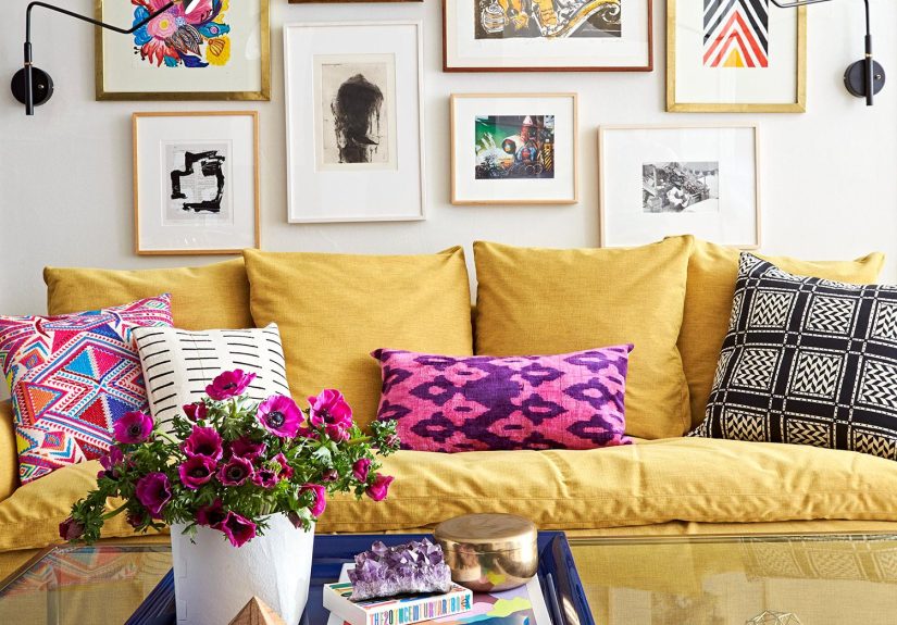
Gallery Wall Style Upgrades (Optional, But Very Fun)
Add dimensional pieces
Mix in a small mirror, a woven wall basket, a tiny shelf, or a framed textile piece. The contrast adds depth
and makes the wall feel collected over time.
Repeat shapes and colors
Even if frames are mismatched, repeating a few elements (black frames, white mats, warm wood tones)
creates cohesion without feeling overly matchy.
Try a “quiet border”
If your gallery wall is freeform, imagine an invisible rectangle around it. Keep the outer edges roughly aligned
so the group reads as one intentional display.
Real-World Experiences: What People Learn After Hanging a Gallery Wall
A gallery wall looks effortless when it’s done, but the process is full of little “ohhh” momentsthe kind you only
get after doing it once (or after doing it twice because the first time taught you things). Here are common,
real-life lessons people run into when hanging a gallery wall, plus what tends to work best.
The “it looked smaller on the floor” surprise
Many people arrange frames on the floor and feel confident… until the wall version looks either
tiny or gigantic. That’s because walls have vertical presence, lighting, and surrounding furniture
that changes perception. The fix is simple: tape out your gallery zone on the wall first and use paper templates.
Seeing the outline in the actual space prevents that “why does my wall look empty?” feeling after you’ve already
committed to holes.
Walls aren’t always straight (and it’s not your fault)
A common frustration is a gallery wall that looks “off” even when each frame is level. Often the wall,
ceiling line, or floor is slightly uneven, so your eyes try to “correct” the tilt. People usually find success by:
- Leveling frames to each other (consistency matters more than perfection to a crooked ceiling).
- Using a baseline or center line guide so the whole grouping reads as intentional.
- Stepping back 6–10 feet for final judgmentclose-up tweaks can trick you.
The “I used the wire and now it’s crooked” saga
Frames hung from a wire can shift as the wire stretches or the hook settles. People often end up nudging frames
every time someone walks past (or every time the HVAC kicks on, because apparently air has opinions).
A common improvement is hanging from D-rings directly when possible, using two hooks for larger frames,
or adding small bumpers to the bottom corners so frames don’t slide.
Renters get creative (and it can still look high-end)
If you’re renting, the goal is usually: maximum style, minimum wall damage.
Many renters report good results by choosing lightweight frames, using removable hanging strips on clean,
smooth surfaces, and keeping heavier pieces on shelves or picture ledges instead of directly on the wall.
A renter-friendly gallery wall can still look intentional if spacing is consistent and the layout is planned first.
Gallery walls evolveso leave yourself room to grow
One of the best “experienced” tips is building a gallery wall that can expand. People who love their final result
often leave a bit of breathing room at the edges, or they plan for one “swap frame” where seasonal art or new photos
can rotate in. A gallery wall doesn’t have to be finished foreverjust finished for now.
Kids, pets, and high-traffic areas change the plan
In busy hallways or homes with kids and pets, people tend to learn that lower frames get bumpedoften.
Common solutions include placing glass frames higher, using acrylic instead of glass for lighter weight and safety,
and anchoring heavier pieces properly. The best gallery wall isn’t just pretty; it survives real life.
The confidence boost is real
After hanging a gallery wall successfully, many people feel oddly powerfullike, “I can probably build a bookshelf now.”
It’s a small home project with a big visual payoff. And once you know the formula (plan, map, template, hang smart),
the next wall gets dramatically easier.