Table of Contents >> Show >> Hide
- What Is Incarnadine No. 248?
- How Incarnadine Behaves in Real Light (AKA: Why Your Walls Are Not a Paint Chip)
- Best Places to Use Incarnadine No. 248
- What Colors Pair Well With Incarnadine?
- Choosing the Right Paint Finish for Incarnadine
- Red Paint Reality Check: Coverage and “Hide”
- Prep and Application: The Stuff That Makes It Look Professional
- Maintenance, Durability, and Cleaning
- VOC Notes: What to Know Before You Paint Indoors
- “Can You Color-Match Incarnadine?”
- Conclusion
- Afterword: 500+ Words of Real-World Experiences With Incarnadine No. 248
- SEO Tags
Some paint colors whisper. Incarnadine No. 248 walks into the room, makes eye contact, and immediately gets invited to the best party in the neighborhood.
It’s a rich, classic crimson that feels equal parts “old-world glamour” and “modern graphic punch,” depending on what you pair it withand how brave you’re feeling
before your first cup of coffee.
If you’re hunting for a red that doesn’t look like a ketchup accident, Incarnadine is worth your attention. This article breaks down what the color actually does on walls,
how to choose the right finish, what to pair it with, and the practical stuff that makes red paint look expensive instead of exhausting.
What Is Incarnadine No. 248?
Incarnadine No. 248 is best known as a deep, saturated crimson from Farrow & Ball’s color lineup. It’s often described as their richest crimsonclassic,
dramatic, and unapologetically bold. Think “library with a velvet chair,” not “stop sign in a hallway.”
The name comes from a term historically used for crimson hues (with roots in Latin). In plain English: it’s the kind of red that looks like it has stories.
In some lighting it leans warmer and plush; in others it looks more shadowy and sophisticatedlike the color is quietly plotting something fabulous.
How Incarnadine Behaves in Real Light (AKA: Why Your Walls Are Not a Paint Chip)
Dark reds are famous for shape-shifting, and Incarnadine is no exception. The same paint can feel:
- Luxuriously warm in golden afternoon light
- Moody and intimate in evening lamps
- Sharper and more graphic in cool north-facing light
Translation: don’t judge this color under one overhead bulb while standing in a hardware-store aisle. If you want Incarnadine to look intentional (and not like you’re
reenacting a Shakespeare tragedy on drywall), test it in multiple spots and at multiple times of day.
Sampling Tips That Save Your Sanity
- Paint a large sample (at least 12" x 12"bigger is better for dark colors).
- Move the sample around (or paint on poster board) to see it in different lighting zones.
- Check it next to fixed finishes you can’t change easily: floors, countertops, tile, and stone.
Best Places to Use Incarnadine No. 248
Incarnadine is versatile, but it’s not a “paint every room in the house and hope for the best” color. Use it where drama makes sense.
1) Dining Rooms That Feel Like a Restaurant (In a Good Way)
Crimson can make a dining room feel richer and more intimateespecially with warm lighting and wood tones. If you host dinners, Incarnadine can turn “Tuesday tacos”
into “we should’ve dressed nicer.”
2) Hallways, Entries, and Powder Rooms
Smaller spaces are great for bold color because you get maximum impact without painting 900 square feet of commitment. In an entryway, Incarnadine signals confidence.
In a powder room, it signals you own at least one candle that costs more than a sandwich.
3) Accent Walls (When You Want Drama Without Full Immersion)
If you love the color but want to keep the rest of the room lighter, an accent wall can work beautifullyespecially behind a headboard, in a reading nook,
or framing built-ins.
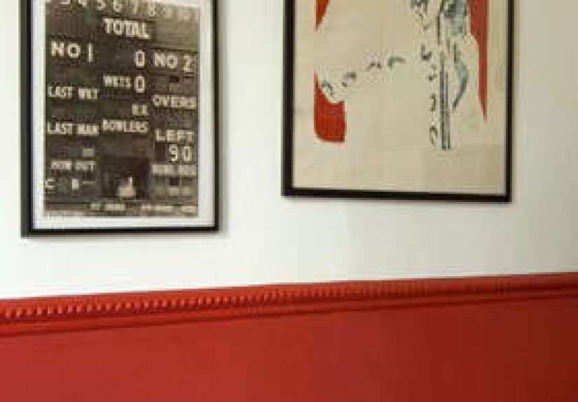
4) Trim, Doors, and Woodwork in a High-Sheen Finish
Incarnadine on a front door or interior doors can be jaw-droppingparticularly in a glossier finish. High sheen emphasizes color depth and makes details pop,
though it also highlights surface imperfections (because gloss is honest like that).
What Colors Pair Well With Incarnadine?
The secret to making crimson look grown-up is pairing it with supporting players that control the vibe.
Classic Pairings
- Warm whites and soft creams: keep it elegant, not harsh.
- Deep browns and espresso wood tones: creates a “heritage” looktraditional, luxe, timeless.
- Charcoal or inky near-blacks: makes it modern and editorial.
Unexpected Pairings (That Look Surprisingly Expensive)
- Muted olives and deep greens: bold but balanced, especially with brass accents.
- Dusty blush or clay neutrals: softens the drama while keeping warmth.
- Bright, clean whites: turns it crisp and graphic (high-contrast, very intentional).
If you’re unsure, start with a white you already trust and a wood tone you already own. Incarnadine does best when it’s not fighting five other strong colors for attention.
Choosing the Right Paint Finish for Incarnadine
Finish matters as much as colorespecially with dark reds. The sheen you pick changes how much light reflects, how easy it is to clean, and how forgiving the surface looks.
Common Sheens and Where They Make Sense
- Matte / Flat: velvety, hides flaws well, but can be less washable depending on the formula.
- Eggshell: a little sheen, more cleanable, good for living spaces and bedrooms.
- Satin: more durable and wipeable, great for higher-traffic rooms.
- Semi-gloss / Gloss: toughest and easiest to clean, ideal for trim/doors; highlights every bump and brush mark.
For many homes, the sweet spot is eggshell or satin on walls (depending on traffic), and semi-gloss on trim. If you want Incarnadine to feel deep and “chalky,”
lean matte; if you want it to feel polished and jewel-like, increase sheenespecially on woodwork.
Red Paint Reality Check: Coverage and “Hide”
Here’s the part nobody puts on the pretty mood board: deep reds can be harder to cover evenly. Not because you’re cursed, but because saturated pigments
can show roller marks, lap lines, and patchiness if the base layer and technique aren’t right.
The Primer Trick That Helps Bold Colors Look Right Faster
A common pro strategy is using a tinted primeroften a gray-tinted baseso bold colors achieve better hide and truer color in fewer coats.
This is especially useful if you’re going from a light wall to a deep crimson.
How Many Coats Should You Plan For?
For a color like Incarnadine, plan on two topcoats as a baseline. If you’re painting over a high-contrast color (say, white to deep red),
the primer plus two coats is the “don’t panic later” approach.
Prep and Application: The Stuff That Makes It Look Professional
If you want Incarnadine to look like a designer chose itnot like you fought a ladder and lostprep is non-negotiable.
Step-by-Step (Simplified, Not Oversimplified)
- Clean the surface (dust and grease are paint’s enemies).
- Patch and sand dents, nail holes, and rough spots.
- De-gloss if needed (especially on shiny trim or old enamel paint).
- Prime repairs and tricky surfaces; consider tinted primer for best hide.
- Cut in edges cleanly before rolling (or work in small sections to keep a wet edge).
- Roll evenly with consistent pressure and don’t overwork drying paint.
- Let it dry properly and apply the second coat for uniform coverage.
Pro tip: dark colors reward patience. Rushing the second coat before the first one sets can cause streaking or uneven sheen. Let the paint do its job.
Maintenance, Durability, and Cleaning
The deeper the color, the more you’ll appreciate a finish that can handle real life: fingerprints, scuffs, and the occasional “who let the dog brush against the wall?”
situation.
Cleaning Without Ruining the Finish
- Wait for full cure before scrubbing (dry to the touch isn’t fully cured).
- Use gentle cleaners and soft cloths first; escalate only if needed.
- Spot-test in an inconspicuous areaespecially on matte finishes.
If the room is high-traffic (hallways, kitchens, kids’ zones), choose a more durable wall finish. That way, Incarnadine stays rich instead of slowly turning into a
scrapbook of fingerprints.
VOC Notes: What to Know Before You Paint Indoors
Most homeowners today prefer lower-odor, lower-VOC optionsespecially indoors. VOC rules for architectural coatings exist in the U.S., and manufacturers often provide
VOC content information and safety guidance. Regardless of brand, follow best practices:
- Ventilate well (open windows, use fans, keep air moving).
- Follow the product’s safety and dry-time instructions.
- Keep kids and pets away until surfaces are dry and the space has aired out.
“Can You Color-Match Incarnadine?”
You can often get a close color match at many paint retailers, but color-matching isn’t just about the pigment recipeit’s also about the base paint chemistry,
sheen level, and how a specific formula responds to light.
If you’re choosing Incarnadine specifically for its signature look, the safest route is to buy it in the system intended for that color. If budget or convenience
makes matching attractive, test a large sample in your actual room and compare it in day and night lighting before committing.
Conclusion
Incarnadine No. 248 is not a shy red. It’s a bold crimson with a classic backbonecapable of looking glamorous, modern, or cozy depending on the pairing
colors and finish you choose. If you sample thoughtfully, pick the right sheen for your lifestyle, and use primer strategically for better coverage, Incarnadine can
deliver that “wow” factor without turning your project into a three-week saga.
In other words: this is the red you choose when you want your room to have a personality. A charming one. Possibly wearing velvet.
Afterword: 500+ Words of Real-World Experiences With Incarnadine No. 248
When people talk about living with Incarnadine No. 248 paint, the stories tend to fall into a few familiar categoriesequal parts design delight and
practical “wish I’d known that sooner.” Here are the most common experiences homeowners and decorators share after the paint dries, the furniture moves back in,
and the room starts behaving like a real room again.
First surprise: the color changes more than expected. On day one, Incarnadine can look like a dramatic stage curtain. Then the morning sun hits, and it
warms up into something almost velvety. At night, under lamps, it often deepens and feels moodierless “bright red” and more “historic crimson.” People who love it
usually love that shift; people who don’t sample first sometimes feel personally betrayed by their own light fixtures. The takeaway: this isn’t a one-note red, and that’s
part of the appeal.
Second surprise: it makes everything around it look more intentional. A plain brass sconce? Now it looks curated. A simple wood console? Suddenly it’s
“warm and grounding.” Even basic white trim can feel crisp and elevated next to a saturated crimson. Many users report that the room feels “finished” faster than expected
because the color does so much heavy lifting. Incarnadine is basically the friend who shows up overdressed and makes everyone else step up their game.
Third surprise: prep matters more with this color than with a pale neutral. A little patchiness that might disappear under beige can show up under deep red.
People who had the best results often did three unglamorous things: (1) they patched and sanded carefully, (2) they used a smart primer strategy (sometimes tinted),
and (3) they committed to a full second coat even if the first coat looked “pretty good.” This is where many “I love it” stories are bornand where many “why does it look
streaky?” stories die.
Fourth surprise: it affects mood. Reds get called “energizing,” but Incarnadine is often described as “comforting” when used correctlyespecially in dining
rooms, libraries, or hallways with warm lighting. People mention that it feels cozy in winter and dramatic year-round. In small spaces like powder rooms, it can feel
delightfully theatrical (in the best way), especially when paired with a mirror, a warm bulb, and maybe a tiny vase that makes you feel like you have your life together.
Fifth surprise: you’ll become weirdly picky about lighting temperature. Homeowners who never cared about bulbs suddenly have opinions. Warm bulbs (around
2700K) tend to make Incarnadine feel richer and more inviting; cooler bulbs can make it feel sharper or more intense. Many people end up swapping bulbs after painting
because the room “wants” a certain glow. It’s not that Incarnadine is demandingokay, it isbut the payoff is a space that looks deliberately styled rather than randomly
colored.
Finally, the happiest Incarnadine users tend to describe the same emotional arc: excitement, a brief “oh wow that’s RED” moment, then a steady appreciation as the room
settles into its new identity. It becomes the color people mention first. It becomes the room guests remember. And for a lot of homeowners, that’s exactly the point.