Table of Contents >> Show >> Hide
- What Actually Makes a Café Feel “Chic”?
- 1) Maman (New York City and Beyond): French-Country Charm That Doesn’t Try Too Hard
- 2) Merci Montecito (Montecito, California): Pastel Parisian, With Grown-Up Restraint
- 3) Pineapple & Pearls (Washington, D.C.): Playful in Front, Polished in Back
- The Design Ideas These Cafés Share (And Why They’re So Easy to Copy)
- The Experience: of Chic-Café Energy (And How to Bring It Home)
- Final Sip
Some cafés just serve coffee. Others serve a whole moodthe kind you want to bottle, label, and mist around your house like an expensive room spray called “Main Character Energy (With Notes of Espresso).” These are the places where the cappuccino foam is perfect, sure… but the lighting is also perfect, the tile is flirting with you, and the chairs make you sit up straighter like you suddenly have a personal stylist.
Today we’re stepping inside three seriously stylish American caféseach with a distinct look you can borrow (politely) for your own home. Think: French countryside charm that doesn’t feel like a costume, pastel Parisian polish that doesn’t go full cupcake, and a D.C. space that proves “playful” can still be grown-up chic.
What Actually Makes a Café Feel “Chic”?
Chic isn’t a single styleit’s a feeling. And the best café interiors pull it off with a few repeatable moves:
- A clear point of view: One strong design “story” (French country, modern glam, soft-minimal Parisian) instead of a greatest-hits collage.
- Material confidence: Tile, stone, wood, metalreal textures that look good even when the place is busy and the pastry case is under attack.
- Lighting that flatters humans: The goal is “I look well-rested,” not “I’m being interrogated.”
- Details that feel intentional: A signature pattern, a repeated color, a standout mirror, a consistent hardware finish.
- Function that doesn’t kill the vibe: The line, the menu board, the condiment stationall handled like design elements, not afterthoughts.
Now let’s tour three cafés that nail itplus the design ideas you’ll want to steal without getting caught on security camera.
1) Maman (New York City and Beyond): French-Country Charm That Doesn’t Try Too Hard
The vibe: A “come in, stay awhile” French-inspired café where blue-and-white patterns, rustic textures, and cozy seating make you feel like you accidentally wandered into someone’s stylish kitchenwhere, conveniently, someone is also selling cookies.
Why the Design Works
Maman’s look lands in that sweet spot between nostalgic and fresh. Instead of screaming “theme,” it whispers “taste.” The palette stays groundedmostly whites, soft neutrals, and signature blue accentswhile texture does the heavy lifting: exposed brick, warm wood tables, and patterned moments that read curated rather than cluttered.
It’s also a masterclass in repeatable branding. Even as locations vary, the design language stays recognizable. That’s chic: not just pretty, but consistent.
Design Ideas You’ll Want to Steal
- Blue-and-white pattern layering: Use one signature pattern family (think toile, stripes, floral china) across small surfacesmugs, plates, a backsplash momentso it feels collected, not chaotic.
- “Grandmillennial” wallpaper… in moderation: Pattern can be a whole wall, or just a nook. A small café corner with wallpaper behind open shelves is plenty to make the space feel styled.
- Farmhouse tables, but make them modern: Pair rustic wood with cleaner silhouettes elsewhere (sleeker chairs, simple pendant lights) so it doesn’t slide into “barn wedding.”
- Soft, homey styling: If it looks like it belongs in a living room (a framed print, a little shelf vignette), it probably belongs in your coffee zone too.
How to Recreate the Look at Home
Start small: You don’t need a full kitchen renovation to borrow the vibe. Try one of these:
- The “Maman shelf”: Install one open shelf near your coffee setup. Stack blue-and-white mugs, add a small vase, and keep the palette tight (white, wood, blue).
- Wallpaper a micro-zone: Use removable wallpaper inside a breakfast nook, behind a bar cart, or even on the back panel of a glass-front cabinet.
- Add a tactile runner: A small woven runner on a counter or console softens the look and makes it feel more “café” and less “kitchen appliance showroom.”
- Repeat one metal finish: Pick brushed brass, matte black, or polished nickelthen repeat it in pulls, a small tray, and a lamp base for instant cohesion.
2) Merci Montecito (Montecito, California): Pastel Parisian, With Grown-Up Restraint
The vibe: A Paris-inspired patisserie energysoft hues, elegant surfaces, and the kind of calm that makes you speak one volume lower without realizing it. (You’re not being shushed. The room is just… persuasive.)
Why the Design Works
Pastels can go twee fast. Merci Montecito avoids that by balancing airy color with structure: light blush and soft gray tones feel gentle, while darker accents create contrast and definition. The result is not “nursery cute,” but “boutique hotel lobby you wish you lived in.”
The materials matter here. Stone counters and thoughtfully chosen surfaces elevate the softness into something more architecturalso the space feels luxurious without being loud.
Design Ideas You’ll Want to Steal
- The “blush-neutral sandwich” palette: Soft pink works best when it’s not alone. Pair it with bone-white and warm gray, then add a small hit of black for crisp edges.
- Statement stone (even in small doses): Stone reads instantly upscale. If you can’t do full slabs, try a stone tray, a small stone side table, or a remnant piece used as a shelf.
- One surprise moment: A playful wallpaper in a tiny space (like a powder room) creates a “hidden gem” effectan easy way to make a home feel designed, not just decorated.
- Rounded edges + soft lighting: Pastels look best with gentle lines. Think rounded mirror corners, globe pendants, and warm bulbs.
How to Recreate the Look at Home
- Paint trick: Use blush as an accent on a single wall or lower cabinet run, then keep ceilings and trim a clean warm white so the space still feels bright.
- Upgrade your “touch points”: Swap in prettier hardware, a sleek faucet, or a minimal sconce. Chic often lives in the things you touch every day.
- Build a pastry-case moment: No, you don’t need a glass case full of croissants (unless you’re living the dream). But you can style a cake stand, a cloche, or a stack of small plates on the counter to create that patisserie vibe.
- Choose one graphic pattern: If your palette is soft, let pattern be sharplike a bold botanical print in a small frame, or a structured stripe in a tea towel.
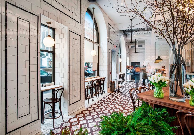
3) Pineapple & Pearls (Washington, D.C.): Playful in Front, Polished in Back
The vibe: A space that treats design like part of the hospitality. The front café energy is bold and funpattern, color, personalitywhile the back shifts into a more refined, modern palette. It’s like the room is saying, “Yes, you can have whimsy and taste.”
Why the Design Works
This is a perfect example of zoning with intention. The front area is your “casual, daytime, pop in for something delicious” zoneso it can handle brighter colors and high-energy visuals. The back is a more formal experienceso the palette tightens up and the finishes feel sleeker.
It’s also proof that a space can feel curated without feeling precious. Even practical objects (containers, cans, the unglamorous stuff) can be chosen like design pieces.
Design Ideas You’ll Want to Steal
- Patterned tile as a personality engine: Tile can function like wallpaperbut tougher. Use it to define a coffee bar zone, an entry, or even a mudroom “moment.”
- One bold color that behaves: Hot pink works here because it’s used strategicallyaccent hits, not full saturation everywhere. Bold is chic when it’s controlled.
- Patina and imperfection: A mirror or piece with character (tiny defects, antique vibes) keeps the space from feeling too new and sterile.
- Mixed lighting: Sculptural pendants plus softer ambient light makes the space feel layeredand expensive.
How to Recreate the Look at Home
- Create a “front-of-house” at home: Give your coffee setup a clear identity. Treat it like a mini café counter with a tray, a menu-style print, and one standout surface (tile, stone, or a bold paint color behind it).
- Use bold color like jewelry: If you want pink (or any vivid hue), try it on a single stool, a lamp, or art. Let it pop against a calmer background.
- Choose one hero object: A dramatic mirror, a funky pendant, or a statement table becomes the “signature” your room revolves around.
- Upgrade the boring stuff: Canisters, bins, and containers can look intentional. When your utility items are beautiful, your whole space levels up.
The Design Ideas These Cafés Share (And Why They’re So Easy to Copy)
Even though these cafés look totally different, they’re running the same playbook underneath. Here’s the cheat sheet:
1) A Tight Palette (With One Wild Card)
Chic spaces aren’t colorlessthey’re disciplined. Pick 2–3 core neutrals, one signature color, and one small “wild card” (a metallic, a high-contrast black detail, or a playful pattern). This is how you get personality without visual chaos.
2) A Signature Surface
In cafés, the surfaces do a lot of storytelling: tile floors, stone counters, textured walls. At home, pick one surface to upgradebacksplash, countertop accessory zone, even peel-and-stick tile behind a coffee setupand let it carry the vibe.
3) Layered Lighting, Not Just “The Big Light”
If you steal only one thing from chic cafés, steal this: lighting. Use a mix of ambient (soft overall), task (where you work), and accent (pretty, decorative). Your space will immediately feel more intentional.
4) Styling That Feels Like a Life, Not a Photoshoot
Great café design looks “lived in” in a good waysmall clusters, a little asymmetry, items that seem collected over time. Aim for “warm and curated,” not “staged and scared to touch.”
The Experience: of Chic-Café Energy (And How to Bring It Home)
Walking into a truly chic café is a little like stepping into a movie where you are instantly more put-together. You didn’t change outfits. You didn’t suddenly become someone who journals with a fountain pen. But the room is convincing enough that you start believing it could happen.
At a place like Maman, the experience starts with comfort. The textures do the welcoming for youwood that looks like it has stories, soft patterns that feel familiar, and little details that make the space feel personal instead of corporate. You order something warm, and the room encourages you to slow down. You notice you’re not just drinking coffee; you’re having a “morning.” You’re sitting at a table that feels like it could be in a friend’s home, and that’s the trick: the design creates emotional permission to linger.
Then you visit a pastel-polished patisserie like Merci Montecito, and the mood shifts from cozy to airy. The space feels lighterlike your brain just unclenched. Soft color palettes have that effect when they’re balanced well: you don’t feel overwhelmed, you feel edited. It’s the kind of place where even waiting for your drink feels pleasant because there’s always something gentle to look atstone with subtle movement, clean lines, a calm contrast that makes everything feel considered. You leave thinking, “Maybe I don’t need more stuff. Maybe I need better stuff.” (This is how interiors quietly rebrand your personality.)
And then there’s the D.C. style of chic: confident, playful, and surprisingly practical. In a space like Pineapple & Pearls, the front café energy is like a winkbold pattern, an unexpected color, a little moment that says, “Yes, we’re having fun, but we’re also very good at this.” The experience is layered: quick coffee up front, a deeper experience further in. That’s the part most homes miss. We design everything to be one mood, all day long. But the chicest spaces shift. A bright, energetic coffee corner can exist alongside a calmer dining area. Your home can have zones with different vibesand it actually makes daily life feel richer.
To bring this experience home, focus on how you want the space to make you feel at 8 a.m. versus 8 p.m. Create a “morning corner” that’s cheerful and easyyour favorite mug visible, a pretty tray, lighting that feels kind. Then create an “evening version” with softer light and fewer visual distractions. Add one signature detaila pattern, a color, a hero mirrorand let it repeat in small ways. Chic isn’t about copying a café perfectly. It’s about stealing the part that changes your mood the moment you walk in.
Final Sip
The chicest cafés don’t just look goodthey behave well. They guide you through the space, flatter you with good lighting, and make everyday rituals feel slightly more special. Whether you borrow Maman’s cozy pattern play, Merci Montecito’s pastel restraint, or Pineapple & Pearls’ bold-yet-controlled energy, the win is the same: your home starts giving you that “favorite café” feelingwithout the line, the parking, or the temptation to buy a second pastry “for later.”