Table of Contents >> Show >> Hide
- What “Pin to Win” Really Means
- Why Color Boards Work So Well on Pinterest
- The Anatomy of a Color Board Winner
- How to Create a Winning Color Board Step by Step
- Common Mistakes That Keep a Color Board from Winning
- Color Trends Help, But Story Wins
- Why Winning Boards Matter Beyond Pinterest
- Experience: What It Feels Like to Build a “Pin to Win” Color Board
- Conclusion
If the phrase Pin to Win: Color Board Winner sounds like the title of a very stylish game show where taupe fights mustard under dramatic studio lighting, you are not entirely wrong. The idea comes from a real Pinterest color-board contest, but the bigger lesson is much more useful: a winning color board is never just a pile of pretty pictures. It is a visual argument. It says, “Here is the mood, here is the palette, here is the feeling, and yes, this shade of blue absolutely deserves to sit next to that walnut bench.”
That is why color boards matter so much on Pinterest, in branding, in home design, and even in personal projects. When done well, they help people make decisions faster, tell a more consistent story, and turn vague inspiration into something usable. A good board does not merely look nice. It creates clarity. It gives your eye a destination instead of sending it on a chaotic road trip with no snacks.
So if you want to understand what makes a color board winner, whether for a Pinterest board, a design concept, a product collection, or a content campaign, this guide breaks it down in plain English. We will cover what makes a board memorable, how color psychology actually helps, how to build one step by step, and why the best boards feel curated rather than crowded.
What “Pin to Win” Really Means
At its core, Pin to Win is about curation. Not hoarding. Not panic-pinning 47 beige sofas and calling it a strategy. Curation means selecting visual pieces that work together to create one coherent story. The “winner” part comes from judgment: which board feels intentional, complete, and emotionally resonant?
The answer is usually not “the brightest one” or “the trendiest one.” Winning boards tend to do something more sophisticated. They balance color, mood, texture, and contrast. They leave space for the eye to rest. They make you feel something specific. And most importantly, they know what they are about.
That last point matters because Pinterest is not just a place for inspiration; it is a place where people plan, discover, and act. If your board looks confused, your audience feels confused. If your board looks focused, your audience trusts it. A color board that wins usually has the confidence of someone who knows exactly why every image was invited to the party.
Why Color Boards Work So Well on Pinterest
Pinterest is built for visual discovery, which makes it the natural habitat of the color board. People go there to imagine kitchens, weddings, outfits, offices, logos, reading nooks, and entire future identities. In other words, they arrive ready to dream, and color is often the first thing that turns that dream into a direction.
A strong Pinterest color board works because it combines emotion with organization. The emotion comes from the palette itself. Soft sage feels different from cherry red. Butter yellow feels different from plum. The organization comes from how those colors are grouped, titled, and described. On Pinterest, names matter. Board titles matter. Pin descriptions matter. Keywords matter. This is where visual inspiration quietly shakes hands with SEO.
That makes a color board one of the rare things on the internet that can be both artistic and practical. It can inspire someone aesthetically while also helping the platform understand what the content is about. Think of it as a mood board that learned how search works and decided to become employable.
The Anatomy of a Color Board Winner
1. It starts with one dominant idea
The best boards begin with a clear lead color or lead mood. That does not mean everything must be identical. It means there is a center of gravity. Maybe the board is built around stormy gray, dusty blue, creamy white, terracotta, or olive green. Whatever the anchor is, it keeps the board from turning into a sample sale of unrelated feelings.
A dominant shade creates order. From there, secondary colors and accents can do their jobs. This mirrors good palette design in interiors and branding: one core direction, a few supporting players, and one or two accents that make the whole thing feel alive. Without that hierarchy, a board starts to look busy instead of brilliant.
2. It shows range without losing cohesion
One reason winning boards often feel richer than amateur ones is that they are not flat. They use variations of tone, intensity, value, and texture. A gray board, for example, might include smoky linen, polished concrete, weathered wood, silver metal, charcoal wool, misty walls, and soft cloud photography. Same family, different personalities.
This is where many boards either shine or face-plant into the decorative bushes. If you only pin the exact same shade in the exact same way, the board becomes monotonous. If you pin too many unrelated shades, it becomes noisy. The sweet spot is tonal variation with a unifying thread.
3. It balances warm and cool energy
Winning color boards are rarely all warm or all cool unless that is the whole concept. More often, they use a thoughtful balance. A cool blue room may need warm wood. A creamy neutral palette may need one sharper black line. A green-heavy board may come alive when brass, clay, or rust enters the chat.
That contrast creates depth. It makes the board feel designed rather than accidental. It also gives your audience more clues about how the palette might function in real life. Warm and cool interplay is one of the easiest ways to make a board feel finished.
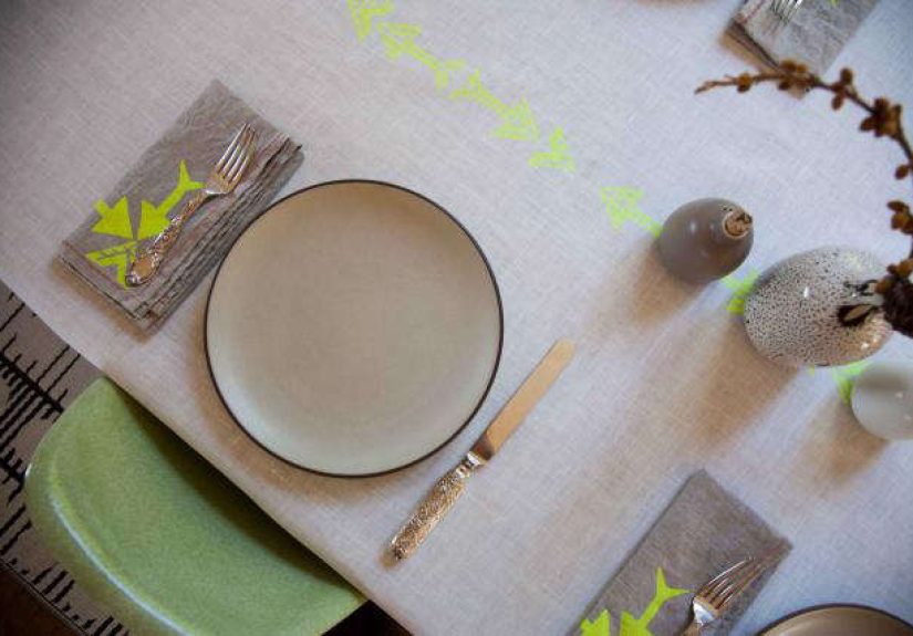
4. It includes texture, not just color chips
A color board is not a hardware-store aisle screenshot. The most engaging boards include surfaces, materials, objects, rooms, fabric, finishes, and real-life moments. Paint swatches are helpful, but texture is what gives color context. Matte black looks different on iron than on velvet. White looks different on plaster than on glossy tile. Beige, meanwhile, can either be elegant or look like oatmeal gave up.
Texture helps viewers understand how color behaves. That makes your board more realistic, more persuasive, and more memorable. It also prevents the board from feeling sterile.
5. It uses searchable language
This part is less glamorous, but it matters. A board with a vague title like “Cute Stuff I Like” is charming in the way a junk drawer is charming. A board titled “Moody Green Kitchen Color Palette” is far more useful. It tells people and search engines exactly what they are looking at.
Winning Pinterest boards do not stop at visuals. They also use descriptive, natural language in the board title and description. That helps the right audience find the content and gives the board a better chance to travel farther.
How to Create a Winning Color Board Step by Step
Choose the emotion first
Before you choose colors, decide on the feeling. Calm? Luxe? Airy? Nostalgic? Edgy? Grounded? This is the difference between a board that feels intuitive and one that feels random. When you know the mood, choosing imagery becomes much easier.
Pick one hero color
Select the shade that carries the concept. This does not have to be the loudest color. It simply needs to be the anchor. Maybe it is soft gray, warm cream, deep forest, dusty rose, or ocher. That one choice will guide everything else.
Add supporting colors
Next, choose two to four complementary colors. A reliable structure is one dominant hue, one secondary hue, one neutral, and one accent. If you are building a larger design system, you can expand from there. But for most Pinterest color boards, restraint is your friend.
Collect images in categories
Do not just pin “pretty things.” Gather images across several useful categories:
- Rooms or full scenes
- Paint or swatch references
- Furniture and materials
- Textiles and patterns
- Objects or styling details
- Nature images that reinforce the palette
This mix makes the board more dimensional. It also helps you test whether the palette works across different surfaces and contexts.
Edit ruthlessly
This is the secret sauce. Great boards are edited. If an image is beautiful but does not fit, remove it. If five images say the same thing, keep the strongest two. If one bright orange chair hijacks an otherwise serene green board, thank it for its enthusiasm and show it the door.
Editing is what separates inspiration from clutter. A winning board feels intentional because someone had the courage to say no.
Name the board like a grown-up
Use a clear, searchable title. Include the main topic and vibe. Examples:
- Soft Gray Minimalist Bedroom Color Board
- Warm Neutral Kitchen Mood Board
- Modern Rustic Wedding Color Palette
- Vintage-Inspired Blue Brand Board
Then write a short description using natural keywords. This boosts discoverability without turning your board into a robot résumé.
Common Mistakes That Keep a Color Board from Winning
Too many colors with equal importance
If everything is the star, nothing is the star. Boards need hierarchy. Without it, viewers do not know where to look.
All trend, no identity
Trends are useful for inspiration, but a board that copies every hot shade of the moment can feel generic fast. The strongest boards use trends as seasoning, not the entire meal.
No value contrast
If every image sits in the same middle tone, the board can feel muddy. Balance light, dark, and brighter notes so the palette has shape.
Ignoring real-world application
A good board should help someone make decisions. If the imagery is beautiful but impossible to translate into a room, campaign, or brand, it is aesthetically entertaining but strategically weak.
Using lazy labels
Calling a board “My Vibes” might feel poetic. Calling it “Earthy Terracotta Living Room Palette” gives it a chance to be found, understood, and shared.
Color Trends Help, But Story Wins
Trend forecasts can be useful because they reveal where attention is moving. Pinterest regularly highlights emerging colors, and major paint and color brands do the same. That said, a trend alone does not make a board successful. Story does.
A trend becomes effective only when it serves a clear point of view. Butter yellow can feel playful, nostalgic, or sophisticated depending on how you pair it. Deep plum can read glamorous or moody. Green can feel botanical, historic, minimalist, or luxurious. Your job is not to chase a color. Your job is to frame it.
That is why some of the most memorable color boards are not the loudest. They are the clearest. They know what mood they are delivering, and every image supports it.
Why Winning Boards Matter Beyond Pinterest
A well-made color board can do more than collect saves. It can become a working tool for designers, marketers, decorators, creators, and business owners. It can guide a room makeover, a product photoshoot, a seasonal launch, a website redesign, or a visual identity refresh.
In branding, color boards help teams align before expensive creative decisions are made. In interior design, they help clients see cohesion before paint hits the wall. In content marketing, they create consistency across visuals. In ecommerce, they can shape how products are grouped and merchandised. In short, a strong board is not just inspiration. It is operational clarity wearing a very attractive coat.
Experience: What It Feels Like to Build a “Pin to Win” Color Board
There is also a human side to all of this, and it is worth talking about because the experience of building a great color board is often what makes people fall in love with the process. At first, most people start messy. They pin quickly, impulsively, and with the confidence of someone who absolutely does not yet have a plan. A pale linen sofa goes next to a dark Victorian hallway, then a lemon tart, then a brass faucet, then a sweater that somehow feels relevant. It looks absurd for a while. That is normal. In fact, that weird middle stage is often where the truth starts to show up.
After twenty or thirty pins, patterns begin to emerge. Maybe everything keeps leaning toward smoky greens and weathered wood. Maybe crisp black-and-white images keep surviving every edit. Maybe every time a bright coral pin appears, it feels like a loud uncle at a quiet brunch. The experience shifts from collecting to noticing. That is the turning point. You stop asking, “What else is pretty?” and start asking, “What belongs here?”
For homeowners, this can be surprisingly emotional. A color board often reveals preferences they could not explain out loud. Someone who thought they loved all-white rooms may realize they are constantly pinning warm stone, mushroom gray, and natural oak. Someone convinced they wanted a trendy blue kitchen may discover they are really drawn to green-black cabinetry and unlacquered brass. The board becomes a mirror. Not a judge, just a mirror with excellent taste.
For small business owners and creators, the experience is different but just as valuable. A winning color board can feel like finally hearing your brand speak in a complete sentence. Suddenly, the website, packaging, social graphics, photography, and product styling stop arguing with one another. The board creates visual rules without making creativity boring. It says, “These are our colors, this is our energy, and no, neon purple does not live here.”
There is also a practical thrill in watching a board become useful. Decisions get faster. Shopping gets easier. Second-guessing drops. You can compare a lamp, a logo mockup, a paint sample, or a campaign visual against the board and instantly know whether it fits. That is the real magic of a color board winner. It does not just impress people scrolling past. It helps real people choose with confidence.
And yes, there is joy in it too. The fun kind. The kind where you realize design is not about following rigid formulas or pretending beige is a personality. It is about building a world that feels coherent, expressive, and a little bit addictive to look at. When a board finally clicks, it feels obvious in hindsight. Of course those shades belong together. Of course that mood makes sense. Of course this is the winner.
Conclusion
If you want to create a Pin to Win: Color Board Winner, remember this: the goal is not to pin more. It is to pin better. Start with one emotional idea, build around one hero color, add contrast and texture, use descriptive titles, and edit until the board tells one clear story. A winning board does not shout. It resonates.
Whether you are styling a room, shaping a brand, planning a launch, or simply organizing your inspiration like the visually sophisticated human you were born to be, color boards remain one of the smartest tools you can use. They help you see what you mean before you spend money, time, or energy making it real. And when they are done well, they do not just win on Pinterest. They win in practice.