Table of Contents >> Show >> Hide
Some paint colors politely fade into the background. Studio Green No. 93 walks in, takes the best seat in the room, and starts setting the mood. This deep, almost-black green from Farrow & Ball has become a designer favorite for anyone who wants drama, sophistication, and that cozy “library at a countryside manor” feelingeven in a small city apartment.
If you’re wondering whether Studio Green No. 93 is right for your walls, cabinets, or exterior, this guide walks you through how the color actually behaves in real spaces, the finishes you can choose from, the best rooms to use it in, and smart pairing ideas so it looks intentional, not like you accidentally painted your home in night-vision green.
What Is Studio Green No. 93?
Studio Green No. 93 is Farrow & Ball’s darkest greena rich, inky shade with strong black pigment. On the color card it reads as green, but on walls and woodwork it can shift from moody forest green to nearly black depending on the light. That chameleon quality is exactly why many designers treat it as a “black with personality” rather than a traditional green.
The name comes from the original Farrow & Ball studio, where some of their earliest colors were created. The brand used this shade on the studio itself, which tells you something: this is not a tentative color. It’s made for spaces that want presencefront doors, paneled living rooms, dining rooms, and cabinetry that deserves to be the star of the show.
Undertones, Depth, and Light Reflectance
Technically, Studio Green has a low Light Reflectance Value (LRV) of around 7. That’s very dark territorymost “safe” wall colors sit somewhere between 40 and 60 on the LRV scale. With so much depth, Studio Green absorbs light instead of bouncing it around, which gives rooms that cozy, enveloping feel.
It leans toward a blackened green rather than a bright emerald or classic hunter. There’s enough green to keep it from feeling flat or cold, but the black pigment grounds it, so you don’t get a flashy jewel tone. In north-facing rooms or low light, it can read almost charcoal-black with a hint of green at the edges. In brighter south- or west-facing rooms, the green steps forward and feels richer and more botanical.
How Studio Green Changes with Lighting
One of the easiest ways to love this color is to accept that it will never look exactly the same from morning to nightor even from wall to wall.
- North-facing rooms: Expect a moodier, more charcoal look. The green is subtle, especially on overcast days. This can feel incredibly sophisticated in a living room or bedroom if you lean into it with warm textiles and layered lighting.
- South-facing rooms: The warmer, stronger light brings out more of the green, making it feel lush and almost like a deep forest canopy. Great for dining rooms or kitchens where you want drama but still see that color clearly.
- Evening and artificial light: Under warm lamps, Studio Green can look softer and slightly browner, which creates a cozy, cocoon-like atmosphere. Under cooler LEDs, it can appear more crisp and inky.
Because it’s so reactive to light, samples are non-negotiable with this color. Test it on multiple walls and look at it in morning, midday, and evening before committing. A little patience now prevents a lot of “why does my ‘green’ room look black?” later.
Where Studio Green No. 93 Works Best
Living Rooms and Dens
If you’ve ever wanted a snug, cinematic living room, Studio Green is your friend. Painted on all four walls (and even the ceiling), it creates a color-drenched box that makes artwork, metallic accents, and warm woods glow. Add a cognac leather sofa, brass lighting, and an oversized area rug, and you’ve got a space that looks straight out of a boutique hotel.
For smaller living rooms, don’t worry too much about the myth that dark colors always make rooms feel tiny. Dark, unified walls can actually blur the edges of the space, making it feel intimate rather than crampedespecially when you keep the ceiling light and use generous lighting.
Bedrooms
Studio Green is a natural match for bedrooms where you want a cocoon-like, restful feel. A popular approach is to paint the wall behind the bed (and sometimes the headboard itself or surrounding paneling) in Studio Green and keep the other walls a soft neutral. The result: a dramatic backdrop that still lets the room breathe.
Pair with creamy bedding, linen curtains, and warm wood nightstands to avoid the room feeling too stark. If you like a modern twist, add a few black accentslamp bases, frames, or hardwarefor a layered, tailored look.
Kitchens and Cabinetry
Deep green cabinets are having a long moment, and Studio Green sits right at the sophisticated end of that trend. On shaker or slab cabinets, it gives a custom, high-end feel that pairs beautifully with marble, quartz, or butcher block counters.
- With white tile and counters: Studio Green becomes a dramatic contrast, especially with white subway tile or a simple quartz countertop.
- With natural stone: Veined marble or quartzite with subtle green, brown, or gray veining ties into the paint color without feeling matchy-matchy.
- With wood: Light oak or ash floors and shelves keep the space from feeling too heavy and play up the “modern farmhouse” or “Scandi cabin” vibe.
If you’re nervous about going all in, try Studio Green just on the island, lower cabinets, or pantry door first. It’s a great way to introduce depth without overwhelming the room.
Home Offices and Libraries
This color was born in a studio, so naturally it shines in creative or focused spaces. On built-in shelving and wall paneling, Studio Green gives that classic library lookthink stacked books, brass picture lights, and a big desk facing the window.
Because it absorbs glare, it can also be surprisingly comfortable on the eyes if you spend long hours at a screen. Just be sure to use layered lighting: a mix of overhead fixtures, task lamps, and maybe even a picture light or two over artwork or shelving.
Front Doors and Exteriors
Outside, Studio Green often reads noticeably greener and less black because natural light hits it so strongly. On a front door, shutters, or exterior trim, it looks rich and classicespecially against brick, stone, or off-white siding.
Many homeowners choose it for:
- Front doors: Paired with warm brass hardware, it feels both traditional and current.
- Garden structures: Sheds, fences, or pergolas painted in Studio Green melt into surrounding foliage, letting the plants take the spotlight.
- Window trim: When used just on trim or sashes, it frames the view and adds crisp definition to the façade.
Best Colors to Pair with Studio Green
Because Studio Green is so deep, it looks best with shades that either soften it or lean into its drama. A few reliable pairings:
- Soft off-whites: Creamy whites with a hint of warmth keep the palette inviting. Farrow & Ball’s Off-White and similar shades provide a gentle contrast on trim, ceilings, or adjacent rooms.
- Muted neutrals: Greige, mushroom, or stone colors work beautifully with Studio Green in open-plan spaces, allowing one room to be dark and dramatic while the next is softer.
- Dusty pinks and plums: A mauve or plum accent (on a chair, throw, or artwork) adds a slightly romantic, “English cottage” note and keeps the deep green from feeling too serious.
- Warm metals and natural textures: Brass, bronze, rattan, sisal, linen, and wood are Studio Green’s best friends. They add warmth, light, and texture so the color never feels flat.
For continuity, try repeating the color in small doses as you move through the homeon interior doors, picture frames, or a single piece of furniture. This makes Studio Green feel like a deliberate design choice, not a one-off experiment.
Finish Options and Practical Considerations
One perk of choosing a heritage brand like Farrow & Ball is the range of finishes designed for different surfaces and levels of traffic. Studio Green No. 93 can usually be found in:
- Dead Flat: An ultra-matte, low-sheen finish ideal for interior walls and ceilings when you want a sophisticated, velvety look and minimal light reflection.
- Modern or Estate Emulsion (depending on market): Durable matte wall paints suitable for busy spaces where you still want that chalky, classic Farrow & Ball look.
- Estate or Modern Eggshell: A low-sheen option for interior woodwork and metalperfect for doors, trim, and cabinetry.
- Full Gloss: High-gloss paint that looks incredible on front doors, trim, and statement pieces of furniture when you want serious shine.
- Exterior Eggshell and Exterior Masonry: Weather-resistant formulas made for outdoor wood, metal, and stone, designed to resist flaking and fading for years.
For deep colors like Studio Green, using a dark-tone primer is crucial. It helps the color reach its true depth with fewer coats and gives a more even finish. Skipping primer can leave the paint looking streaky or washed out.
Tips for Decorating with Studio Green No. 93
- Balance the darkness: Use plenty of light sourcesceiling fixture, table lamps, floor lamps, and maybe a wall sconce or two. Dark walls love layered lighting.
- Mind your ceilings: If you’re color-drenching (walls, trim, and ceiling all in Studio Green), break up the depth with lighter floors, rugs, and plenty of art.
- Play with contrast: Crisp white picture frames, linen curtains, light-colored sofas, and pale rugs keep things from feeling too heavy.
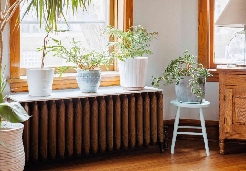
- Add life: Plants look amazing against Studio Green. The foliage pops, and the color makes your ficus or monstera look extra lush.
- Test furniture colors: Mid-tone woods like oak, walnut, or teak usually pair beautifully. Very dark wood can disappear into the walls; very pale wood can feel too stark unless it’s repeated throughout the room.
Real-Life Experiences with Studio Green No. 93
Designers and homeowners who take the plunge with Studio Green tend to become evangelists for it. Here are a few common themes people report once the paint dries (and they’ve stopped nervously pacing around the room).
“I Thought It Would Be Too DarkNow I Never Want to Leave the Room”
Many people start with a test wall convinced the shade will be overwhelming. The surprise is how restful it feels once the space is fully painted. Rather than bouncing around, light settles softly on the walls, which makes screens, books, and artwork easier to focus on. In a living room, this can create a “movie night” atmosphere 24/7ideal if you love cozy evenings more than bright, airy afternoons.
One common experience: guests will walk in, pause, and say something like, “I would never have thought to choose this color, but it feels amazing in here.” That’s Studio Green’s superpower: bold but not shouty.
A Game-Changer for Tired Kitchens
Another popular use is rescuing dated or basic cabinetry. Think: standard white shaker cabinets that look a little too builder-grade. Painting the lowersor all the cabinetsin Studio Green instantly makes them feel custom. Pair with simple hardware in warm brass or black, and suddenly your kitchen looks like it belongs in a design magazine instead of a rental listing.
Homeowners often report that they start cooking at home more after the update, not just because the kitchen looks better, but because the space feels grounded and intentional. The color frames the counters, backsplash, and open shelves, making everything from copper pans to simple white plates stand out.
Small Spaces That Feel Like Jewel Boxes
Powder rooms, entryways, and tiny home offices are where Studio Green really shines for the color-curious. These are usually quick paint projects that don’t require moving tons of furniture, and the payoff is huge.
In a powder room, Studio Green on the walls combined with a small pedestal sink and a dramatic mirror turns a purely functional space into a mini design moment. In an entryway, painting the walls and interior side of the front door creates a strong first impression and helps hide scuffs from daily traffic.
Exterior Stories: From “Fine” to Fantastic
Outside, many homeowners start with just a front door in Studio Green, then get hooked. The color often appears more obviously green in daylight, which makes it perfect for cottages, farmhouses, and traditional homes. Against red brick or warm stone, it feels timeless. Against crisp white siding, it adds a sophisticated, almost European note.
It’s also popular for garden structuresthe shed, greenhouse frame, or fence that you’d rather not highlight. Painted in Studio Green, those elements recede visually and let foliage and flowers take the spotlight, creating the illusion of a more polished, cohesive garden.
Lessons Learned from People Who’ve Lived with It
- Don’t skimp on lighting. Almost everyone who loves Studio Green mentions that lamps, wall lights, and dimmers are essential. Once those are in place, the color feels luxurious rather than gloomy.
- Sample generously. People who painted swatches on multiple walls and looked at them over several days were almost always happier with the final result than those who decided from a tiny color card.
- Lean into contrast and texture. Woven baskets, chunky knit throws, linen cushions, patterned rugs, and wood furniture keep the space warm and layered. Glossy surfaces alone can make the room feel colder.
- Expect compliments. Studio Green isn’t a shy shade, and visitors notice it. If you like your home to feel memorable and a little bit unexpected, that’s a major plus.
In short, Studio Green No. 93 is for people who aren’t afraid of a little dramaor who at least want their rooms to look like they aren’t afraid of a little drama. With the right prep, lighting, and pairings, this deep, nuanced green can turn ordinary rooms, doors, and cabinets into rich, inviting spaces that feel timeless and thoughtfully designed.