Table of Contents >> Show >> Hide
- What the Simple Secret Actually Is
- Why Enveloping a Room in Color Works So Well
- How to Choose the Right Color Without Regretting It by Tuesday
- How to Pull Off the Look Like a Designer
- Color Combinations and Examples That Actually Work
- The Most Common Mistakes to Avoid
- What Living With an Enveloping Color Scheme Actually Feels Like
- Final Thoughts
There are decorating tricks that sound complicated, expensive, and just a little smug. Then there is this one: stop treating color like it belongs on only the walls. That is the big idea behind today’s most immersive room color ideas, and it is almost hilariously simple. If you want a room to feel richer, moodier, cozier, or more intentional, let the color keep going. Carry it onto the trim. Let it reach the ceiling. Wrap it around the millwork. Suddenly, the room does not just have a paint color. It has a point of view.
This is the decorating move many designers use when they want a room to feel enveloping instead of merely painted. Rather than chopping up a space with bright white trim, a different ceiling color, and visual stop signs at every corner, they create a continuous color story. The result can feel soft and cocooning, dramatic and polished, or airy and elegant, depending on the hue. It is the same principle behind a great monochromatic outfit: one color, thoughtfully layered, somehow looks more expensive than a closet full of random decisions.
And no, this does not mean every room has to look like a moody jewel box from an art film. A color-drenched room can be deep olive, dusty blue, warm taupe, earthy rust, muted mauve, creamy white, or even a quiet gray-green that whispers instead of shouts. The secret is not simply “pick a bold color and go wild.” The secret is continuity. That is what makes the room feel designed rather than decorated in a panic on a Saturday afternoon.
What the Simple Secret Actually Is
The short version is this: if you want to envelop a room in color, use one dominant hue across more surfaces than you normally would. Paint the walls, trim, doors, and often the ceiling in the same shade or in very close tonal relatives. Instead of creating contrast between every architectural element, you reduce the visual breaks and let the eye move smoothly around the room.
That is why this trick works so well. Most rooms are full of interruptions: white baseboards, white crown molding, white doors, white ceilings, maybe a random vent trying its best to ruin the mood. Each contrast line slices up the room. When those lines soften or disappear, the space feels more cohesive. You notice the room itself, not the boundaries.
Designers often call this approach color drenching, and it has become one of the most talked-about interior color ideas for good reason. It can flatter traditional millwork, modern built-ins, awkward ceiling angles, and tiny powder rooms that would otherwise look like they gave up halfway through their own makeover.
Why Enveloping a Room in Color Works So Well
It makes the architecture feel intentional
When trim, walls, and ceiling all participate in the same palette, the room feels less pieced together. Crown molding looks integrated instead of tacked on. Built-ins read as part of the architecture. Door casings stop yelling for attention. Even an older room with fussy details can suddenly feel current because the color unifies the bones.
It reduces visual noise
White trim has its place, but it also creates contrast everywhere. If you want a calmer room, fewer hard breaks help. A single-hue scheme lets your eye rest. Artwork pops more. Lighting looks warmer. Upholstery and wood tones feel more considered. The room stops sounding like a committee meeting and starts singing backup in harmony.
It can make a room feel bigger or cozier
Yes, both. Lighter color drenching can blur edges and make a room feel taller and more open. Darker drenching can make a room feel intimate, soft, and cocoon-like. The trick is choosing the effect you want. If your goal is airy, lean lighter and warmer. If your goal is dramatic, saturated hues will do the heavy lifting.
It brings personality back into the house
After years of safe whites and agreeable greiges, many homeowners are craving rooms with actual pulse. Enveloping a room in color gives you that personality without requiring a hundred different accents. You do not need a circus of objects when the room itself sets the tone.
How to Choose the Right Color Without Regretting It by Tuesday
Start with the architecture
One of the smartest designer paint tips is to look at the room before you look at the fan deck. Is the room small and tucked away? A deeper hue may make it feel rich and confident. Is it large, bright, and open? A lighter version of the color may feel more expansive and effortless. Sloped ceilings, alcoves, built-ins, and heavy millwork often benefit from a unified treatment because one color simplifies all those lines.
Let the room’s purpose guide the mood
Bedrooms, reading nooks, and dens usually love cooler muted tones, earthy neutrals, and soft blue-greens. Dining rooms, libraries, and offices can handle richer jewel tones and moodier colors. A powder room is the classic low-risk, high-reward place to get adventurous. It is tiny, it is memorable, and guests will absolutely talk about it in the nicest possible way.
Test more than one version of the color
Do not trust a paint chip under store lighting. Sample the shade on multiple surfaces in the actual room, including the ceiling. Then test one shade lighter and one shade darker than your first choice. Paint changes wildly throughout the day, and ceilings often read stronger than walls. This is one of those boring grown-up steps that saves you from living inside an accidental grape soda.
Use your real life as inspiration
Some of the best room color ideas come from things you already love: a vintage rug, a painting, a favorite ceramic bowl, a worn leather chair, even a jacket you wear every chance you get. If you are drawn to muddy olive, dusty terracotta, stormy blue, or soft putty over and over again, that is not random. That is your palette trying to introduce itself.
How to Pull Off the Look Like a Designer
Paint more than just the walls
If you stop at the walls, you miss the magic. The enveloping effect happens when the trim, baseboards, doors, casings, and sometimes built-ins join the party. In many rooms, the ceiling should come along too. It is often called the fifth wall for a reason. Leaving it bright white can interrupt the mood just when the room was getting good.
Vary the finish, not necessarily the color
A monochromatic room does not have to feel flat. Different sheens create subtle dimension. Think matte or flat on walls, a slightly glossier finish on trim or doors, and a finish choice for the ceiling that suits the room’s condition and lighting. This gives the eye texture to enjoy without breaking up the color story.
Use texture as your secret weapon
If color is the star, texture is the supporting cast that deserves an award. Linen drapes, velvet upholstery, woven shades, nubby throws, plaster finishes, aged wood, and stone all keep the room from feeling one-note. A blue room with boucle, brass, oak, and paper shades feels layered. The same blue room with nothing but flat drywall can feel like a very committed blueberry.
Let nearby rooms shift tonally, not randomly
One of the most helpful interior color ideas is to move from room to room using related hues instead of sharp jumps. If one room is hunter green, the next might lean olive or blue-green. If one room is burgundy, the next might go dusty plum or clay. Tonal transitions feel sophisticated because they create movement without chaos.
Color Combinations and Examples That Actually Work
Some palettes are especially good at creating an enveloping feel:
Dusty blue and blue-gray
These shades are classics for bedrooms, offices, and sitting rooms. They feel tailored without being stiff and moody without becoming dungeon-adjacent. A blue-drenched room paired with cream upholstery, walnut wood, and warm metal lighting looks timeless.
Muddy green and olive
Green is a natural choice for a color-drenched room because it reads grounded and livable. Olive, moss, and smoky sage work beautifully with leather, black accents, stone, unlacquered brass, and vintage art. It is one of the easiest ways to make a space feel both fresh and old-soul at the same time.
Rust, terracotta, and earthy red
These shades bring warmth, especially in dining rooms and studies. They feel bold without veering neon, and they pair beautifully with cream, tobacco, deep green, and dark wood. Done well, they feel collected and elegant. Done badly, they feel like a cinnamon challenge. Sampling is your friend.
Taupe, mushroom, and warm neutral tones
Not every enveloping room has to be dramatic. A taupe or mushroom room can be incredibly sophisticated, especially when the trim and ceiling match. These tones are perfect for people who want the softness of a neutral but not the sterile feeling of standard builder white.
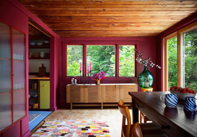
Mauve, plum, and softened berry tones
These are having a well-deserved moment. In the right light, they feel warm, flattering, and surprisingly versatile. Pair them with deep brown, antique brass, and creamy textiles for a look that feels current yet romantic.
The Most Common Mistakes to Avoid
Leaving random white elements behind
A white lampshade, white vent cover, or white ceiling can break the illusion fast. Not every object has to match, but the highly visible built-in surfaces should feel intentional. Even swapping out a basic white shade for linen or a colored version can make the palette feel more complete.
Ignoring lighting
A color that looks rich and soulful at noon can look muddy at night. Natural light, lamp light, bulbs, shadows, and window direction all matter. Test your sample morning, afternoon, and evening before committing.
Choosing contrast when you really want immersion
If your dream room is cozy and enveloping, crisp white trim may work against you. Contrast is not wrong, but it creates a different effect. Be honest about the mood you want before making trim decisions.
Forgetting furnishings and finishes
The wall color is not working alone. Floors, rugs, countertops, stone, wood tones, and upholstery all have a vote. A smart monochromatic room respects those existing materials and builds around them rather than pretending they are not in the room.
What Living With an Enveloping Color Scheme Actually Feels Like
Here is the part that paint chips cannot show you: a room wrapped in color changes the experience of being in it. It is not only about what the room looks like in a photo. It is about how the room behaves around your life.
In the morning, an enveloping room often feels gentler. Without the sharp interruption of bright white trim and ceiling lines, the light enters more softly. A muted blue bedroom can feel almost misty at sunrise. A warm taupe office can make early coffee and a laptop look strangely elegant, which is no small miracle. Even a darker green den can feel restful rather than heavy when sunlight moves across one continuous color surface.
At night, the effect gets even better. Lamps cast warmer pools of light, and the room feels collected around you. In a dining room drenched in rust, plum, olive, or smoky blue, dinner somehow feels more intentional, even if the menu is takeout eaten from heroic levels of denial. The space feels complete. The mood is built in. You are not relying on decor to create atmosphere because the color already did the job.
People also tend to notice something unexpected: clutter becomes less bossy. That does not mean a color-drenched room can replace a closet, sadly. But when the architecture is unified, the eye is not bouncing from white trim to white ceiling to dark wall to pale door. Books, plants, art, and furniture settle into the scene more naturally. The room feels quieter even when real life is still happening inside it.
There is also a confidence to living with stronger color. Homeowners who try it often say the room starts to feel less generic and more like theirs. That is especially true in older homes with trim, paneling, or sloped ceilings that used to feel awkward. Once those features are painted into the same color family, they stop looking like problems and start looking like personality. A cramped powder room becomes a jewel box. A spare bedroom becomes a retreat. A home office becomes a place where you might actually answer emails without immediately needing a snack break.
Another real-world benefit is seasonal flexibility. Good enveloping colors do not rely on trendy little accents to feel relevant. A muddy green still looks beautiful in summer with woven textures and natural light, then turns cozy in winter with wool, brass, and low lamplight. A blue-gray room can feel crisp in spring and cocooning in fall. Because the palette is tonal, it adapts easily as pillows, flowers, throws, and artwork rotate through the year.
Most importantly, enveloping color creates emotional clarity. Every room sends a message, whether you mean it to or not. A room washed in one thoughtful hue tends to say, “Relax, this is on purpose.” It feels finished. It feels grounded. It feels memorable. And in a world full of homes that look like they were assembled by algorithm, that kind of feeling is more than decoration. It is identity.
Final Thoughts
This designer secret is simple because it is based on one smart shift: treat color as an environment, not an accent. When you carry a hue across the walls, trim, ceiling, and millwork, you create a room that feels cohesive, immersive, and deeply intentional. Whether you choose smoky blue, earthy green, warm taupe, soft mauve, or rich rust, the goal is the same. Let the room be wrapped, not interrupted.
That is what makes this idea so powerful. It is accessible, flexible, and transformative. You are not chasing a gimmick. You are learning how to use color to shape mood, scale, and atmosphere. And once you see how much better a room feels when the color keeps going, it is very hard to go back to a lonely wall trying to do all the emotional labor by itself.