Table of Contents >> Show >> Hide
- What Is the Moooi Paper Chandelier, Exactly?
- Why Designers and Homeowners Keep Falling for It
- The “High” Option: Why the Original Is Still the Dream Piece
- The “Low” Option: How to Get the Look Without Buying a Direct Copy
- Where a Moooi-Style Chandelier Works Best
- How to Size and Hang It Without Regret
- Is the Moooi Chandelier Worth It?
- Experience: What Living With a High/Low Moooi Chandelier Look Actually Feels Like
- Final Thoughts
- SEO Tags
If you love lighting that makes guests stop mid-sentence and ask, “Wait, is that made of paper?” then congratulations: you have entered the wonderfully weird world of the Moooi chandelier. More specifically, the conversation here is really about the Moooi Paper Chandelier, the iconic Studio Job design that helped turn a classic candelabra silhouette into something playful, sculptural, and just a little bit mischievous. It looks aristocratic, but it also looks like it might have skipped out of an art studio with glue on its sleeve. That tension is exactly why people still talk about it.
The phrase “high/low Moooi chandelier” has legs because this fixture sits at the intersection of two design fantasies. The first is the dream of owning the real thing: a statement chandelier from a globally known design brand, made with unusual materials and serious artistic intent. The second is the much more relatable dream of getting that same mood for less money, less stress, and fewer moments of staring at your ceiling joists like they personally betrayed you.
And that is what makes this topic so much fun. The Moooi look is not just about buying a lamp. It is about understanding why the original works so well, what details give it its charm, and how to recreate that energy without ending up with a sad imitation that looks like it lost a fight with a craft store.
What Is the Moooi Paper Chandelier, Exactly?
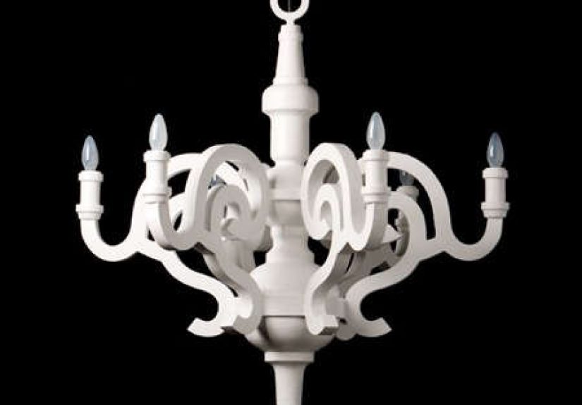
The original Paper Chandelier was created by Studio Job for Moooi, and it became one of those rare pieces that feels both familiar and surprising. At a glance, it reads like a traditional chandelier: scrolling arms, candle-style lights, and an old-world profile that nods to Rococo and classical European interiors. But then the materials step in and steal the scene. Instead of crystal and metal pomp, the piece is made from paper, cardboard, and papier-mâché. That material choice turns the chandelier into a visual joke, an art object, and a serious design piece all at once.
That contrast is the entire magic trick. The Paper Chandelier borrows the silhouette of something grand and historical, then remakes it in humble, nostalgic materials that remind people of school projects, hand-built models, and the thrill of making something out of almost nothing. It is luxurious, but with a wink. Fancy, but not uptight. Baroque, but weirdly approachable.
In many versions, the chandelier is presented in a clean monochromatic finish, often white, which lets the form do the heavy lifting. Some models are shown with shades, while others lean into a bare candelabra look. Either way, the result is less “Versailles” and more “Versailles after attending design school and learning how to be ironic.”
Why Designers and Homeowners Keep Falling for It
There are plenty of statement lights on the market, but the Moooi Paper Chandelier keeps popping up in design conversations because it solves a difficult problem: it is dramatic without being overly glittery. Not everyone wants a room that screams crystal palace. Some people want a fixture with presence, but also personality. The Paper Chandelier delivers both.
First, it has a strong sculptural silhouette. Even when the light is off, it acts like art. That matters in rooms where a chandelier is expected to carry visual weight all day, not just after sunset. Second, its material palette softens the form. The chandelier can feel grand, but it rarely feels cold. Third, it has a kind of visual humor. Good design does not always need to be solemn. Sometimes the best interiors are the ones that make you smile before they make you nod respectfully.
There is also a practical reason this design has staying power: it bridges styles. Put it in a minimalist room and it becomes the star. Put it in a traditional room and it becomes the twist. Put it in an eclectic room and it looks like it has been waiting there all along, sipping espresso and judging your throw pillows in a supportive way.
The “High” Option: Why the Original Is Still the Dream Piece
Let’s talk about the expensive elephant hanging from the ceiling. The real Moooi Paper Chandelier is a luxury purchase, and today it sits firmly in investment-piece territory. That should not scare people off, but it should frame expectations correctly. This is not the kind of fixture you buy because you merely need overhead light. This is the kind you buy because you want a room to have a point of view.
The original earns its reputation through a few things budget versions often miss. The proportions are cleaner. The curves feel intentional rather than clumsy. The finish usually looks more refined and less plasticky. And because the design comes from a strong conceptual foundation, the piece feels coherent. Nothing looks random. Every flourish belongs there.
That matters more than people think. A chandelier like this depends on balance. If the arms are too bulky, the whole thing starts looking cartoonish. If the finish is too shiny, it loses that matte, sculptural charm. If the scale is off, the magic disappears. The original works because it understands where drama should stop. It is expressive, but controlled.
The high-end version also tends to make more sense in interiors that already have some design confidence. If your room has thoughtful furniture, solid architecture, and enough breathing space, the Moooi chandelier does not feel excessive. It feels right at home. In a cramped room with low ceilings and visual clutter, though, even a beautiful chandelier can start to feel like it is trying too hard. No light fixture, however iconic, can save a room that is also moonlighting as a storage unit.
The “Low” Option: How to Get the Look Without Buying a Direct Copy
Here is the smartest way to approach the low side of the high/low equation: do not chase a one-to-one knockoff if you can avoid it. That route often ends in disappointment, questionable quality, and a fixture that photographs better than it lives. Instead, chase the design language.
1. Prioritize silhouette over branding
If you want the Moooi mood, start with the outline. Look for chandeliers with curling arms, candle-inspired bulbs, and a slightly theatrical profile. The shape is what reads from across the room. If the silhouette is strong, you are already halfway there.
2. Choose matte finishes
The Paper Chandelier works partly because it feels soft and sculptural, not glossy and over-polished. Matte white, chalky ivory, plaster-like finishes, and even paper-composite textures will usually get you closer to the original spirit than anything too reflective.
3. Embrace playful materials
Paper, resin, composite, plaster-look finishes, and lightweight molded materials can all echo the original’s “humble material, grand gesture” philosophy. If your affordable option looks too metallic or too industrial, you may lose the whimsical tension that makes the Moooi piece special.
4. Let the room do part of the work
A budget chandelier can look much more expensive when the styling around it is calm and deliberate. Give it breathing room. Pair it with clean walls, a strong table, restrained textiles, and maybe one or two vintage accents. If everything in the room is yelling, the light cannot flirt. It can only panic.
5. Avoid cheap fake “ornate” details
This is the trap. Overwrought faux carving, brittle plastic flourishes, and suspiciously shiny “distressed” finishes usually read as costume jewelry. The original Moooi design is witty, but it is not tacky. Your affordable version should feel edited, not overdecorated.
In other words, getting the look for less is less about finding “the same chandelier, but cheaper” and more about capturing the same emotional effect: a classic shape made fresh, slightly surreal, and memorable.
Where a Moooi-Style Chandelier Works Best
The beauty of this style is its versatility. It can be used in more places than people expect, though some rooms are especially good matches.
Dining Room
This is the obvious winner. A sculptural chandelier above a dining table creates instant ceremony. Meals feel a little more intentional, even when dinner is just takeout and a heroic attempt to make a bagged salad feel personal.
Entryway
If you have the ceiling height, this is a brilliant place for a high/low Moooi-inspired piece. It introduces your design personality immediately and turns a transition space into a moment.
Bedroom
Yes, a chandelier in a bedroom can be excellent, especially if the rest of the room is soft, layered, and a little romantic. The key is maintaining proper clearance and keeping the scale proportionate.
Living Room
In a living room, this chandelier works best when it is clearly the anchor. It should not have to wrestle with an overly busy coffee table, a hyper-patterned rug, and six other “statement” pieces. Every room has a social battery. Do not drain it.
How to Size and Hang It Without Regret
Even the best chandelier can look awkward if it is the wrong size or hung at the wrong height. Fortunately, there are a few dependable guidelines that help.
For general room sizing, a common rule is to add the room’s length and width in feet, then use that number in inches as a starting point for chandelier diameter. So if your room is 12 feet by 14 feet, a chandelier around 26 inches wide is a reasonable baseline. With statement pieces, you can bend that rule a bit, but it is still a useful checkpoint.
Over a dining table, many experts recommend choosing a fixture that is about one-half to two-thirds the width of the table. If you go too small, the chandelier looks timid. If you go too large, it can dominate the table like a diva who missed the rehearsal memo.
As for hanging height, a chandelier above a dining table typically sits about 30 to 36 inches above the tabletop. In rooms with taller ceilings, you can raise it a bit. In open spaces such as bedrooms, foyers, or circulation areas, keep the bottom of the fixture at least 7 feet above the floor to preserve head clearance and visual comfort.
These rules matter even more with a Moooi-style chandelier because the shape is expressive. The fixture already draws attention. If it hangs too high, it loses intimacy. If it hangs too low, it becomes less “design icon” and more “ceiling ambush.”
Is the Moooi Chandelier Worth It?
If you are asking whether the original Moooi Paper Chandelier is worth its premium price, the honest answer is: it depends on what you value. If you want a conversation piece with design pedigree, sculptural presence, and a genuinely original concept, then yes, it makes a compelling case. If you mainly need good ambient light at a reasonable cost, then no, there are far more practical options.
But practical is not always the point. Great interiors are not built on practicality alone. They are built on decisions that create mood, memory, and identity. A chandelier like this can change how a room feels even before anyone flips the switch. That is hard to measure, but easy to notice.
For many people, the sweet spot is not necessarily buying the original. It is learning from the original. Study the proportions. Notice the finish. Borrow the contrast between classic form and playful material. Then decide whether your budget belongs to the real piece, a reinterpretation, or a clever room plan that captures the same magic.
Experience: What Living With a High/Low Moooi Chandelier Look Actually Feels Like
Here is the part glossy product listings usually skip: what the chandelier experience is like once you stop admiring it online and start living under it. In real rooms, a Moooi-style chandelier changes more than the light. It changes behavior. It changes the atmosphere. It even changes how people talk about the room.
In an entryway, the effect is immediate. Guests notice it before they notice your console table, your art, or the fact that you definitely meant to leave those shoes there in a casually curated way. A chandelier with this kind of shape creates anticipation. It tells people they are walking into a home with opinions, and good ones. Even if the rest of the space is fairly simple, the fixture gives the room a sense of intention.
In a dining room, the experience becomes more emotional. A Moooi-inspired chandelier creates a bubble of ceremony over the table. Weeknight pasta feels slightly more glamorous. Coffee with a friend feels more like a meeting worth dressing for. Holiday dinners benefit most because the light adds theater without needing seasonal decorations to do all the work. It is one of those rare pieces that can make a room feel festive without a single garland in sight.
In bedrooms, the mood is softer but just as powerful. A chandelier with a baroque silhouette and a matte finish can make the room feel dreamy instead of showy. The trick is balance. Too many ornate accessories, and the space starts feeling costume-like. But pair the light with crisp bedding, gentle textures, and a restrained palette, and the room takes on that boutique-hotel quality people are always chasing.
There is also the daily practical experience. Chandeliers like this are not invisible background objects. You see them all the time. Morning light hits them differently than evening light. Shadows shift. The silhouette becomes part of the room’s rhythm. That means you should choose one you genuinely enjoy looking at, not just one that seemed trendy in a mood board at 11:47 p.m.
The high/low version of this experience is especially interesting. When you buy the original, you are living with a piece that carries brand history and design credibility. That can be satisfying if you care deeply about authorship and collectible design. When you create the look for less, the pleasure is different. It is the satisfaction of having captured a mood intelligently. You still get the drama, the softness, and the conversation-starting silhouette, but with more budget left for the rug, paint, or the shockingly expensive electrician visit nobody warned you about.
And yes, people do talk about it. They ask whether it is vintage. They ask whether it is paper. They ask whether it was hard to install. They ask where you found it. Good lighting invites curiosity. Great lighting makes people remember the room long after they leave. That is the real experience you are buying into, whether you go high, low, or somewhere smartly in between.
Final Thoughts
The genius of the Moooi Paper Chandelier is not just that it looks beautiful. It is that it takes a familiar chandelier archetype and makes it feel strange again in the best possible way. That is hard to do. It is even harder to do with humor, elegance, and enough restraint to keep the piece from becoming a gimmick.
If you want the original, buy it because you love its design intelligence, not just its name. If you want the look for less, focus on silhouette, finish, scale, and atmosphere instead of chasing a cheap imitation. Either way, the lesson is the same: good lighting does not merely brighten a room. It edits the mood, sharpens the architecture, and tells people something about your taste before you say a single word.
And honestly, that is a lot of power for something hanging from a hook.