Table of Contents >> Show >> Hide
- Why an Aesthetic Phone Setup Works
- 1. Pick One Visual Theme and Commit to It
- 2. Clean Up Your Home Screen Like a Stylist, Not a Hoarder
- 3. Style the Outside of Your Phone Too
- Simple Aesthetic Phone Ideas by Style
- Mistakes That Ruin an Aesthetic Phone Setup
- Conclusion
- Real-Life Experiences: What Happens When You Actually Try This
Your phone is basically your tiny glass roommate. It wakes you up, shows you memes, remembers your passwords, and judges your screen time in silence. So if you are going to stare at it for hours every week, it might as well look good.
The good news is that making your phone look aesthetic does not require a design degree, a ring light, or a shocking level of emotional commitment to beige. In most cases, you only need a clear visual direction, a smarter home screen setup, and a few accessories that make your device feel polished instead of randomly assembled.
Whether you use an iPhone, a Samsung Galaxy, a Pixel, or another Android device, the same idea applies: the prettiest phones are not the ones with the most stuff on them. They are the ones where every visual choice feels intentional. Think matching colors, cleaner layouts, useful widgets, and accessories that add style without turning your phone into a glittery brick.
Below are three simple ways to make your phone look aesthetic, plus practical tips for choosing wallpapers, organizing icons, styling widgets, and adding accessories that improve both looks and everyday use.
Why an Aesthetic Phone Setup Works
An aesthetic phone is not just about being cute for social media screenshots. A thoughtful setup can make your device easier to use. When colors match, widgets are useful, and clutter is reduced, your screen feels calmer and more intentional. You spend less time hunting for apps and more time actually doing what you opened the phone to do in the first place.
That balance matters. The best phone setup is where style and function stop arguing and decide to split the rent. A wallpaper that complements your icons, a widget that looks good and gives useful information, and a case that protects the phone while matching your vibe all work together. That is the secret.
1. Pick One Visual Theme and Commit to It
The fastest way to make your phone look aesthetic is to stop decorating it like five different people borrowed it over the weekend. Pick one visual direction and build around it.
Choose a Theme Before You Change Anything
Start by choosing a theme that reflects your style. This could be minimal black and white, soft pastel, warm neutral tones, retro color pops, dark mode with high contrast, nature-inspired greens, or a clean modern setup with subtle gradients. The exact style does not matter nearly as much as consistency.
If you skip this step, you end up with a moody wallpaper, neon icons, a sparkly widget, and a floral case all fighting for attention like contestants on a reality show. Cute individually. Chaotic together.
Match Your Wallpaper to the Mood
Your wallpaper sets the tone for everything else. If you want a cleaner look, pick a background with negative space so icons and widgets do not feel crowded. Soft gradients, minimalist illustrations, monochrome photography, abstract textures, and subtle landscape images often work especially well.
If your wallpaper is busy, your home screen can look cluttered even when it technically is not. A great rule is this: if the wallpaper is doing a lot, let the icons and widgets do less. If the wallpaper is simple, you have more room to play with bolder widgets or custom icon colors.
Use Colors That Belong Together
Aesthetic phone setups usually look good because the colors feel coordinated. You do not need to be a color expert. Just choose two or three colors and repeat them throughout the setup. For example:
- Cream, taupe, and soft brown for a warm neutral look
- Black, charcoal, and silver for a sleek modern look
- Sage, off-white, and dusty pink for a soft lifestyle vibe
- Navy, white, and muted gold for a crisp polished setup
Many phones now make this easier. iPhone users can customize the appearance of app icons and widgets, while Android devices often offer wallpaper-based color matching, themed icons, or style controls that help the interface feel more unified. That means the software is finally helping your phone stop looking like it got dressed in the dark.
Keep the Lock Screen and Home Screen Related
Your lock screen and home screen do not have to be identical, but they should feel like cousins who actually speak to each other. If your lock screen uses a clean photo in soft blue tones, your home screen should probably not scream bright red comic book energy.
Try pairing them this way:
- Lock screen: more visual, artistic, or photo-based
- Home screen: simpler, cleaner, easier to read
This approach makes the phone feel styled without sacrificing usability.
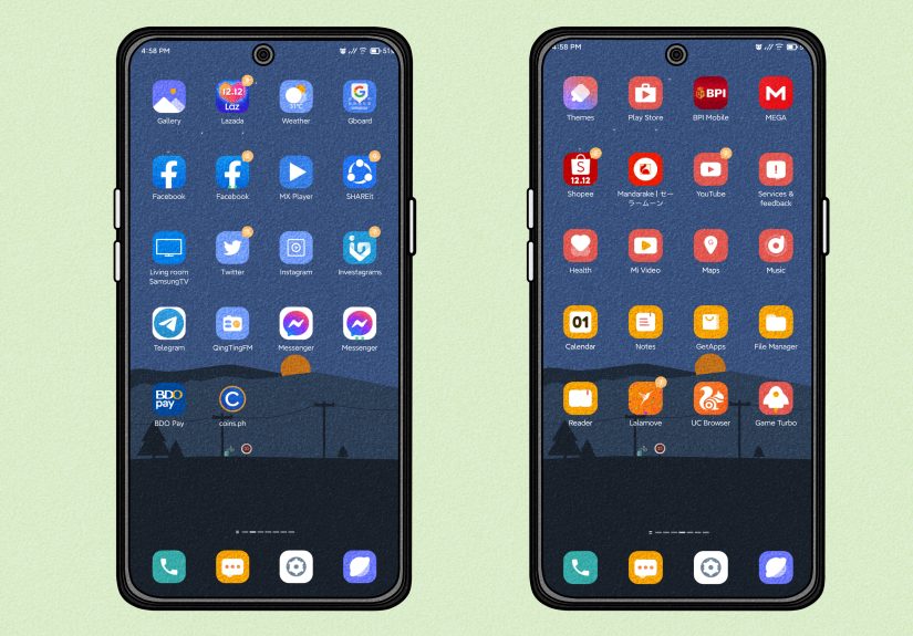
2. Clean Up Your Home Screen Like a Stylist, Not a Hoarder
Once your color direction is set, the next step is organization. Aesthetic phones are rarely crowded. They feel curated. That does not mean empty for the sake of emptiness. It means every icon, folder, and widget has a reason to be there.
Remove the Visual Noise
Start by clearing out anything you do not use regularly on your main screen. If an app is not essential, move it to the App Library, app drawer, or a secondary page. Leave only your most-used tools on page one.
This one change can make a phone look more premium in about three minutes. Suddenly there is breathing room. Suddenly your wallpaper can exist without being smothered by forty-seven apps you last touched during a very specific phase of your life.
Use Folders, But Do Not Overpack Them
Folders help, but they are not a junk drawer for digital chaos. Group similar apps together in a way that makes sense: social, finance, travel, editing, health, shopping, or work. Name them simply. Cute folder titles can be fun, but clarity matters more than performance art.
If one folder has 23 apps in it, that is not organization. That is a tiny suitcase packed by optimism.
Limit Yourself to a Few Widgets
Widgets are one of the easiest ways to make your phone look aesthetic, but they work best when chosen carefully. Good widget choices usually do at least one of these things:
- Show information you actually need, like weather, calendar, reminders, battery, or fitness stats
- Support the visual theme through matching color, transparency, font, or shape
- Create structure on the screen so the layout feels intentional
A common mistake is adding too many widgets just because they look nice. The result is often a home screen that feels crowded and confusing. One or two well-placed widgets usually look better than four that all compete for attention.
Think in Layouts, Not Just Icons
Instead of placing apps randomly, think of your screen as a layout. You can build a cleaner look by aligning elements with purpose. For example:
- A large widget at the top, with two rows of favorite apps below
- A left-aligned cluster of icons with open space on the right
- A symmetrical grid with one focal widget in the center
- A bottom-heavy layout that keeps the upper area visually quiet
Blank space is not wasted space. It is what makes the design feel breathable. Some of the best-looking phones are attractive precisely because they do not fill every inch of the screen.
Customize Icons Without Losing Function
If you want a truly aesthetic phone, icon styling can make a huge difference. On some phones, you can tint icons, switch icon styles, apply themed icons, use theme packs, or install icon packs through built-in tools or customization apps. Android users often have more freedom here, while iPhone users can also style icons creatively through customization tools and shortcuts.
But be careful. A gorgeous icon pack that makes every app impossible to identify is a little like buying a beautiful bookshelf and then removing all the book titles. Stylish, yes. Useful, no.
Try these icon rules:
- Keep icon colors within your chosen palette
- Use one icon style across the whole screen
- Do not sacrifice readability for trendiness
- Test the setup for a day before fully committing
3. Style the Outside of Your Phone Too
Aesthetic does not stop at the screen. The physical look of your phone matters just as much, especially because other people actually see that part. A well-chosen case, grip, or stand can make your device feel finished instead of halfway dressed.
Pick a Case That Matches Your Screen Style
If your digital setup is soft and minimal, a chunky neon case may ruin the mood. If your screen style is bold and graphic, a plain clear case may feel underwhelming. Try to match the exterior to the same design language as the inside.
Some easy aesthetic case directions include:
- Clear case with a clean wallpaper for a modern look
- Matte solid-color case for minimal setups
- Textured fabric or leather-like case for a richer feel
- Printed case with subtle art, florals, or abstract designs for more personality
Also remember that a beautiful case should still protect the phone. The goal is stylish and practical, not elegant and one drop away from disaster.
Add a Grip or Stand That Looks Intentional
Phone grips, kickstands, loops, and magnetic accessories can do more than make the phone easier to hold. They also change the overall look. A minimal grip in a matching tone can make the back of the phone feel designed rather than accidental.
This is especially useful if you watch videos, take a lot of selfies, or are constantly one slippery coffee moment away from dropping your device. A grip or stand can add convenience while still looking sleek if you choose the right finish and shape.
Do Not Ignore Small Details
Little upgrades can quietly improve the whole aesthetic. A coordinated charging cable, a cleaner lock screen clock style, a matching watch face, or a polished widget font can make the setup feel more complete. None of these changes are dramatic alone, but together they create that satisfying “wow, this looks put together” effect.
This is the difference between decorating and styling. Decorating adds things. Styling edits them.
Simple Aesthetic Phone Ideas by Style
Minimalist
Use a grayscale wallpaper, large clean icons, one clock widget, and a matte black or white case. Keep only the essentials on the main page.
Soft and Cozy
Choose beige, blush, or sage tones, a subtle photo background, rounded widgets, and a cream or translucent case. Add a small calendar or weather widget for balance.
Bold and Modern
Use a strong contrast wallpaper, dark mode, geometric icons, and a sleek case in black, navy, or metallic tones. Keep the layout sharp and structured.
Creative and Playful
Try illustrated wallpapers, colorful widgets, fun folder names, and a printed case that still matches your palette. This style works best when the colors are still coordinated.
Mistakes That Ruin an Aesthetic Phone Setup
- Using too many colors without a clear theme
- Packing the home screen with every app you own
- Choosing a wallpaper that makes icons hard to see
- Adding widgets that look nice but do nothing useful
- Mixing case styles and screen styles that clash
- Following trends that do not actually suit how you use your phone
The point is not to copy somebody else’s setup exactly. It is to create a phone that feels like your style, your habits, and your taste. The most aesthetic phone is usually the one that looks personal without looking messy.
Conclusion
If you want to make your phone look aesthetic, start simple. First, choose a clear visual theme so your wallpaper, colors, and icons feel cohesive. Second, clean up your home screen so it looks intentional instead of overcrowded. Third, style the outside of your phone with a case or accessory that supports the same vibe.
That is really it. You do not need to spend a fortune or rebuild your digital life from scratch. A few smart changes can make your phone feel cleaner, prettier, and more enjoyable to use every day. And honestly, opening a phone that looks good is a tiny joy that adds up fast.
Your phone works hard. It deserves better than visual chaos.
Real-Life Experiences: What Happens When You Actually Try This
One of the most interesting things about making your phone look aesthetic is how quickly it changes the way you feel about a device you already own. People often assume they need a brand-new phone to get that fresh, satisfying feeling, but sometimes what they really need is a better setup. A new wallpaper, a smarter layout, and a case that finally matches the overall style can make the same old phone feel surprisingly new.
A lot of people start with the wallpaper because it feels easy. They switch from a default background to something softer, moodier, or more minimal, and immediately notice the phone feels less generic. Then they reorganize the main screen and realize half the apps they kept visible were never truly needed there in the first place. That first cleanup often feels oddly satisfying, like clearing a messy desk and suddenly being able to think again.
There is also a practical side to the experience. Once users reduce clutter and keep only favorite apps on the main screen, they usually move faster through everyday tasks. Aesthetic design is often treated like a luxury, but in real life it can improve convenience. A cleaner home screen means less visual noise. A useful widget means fewer taps. A better grip or stand means fewer near-drops while texting one-handed in a grocery store line, which is a very specific modern survival skill.
Another common experience is learning that “aesthetic” does not always mean trendy. Someone might copy a dramatic setup they saw online, complete with ultra-custom icons and decorative widgets, only to realize it looks great in screenshots and feels terrible in daily use. Maybe the app icons are too abstract. Maybe the text is hard to read. Maybe the wallpaper is so busy that every notification looks like it is hiding in a hedge. After a few days, most people naturally move toward a setup that balances beauty with clarity.
That is usually when the phone starts to feel truly personal. The best setups are rarely the most extreme ones. They are the ones that reflect real habits. A student may want a calendar and notes widget front and center. A busy parent may prioritize reminders, weather, and quick camera access. Someone who loves photography may build the whole screen around a favorite image and keep the rest minimal. The aesthetic part works better when it grows from real life rather than fighting against it.
There is also something fun about the outside of the phone changing with the inside. A person who once bought any random protective case may suddenly notice how much better the whole device looks when the case color matches the wallpaper palette. Add a subtle grip, a coordinated strap, or a cleaner stand, and the phone feels complete. Not flashy. Just considered.
In the end, the experience is less about perfection and more about intention. You try a few things, remove what does not work, and keep what feels good. That process alone makes the phone feel more like yours. And for something you use every day, that small shift can be surprisingly delightful.