Table of Contents >> Show >> Hide
- A Historic House with Good Bones and Bad Interruptions
- The Real Design Brief: Make It Feel Like a Palate Cleanser
- How the Floor Plan Does the Emotional Heavy Lifting
- Materials That Hush Instead of Shout
- Natural Light, Privacy, and the Soft Glow Problem
- Old-House Respect Without Historic Freeze-Drying
- Why the Radiant Heat and Hidden Storage Matter More Than the Pretty Photos
- Why This House Feels So Timely
- Related Experiences: What It Feels Like to Live in a House Designed for Peace and Quiet
Some renovations are about showing off. Bigger island. Louder backsplash. A chandelier so dramatic it deserves its own talent agent. This Westchester County remodel by TBo Architects goes in the opposite direction, and that is exactly why it works so beautifully. In Pelham, New York, Thom Dalmas and Bretaigne Walliser of TBo took a 1910 Mediterranean-style house with great bones, too many awkward edits, and plenty of natural promise, then transformed it into something much rarer than a “dream home”: a genuinely calming one.
The project is compelling not because it screams for attention, but because it whispers with confidence. A Brooklyn family moved north in search of breathing room and found a fixer-upper with a terracotta-tiled roof, generous windows, and the kind of old-house charm that makes people say things like, “It has potential,” right before discovering twelve layers of paint and several questionable decisions from previous owners. Instead of treating the home like a museum piece or bulldozing its character in the name of “modernization,” TBo did something smarter. The architects kept what mattered, removed what didn’t, and designed for a brief that was surprisingly specific: create peace and quiet.
That request gives the whole renovation its soul. This was not just a cosmetic makeover for a historic house in Westchester County. It was an exercise in emotional architecture: how do you make a family home feel lighter, slower, and less overstimulating without making it sterile or cold? TBo’s answer is a masterclass in restraint, circulation, storage, texture, and light. The result is a 1910 house remodel that feels contemporary without becoming generic, minimal without being severe, and elegant without trying too hard. In the age of overdesigned everything, that is practically rebellious.
A Historic House with Good Bones and Bad Interruptions
Before the renovation, the house had what many early-20th-century homes have after decades of piecemeal updates: charm on the outside, confusion on the inside. The exterior needed only cosmetic improvements, but the interior had become a patchwork of small, dark rooms, awkward circulation, and accumulated interventions that diluted the home’s original logic. TBo approached the problem like editors rather than stylists. Instead of layering on decorative tricks, they first asked a more important question: what is this house trying to be?
The answer was not hidden in trend forecasts or mood boards with 47 shades of oatmeal. It was already there in the architecture. The property offered light, nature, and a strong connection to site. Those qualities just needed to be recovered. So TBo reconfigured the ground floor, opened the family zones, removed closets behind the central stair, and restored a more intuitive relationship between kitchen, dining, living, and work areas. The genius here is that the house now feels more open without losing the intimacy that old homes do so well.
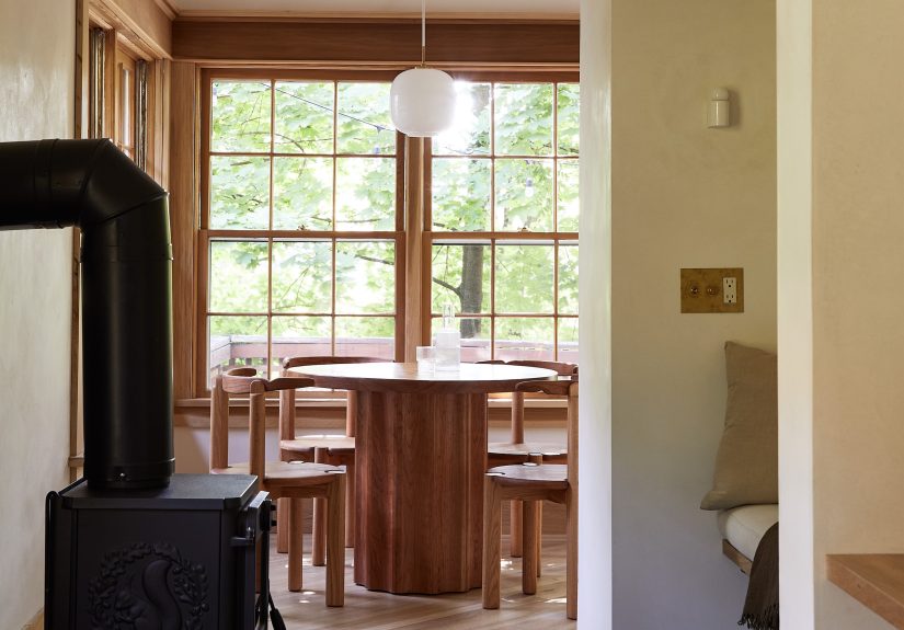
That balance matters. Plenty of renovations flatten historic houses into one giant room where the only privacy available is emotional. TBo resisted that trap. Yes, the floor plan is brighter and more connected, but it also includes pockets of retreat: a breakfast nook, an inglenook by a stove, a built-in desk area, and quiet zones integrated into the open plan. The home does not force constant togetherness. It permits family life while still making room for solitude, which may be the most luxurious feature of all.
The Real Design Brief: Make It Feel Like a Palate Cleanser
The homeowners reportedly wanted the house to function as a refuge from overstimulation, and that idea explains nearly every design move. This is not minimalism as performance. It is minimalism as relief. The spaces are visually quiet, but not empty. There is storage everywhere, but it does not wave a flag and announce itself. The architecture does the heavy lifting so daily life can feel easier.
That distinction is crucial for anyone interested in peaceful interior design. A calm house is not created by deleting personality and buying beige objects until the room looks like a luxury candle ad. It is created by reducing friction. In this project, that means better flow, more daylight, fewer visual interruptions, softer surfaces, and built-ins that keep clutter from becoming the unpaid intern running the household.
TBo’s discipline shows in the way the house has been pared back “almost monastic” in its simplicity while still feeling warm and lived-in. Original wood casework was stripped back to reveal texture and depth. Old warped floors were replaced with character-grade white oak laid diagonally, giving the rooms subtle movement without visual noise. Limewash and plaster finishes soften the walls rather than turning them into slick, hard planes. Everywhere you look, the message is the same: less spectacle, more atmosphere.
How the Floor Plan Does the Emotional Heavy Lifting
The renovation’s smartest move may be the floor plan itself. Formerly divided rooms on the north side of the house were opened into a generous kitchen, dining, and breakfast zone, while circulation improved through the removal of unnecessary barriers. But TBo did not simply create “open concept” in the broad, developer-grade sense. They created what might be called selective openness.
That means the common areas flow together, but the architecture still choreographs moments of pause. The breakfast area feels tucked in. The inglenook offers literal and emotional warmth. The office nook gives a home workspace a sense of place without making work the main character of family life. Even the cabinetry acts like architecture, helping define zones without shutting down light.
The Pantry Volume That Solves Half the House
One of the standout features is the floor-to-ceiling plaster-and-millwork volume that anchors the kitchen. It contains pantries, integrated appliances, niches, storage, and the back side of a bench near the inglenook. In plain English, it is a wildly hardworking room divider that also looks serene. This is the sort of move that makes architects grin and homeowners sleep better at night.
Why? Because multifunctional built-ins are one of the easiest ways to make a family house feel larger, calmer, and more organized without adding square footage. The cabinet bank is not just pretty; it is tactical. It hides visual clutter, defines space, supports daily rituals, and reduces the need for freestanding furniture. In a historic home renovation, that is a particularly elegant strategy because it keeps the room from filling up with too many competing objects.
Materials That Hush Instead of Shout
If the layout creates calm, the material palette sustains it. TBo selected finishes with softness, depth, and a kind of low-volume confidence. The white oak flooring, laid diagonally with edge banding, gives the new plan a quiet rhythm. Lime paint adds nuance without fuss. Plaster surfaces create a hand-worked, almost breathable quality that flat paint rarely achieves. In the bathroom, tadelakt and cement tile make the room feel tactile and grounded rather than glossy and disposable.
The palette also proves an important point about minimalist family homes: restraint does not mean blandness. This house uses creamy woods, earthy plaster, mossy tile, pale green quartzite, linen, wool, and oak-backed details to create depth through texture instead of excessive contrast. The result is a soothing interior with actual character. It feels old and new at the same time, which is exactly what the best historic home renovations should do.
There is also a pleasing honesty to the material choices. The stripped original casework stays gloriously wooden. The fireplace surround and niches feel handmade. The restored bathtub keeps a thread of continuity upstairs. Nothing feels fake-aged, excessively polished, or staged within an inch of its life. This is a house that respects patina without worshipping inconvenience.
Natural Light, Privacy, and the Soft Glow Problem
One of the homeowners’ stated goals was a “suffused glow” that would encourage slowness and stillness. Frankly, that is a much better design target than “make it look expensive.” TBo pursued that glow in several ways. Overgrown landscaping was tamed so light could filter inside. New window openings and updated double- and triple-hung windows improved brightness and connected interior rooms to the deck and yard. The result is daylight that feels generous but not harsh.
This part of the project aligns with a broader truth in residential design: natural light is not just a visual perk; it shapes how a home is used and experienced. In a renovation like this, better daylighting changes mood, improves orientation, makes rooms feel larger, and reduces the need for daytime artificial lighting. But TBo also understood the other side of the equation. More light should not come at the expense of privacy. So the windows were added strategically, not theatrically, preserving the feeling of shelter even as the rooms opened up.
That shelter is a huge reason the house feels peaceful. A lot of contemporary homes are bright, yes, but also weirdly exposed, as if every moment of domestic life is auditioning for social media. The Pelham house is different. It welcomes light while still protecting inwardness. That is a subtle design achievement, and one that feels increasingly valuable.
Old-House Respect Without Historic Freeze-Drying
Good preservation is not about turning an old house into an untouchable relic. It is about understanding what gives a building its identity and making decisions that protect that identity while allowing real life to happen inside it. TBo handled this with admirable maturity. The original front door and casework were retained and revealed. The exterior was refreshed rather than reinvented. The old tub was restored rather than casually discarded because someone got seduced by a showroom soaking tub with “spa” in the product description.
At the same time, the architects were not sentimental about bad renovations from the past. They removed warped flooring, upgraded heating, reworked circulation, and inserted new windows where the house needed them. This is what makes the project such a strong example of a 1910 house remodel done right. It respects history, but it does not confuse history with stagnation.
That attitude is especially relevant in places like Westchester County, where older housing stock often carries enormous architectural value but also a long record of compromises, add-ons, and functional headaches. The smartest renovations are the ones that recover clarity. In this project, clarity comes not from simplification for its own sake, but from aligning the house with how the family actually wants to live.
Why the Radiant Heat and Hidden Storage Matter More Than the Pretty Photos
Let us take a moment to appreciate the quiet heroism of radiant floor heating and serious storage. These are not flashy upgrades. Nobody gasps dramatically at a hidden drawer or warm oak underfoot. But in daily life, they are transformational.
Replacing cast-iron radiators with radiant heat helped improve comfort and free the rooms from visual interruption. That matters in a house centered on stillness. A peaceful room is not only about color and furniture; it is also about how the body feels in that room. Warm floors on winter mornings, fewer bulky elements interrupting walls, and a more even sense of comfort all contribute to calm in ways that photographs can only hint at.
Storage works the same way. The island is loaded with cabinets and drawers on both sides. Built-in tableware storage sits where it is actually useful. The pantry volume absorbs appliances and supplies. Instead of forcing the family to become minimalist monks, the design gives normal family clutter a place to disappear. That is not cheating. That is architecture doing its job.
Why This House Feels So Timely
The Pelham project lands at a moment when many homeowners are rethinking what they want from domestic space. The old priorities of square footage, statement features, and showroom polish are losing some ground to quieter values: wellness, flexibility, texture, privacy, and emotional ease. This house captures that shift perfectly.
It is also a reminder that “quiet luxury” is only interesting when the quiet part comes first. The most compelling thing about this home is not that it uses custom millwork, quartzite, or high-end fixtures. It is that those elements are subordinated to a bigger idea. Every design move supports a life that feels less frantic. That is why the renovation lingers in the mind. It offers a version of beauty that is not merely photogenic, but restorative.
In the end, TBo Architects did more than renovate a 1910 house in Westchester County, NY. They translated a psychological need into architecture. They made space for family life, but also for silence. They made the house brighter, but also softer. They made it more open, but also more private. And they proved that the most sophisticated kind of design is not about adding noise. It is about knowing exactly what to quiet down.
Related Experiences: What It Feels Like to Live in a House Designed for Peace and Quiet
What makes a project like this memorable is not just the plan, the finishes, or the before-and-after contrast. It is the experience of moving through the house once the renovation is complete. A peaceful home changes ordinary moments first. Morning feels different. You step onto a warm floor instead of searching for slippers like a person fleeing an ice field. Light arrives gradually across plastered walls instead of ricocheting off glossy surfaces. The kitchen is not yelling at you before coffee. That alone deserves applause.
In a well-designed quiet house, you notice that your shoulders drop without being told to relax. You set a mug on the counter and the room absorbs the sound instead of amplifying it. You sit at the breakfast nook and the window gives you yard, sky, and a sense of distance from the day’s incoming nonsense. The built-ins are doing invisible labor in the background, so the table stays clear longer, the counters stay calmer, and family life feels less like a race against accumulating objects.
There is also a different kind of comfort that comes from having small destinations within the home. The inglenook becomes a place to read or pause between tasks. The desk nook allows work to happen without colonizing the dining table. The bathroom, with its tactile plaster and restored tub, stops feeling like a utility zone and starts behaving like a recovery room. None of these spaces are gigantic, but that is part of the lesson. Serenity often comes from proportion and placement, not from size.
Families especially feel the impact of this kind of design in subtle ways. Children can play in an open plan without the whole house feeling chaotic because there are edges, anchors, and routines built into the layout. Adults can be together without being on top of each other. One person can cook, another can read, someone else can work at the desk, and nobody feels exiled to a bad chair in a hallway. The architecture supports parallel lives under one roof, which is one of the hardest and most useful things a home can do.
Seasonality matters too. In summer, more daylight and a better connection to the deck and garden can make the house feel breezy and expansive. In winter, radiant heat, warm wood, and soft finishes create a cocoon effect without tipping into heaviness. This is where material decisions stop being decorative and start becoming experiential. A limewashed wall is not just a style move; it changes how light lands in the room. A wood floor laid on the diagonal is not just a detail; it subtly guides movement and gives the eye something gentle to follow.
Perhaps the biggest experience of all is mental. Homes designed for peace and quiet reduce the amount of tiny visual and spatial negotiations people perform every day. Where do I put this? Why is this room so dark? Why does the kitchen always feel crowded? Why is there nowhere to sit that is not “the main event”? When architecture resolves enough of those questions, daily life becomes smoother and more generous. You get a little more attention span, a little more patience, maybe even a little more grace.
That is why this Westchester renovation resonates beyond one family or one address. It reflects a growing desire for homes that do not merely impress visitors, but actively support the people living inside them. The experience of peace is not an accessory added at the end. It is built through circulation, proportion, storage, texture, warmth, and light. When all of those elements work together, a house stops feeling like a project and starts feeling like a refuge. And honestly, in modern life, refuge may be the finest upgrade money can buy.