Table of Contents >> Show >> Hide
- What Is the Break Even Point?
- Break Even Formula: The Two Most Useful Versions
- How to Calculate the Break Even Point Step by Step
- How to Plot the Break Even Point on a Graph
- A Simple Table You Can Use to Build the Graph
- Why the Break Even Graph Matters
- Common Mistakes in Break Even Analysis
- Go One Step Further: Margin of Safety
- What the Break Even Point Tells You Strategically
- Experience-Based Lessons People Often Learn After Doing Break-Even Analysis
- Conclusion
Every business owner eventually asks the same slightly dramatic question: “At what point do I stop losing money and start sleeping better at night?” That magical place is the break even point. It is the moment when your total revenue finally catches up with your total costs. No profit. No loss. Just financial neutrality with a tiny round of applause.
Knowing how to calculate the break even point is useful whether you run a coffee cart, an Etsy shop, a lawn-care side hustle, or a company that sells enough spreadsheets to frighten normal people. It helps you price products, plan sales goals, test new ideas, and figure out whether your business model is sturdy or held together with optimism and a discount coupon.
In this guide, you will learn the break even formula, how to calculate break-even in units and in sales dollars, and how to plot a break even graph that makes the whole picture easier to understand. We will also walk through a real example, cover common mistakes, and end with practical experience-based lessons people often learn the hard way.
What Is the Break Even Point?
The break even point is the sales level where your business covers all of its costs. At that point, revenue equals expenses. You have not made a profit yet, but you are no longer operating at a loss either. Think of it as the business equivalent of finally reaching the top of a staircase while carrying groceries.
To understand break-even analysis, you need three core ingredients:
1. Fixed Costs
These are costs that usually stay the same regardless of how many units you sell, at least within a normal operating range. Examples include rent, insurance, salaries, subscriptions, and loan payments. Your landlord does not usually lower the rent because you had a “slow quarter full of character-building.”
2. Variable Costs
These change with production or sales volume. If you make more candles, you need more wax, jars, labels, and shipping materials. If you sell fewer products, these costs fall. Variable cost is often measured per unit.
3. Contribution Margin
This is the amount each sale contributes toward covering fixed costs and then profit. It is one of the most important ideas in cost-volume-profit analysis.
Contribution Margin per Unit = Selling Price per Unit – Variable Cost per Unit
Once your total contribution margin covers all fixed costs, you have reached break-even. After that, additional contribution margin becomes profit.
Break Even Formula: The Two Most Useful Versions
There are two standard ways to calculate the break even point. One tells you how many units you need to sell. The other tells you how many sales dollars you need to generate.
Break Even Point in Units
Break Even Point (Units) = Fixed Costs / Contribution Margin per Unit
Use this version when you sell a product or service with a clear price per unit.
Break Even Point in Sales Dollars
Break Even Point (Sales Dollars) = Fixed Costs / Contribution Margin Ratio
The contribution margin ratio shows what percentage of each sales dollar is available to cover fixed costs and profit.
Contribution Margin Ratio = Contribution Margin / Sales
For a single product, you can also write it as:
Contribution Margin Ratio = (Selling Price per Unit – Variable Cost per Unit) / Selling Price per Unit
If that looks like a lot of math, do not worry. The formulas are friendlier than they seem once you plug in actual numbers.
How to Calculate the Break Even Point Step by Step
Let’s use a simple example.
Suppose you sell insulated water bottles.
- Selling price per bottle: $50
- Variable cost per bottle: $30
- Monthly fixed costs: $12,000
Step 1: Find the Contribution Margin per Unit
$50 – $30 = $20
Each bottle contributes $20 toward fixed costs and profit.
Step 2: Calculate Break Even in Units
$12,000 / $20 = 600 units
Your business must sell 600 bottles per month to break even.
Step 3: Calculate the Contribution Margin Ratio
$20 / $50 = 0.40
Your contribution margin ratio is 40%.
Step 4: Calculate Break Even in Sales Dollars
$12,000 / 0.40 = $30,000
So your business breaks even at $30,000 in monthly sales.
Step 5: Double-Check the Math
If you sell 600 bottles at $50 each, your revenue is $30,000. Your variable costs are 600 x $30 = $18,000. That leaves a contribution margin of $12,000, which exactly matches fixed costs. Profit is $0. That is textbook break-even.
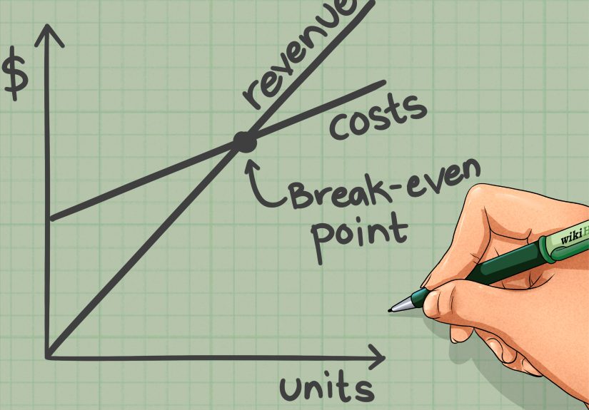
How to Plot the Break Even Point on a Graph
Now for the visual part. A break even graph makes the numbers easier to understand because it shows exactly where costs and revenue meet.
Set Up the Axes
Use the horizontal axis for units sold and the vertical axis for dollars.
Plot the Fixed Cost Line
This is a horizontal line because fixed costs stay the same regardless of volume, at least within your relevant operating range. In our example, draw a line across the graph at $12,000.
Plot the Total Cost Line
Total cost starts at fixed costs and rises as variable costs increase.
Total Cost = Fixed Costs + (Variable Cost per Unit x Units)
In our example:
Total Cost = $12,000 + ($30 x Units)
Useful points to plot:
- 0 units = $12,000
- 600 units = $30,000
- 1,000 units = $42,000
Plot the Revenue Line
Revenue starts at zero because if you sell nothing, you earn nothing. Shocking, but true.
Revenue = Selling Price per Unit x Units
In our example:
Revenue = $50 x Units
Useful points to plot:
- 0 units = $0
- 600 units = $30,000
- 1,000 units = $50,000
Find the Intersection
The point where the revenue line crosses the total cost line is the break even point. In this example, the lines intersect at:
600 units, $30,000
To the left of that point, your business is in the loss area. To the right, it moves into the profit area.
A Simple Table You Can Use to Build the Graph
| Units Sold | Revenue | Total Variable Cost | Total Cost |
|---|---|---|---|
| 0 | $0 | $0 | $12,000 |
| 200 | $10,000 | $6,000 | $18,000 |
| 400 | $20,000 | $12,000 | $24,000 |
| 600 | $30,000 | $18,000 | $30,000 |
| 800 | $40,000 | $24,000 | $36,000 |
| 1000 | $50,000 | $30,000 | $42,000 |
If you put these values into Excel or Google Sheets and insert a line chart, you will get a clean break-even graph without needing a finance degree or emotional support calculator.
Why the Break Even Graph Matters
The formula gives you one number. The graph gives you context.
When you plot the break even point on a graph, you can quickly see:
- How steep your revenue line is compared with your total cost line
- How much fixed cost is dragging down the starting point
- How much room you have between expected sales and break-even
- Whether a price increase or cost reduction would improve profitability faster
This is why break-even analysis is useful for pricing, budgeting, product launches, and funding conversations. A lender or investor may not care that your product is “super exciting.” They usually prefer numbers that can survive daylight.
Common Mistakes in Break Even Analysis
Confusing Fixed and Variable Costs
Some costs are easy to classify. Others are not. Utilities, labor, shipping, software, and marketing can have mixed behavior. If you label costs carelessly, your break-even point will be off.
Using Revenue Instead of Contribution Margin
Revenue alone does not pay the bills. What matters is how much remains after variable costs. That is why the contribution margin is the star of the show.
Forgetting the Relevant Range
Break-even formulas often assume fixed costs stay fixed. But sometimes they jump. Maybe you need a bigger space, more staff, or additional equipment after a certain sales level. Suddenly your “fixed” costs are not feeling very fixed.
Ignoring Sales Mix
If you sell multiple products, break-even gets trickier. The answer depends on the mix of products sold and their different contribution margins. One hot seller with a weak margin can quietly sabotage your break-even target.
Assuming Life Is Perfectly Linear
Most break-even models assume constant price, constant variable cost per unit, and stable demand. Real life enjoys ruining assumptions. Use the result as a smart planning tool, not a crystal ball.
Go One Step Further: Margin of Safety
Once you know your break-even point, calculate your margin of safety. This tells you how far actual or projected sales are above break-even.
Margin of Safety = Actual Sales – Break Even Sales
Suppose your projected monthly sales are $40,000 and your break-even sales are $30,000.
Margin of Safety = $40,000 – $30,000 = $10,000
That means sales could drop by $10,000 before you start losing money. It is a useful measure because “we are profitable” sounds nice, but “we only have a tiny safety cushion” sounds honest.
What the Break Even Point Tells You Strategically
A break-even calculation is not just an accounting exercise. It helps you answer big business questions, including:
- Should you raise prices?
- Can you afford a new employee?
- How many units must a new product sell to justify launch costs?
- Would lower variable costs improve your odds more than a marketing push?
- How risky is your current business model?
For example, reducing variable cost per unit from $30 to $25 in our bottle example would increase contribution margin to $25. Then break-even units would fall from 600 to 480. That is not a tiny improvement. That is a meaningful operational advantage.
Experience-Based Lessons People Often Learn After Doing Break-Even Analysis
In real-world budgeting, business planning, and pricing discussions, people rarely struggle with the basic formula for long. What trips them up is the experience of applying it to messy numbers. On paper, break-even analysis looks clean and elegant. In practice, it tends to expose all the assumptions hiding in the corners of the room.
One common experience is discovering that the original sales goal was wildly optimistic. A team may say, “We only need to sell 500 units a month,” with great confidence and a suspiciously cheerful slideshow. Then they graph total revenue against total cost and realize 500 units is nowhere near enough because variable costs were underestimated, fixed costs were incomplete, or discounts were ignored. The graph has a way of ending arguments quickly. Once the revenue line is still below the total cost line, even the most enthusiastic forecast starts to behave.
Another frequent lesson is that small pricing changes can have a surprisingly large effect on the break even point. People often assume a $2 or $3 increase in price is too minor to matter. Then they recalculate the contribution margin and watch the break-even units fall faster than expected. The opposite is also true. A business can proudly increase sales volume while quietly earning almost nothing because the margin is too thin. That experience teaches a painful but valuable truth: being busy is not the same as being profitable.
Many first-time business owners also learn that cost classification is harder than it sounds. A cost that looks fixed may turn semi-variable. A labor expense might rise in steps. Shipping might vary by region. Advertising may be partly fixed and partly discretionary. Once people start sorting costs honestly, the break-even calculation becomes more accurate, but also less flattering. That is actually good news. A realistic ugly number is more useful than a beautiful fake one.
People also tend to remember the first time they use a break-even graph in a meeting. Numbers in a table can be ignored. A graph cannot. When the total cost line starts above zero and climbs steadily while the revenue line lags behind, the business story becomes visual. Teams can instantly see the loss zone, the break-even point, and the profit zone. That shared picture makes decision-making easier because everyone is looking at the same reality instead of defending separate guesses.
Perhaps the biggest practical lesson is that break-even analysis works best when it becomes a habit rather than a one-time exercise. Businesses change. Costs change. Sales mix changes. A graph that made sense six months ago may now be outdated thanks to wage increases, supplier changes, or new pricing. The most effective operators revisit their break-even point regularly, test different scenarios, and use the results to guide action. In other words, they do not treat the break-even point like a framed diploma. They treat it like a dashboard warning light that keeps the business honest.
Conclusion
If you want a clear view of when a business stops losing money, the break even point is one of the best metrics to calculate. The math is straightforward: identify fixed costs, estimate variable costs, calculate the contribution margin, and use the right formula for units or sales dollars. From there, plot the numbers on a graph so you can see where total revenue meets total cost.
The real value of break-even analysis is not just in finding a number. It is in using that number to make smarter decisions about pricing, cost control, target sales, and risk. When you plot the break even point on a graph, the business story gets much easier to read. And when the story is easier to read, the next decision tends to get a lot smarter.