Table of Contents >> Show >> Hide
- Why the Heap Login Process Matters More Than It Seems
- The Core Security Layers Around a Heap Account
- What Good UX Looks Like in a Secure Login Flow
- Where Product Adoption and Onboarding Enter the Story
- A Better Blueprint for the Heap Login Experience
- Common Mistakes That Hurt Both Security and UX
- Experience Notes: What This Topic Feels Like in the Real World
- Conclusion
The login screen is one of the most underrated product moments in SaaS. It looks small. It feels routine. It is often treated like the digital equivalent of a coat rack: useful, bland, and hopefully ignored. But in reality, the login process does three huge jobs at once. It protects sensitive data, shapes first impressions, and quietly decides whether onboarding feels smooth or mildly annoying in the way only enterprise software can be.
That is exactly why the Heap login process is worth discussing through a UX lens, not just a security lens. Heap is a product analytics platform, which means the account behind the login is often connected to valuable behavioral data, internal dashboards, teams, and business decisions. If access is too loose, that is risky. If the setup is too painful, adoption suffers. And if the flow is confusing, users start their relationship with the product by muttering at their screen. That is not the kind of activation event anyone wants.
A strong login experience should feel like a good hotel lobby: secure, clear, welcoming, and not weirdly dramatic. Users should know where to go, what to do, why the extra step exists, and how to recover if something goes sideways. The best account security flows do not merely block bad actors. They also guide legitimate users to success with less friction, fewer errors, and more trust.
Why the Heap Login Process Matters More Than It Seems
On the surface, a login is a gate. In practice, it is a product feature. It is often the first recurring workflow a user experiences after signup, invite acceptance, or SSO setup. That means it affects product adoption in three different ways.
1. It sets the tone for trust
When users log into an analytics tool, they expect two things: protection and professionalism. If the sign-in flow supports stronger layers like single sign-on, two-factor authentication, recovery codes, and admin controls, the product signals that it takes account security seriously. That matters because trust is part of onboarding. People adopt products faster when they feel the platform is organized, reliable, and built for adults rather than chaos goblins.
2. It can speed up or slow down activation
Every extra prompt in a login flow creates a tiny tax. One field is fine. Four unexpected steps, two confusing emails, and a code from a device a user no longer owns? That is how activation turns into abandonment. Good login UX reduces avoidable friction while keeping the meaningful friction that actually improves security.
3. It influences long-term admin behavior
Heap is used by teams, not just lone wolves with a dashboard habit. That means login design affects admins who manage teammates, permissions, access to projects, and account-level security settings. A product that makes these controls visible and understandable is easier to roll out across an organization. A product that hides them behind mystery menus creates support tickets, policy drift, and passive-aggressive Slack messages.
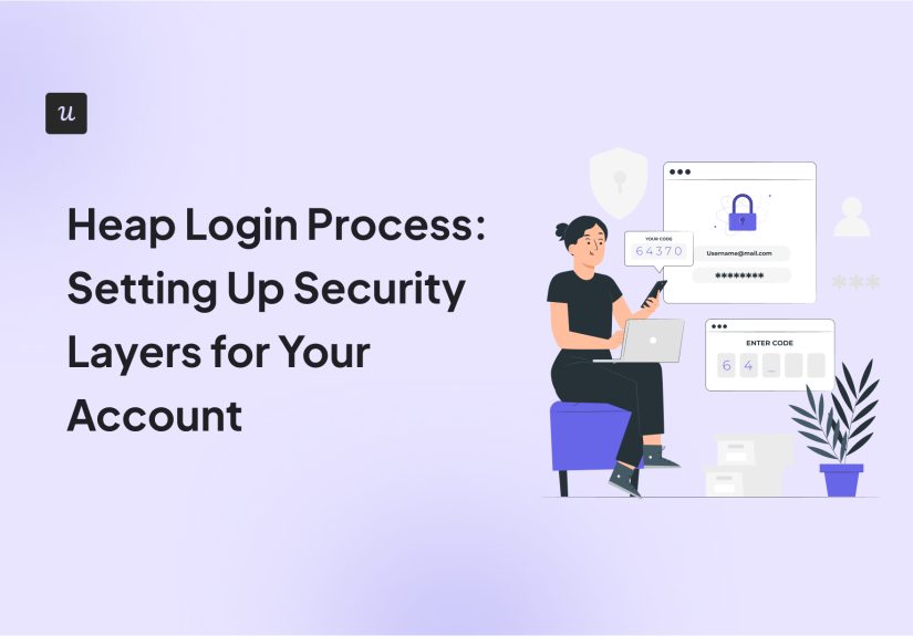
The Core Security Layers Around a Heap Account
A thoughtful Heap login process should be understood as a stack of security layers rather than a single password box wearing a fake mustache. Each layer serves a different purpose, and together they create a stronger, more resilient access model.
Password or SSO as the starting point
For many teams, the smartest first move is single sign-on. SSO reduces the number of passwords users need to remember, centralizes identity management, and allows an organization to piggyback on the security policies of its identity provider. In plain English: one less password to forget, one more reason users actually finish setup.
That said, SSO should not be treated as a magic wand. It is better understood as a cleaner front door. The experience improves because users sign in with a familiar identity provider, but the real win is administrative control: centralized provisioning, policy enforcement, and easier lifecycle management when people join or leave a team.
Two-factor authentication as the second lock
Heap’s public documentation makes it clear that 2FA can add an extra layer of account protection beyond a password or SSO credential. From a UX perspective, this is where things get interesting. Users rarely love extra steps in the abstract, but they do appreciate not getting hacked. The job of good design is to make that extra step feel understandable, fast, and worth it.
The best 2FA moment explains itself. It tells users why this is being required, what app or method they should use, how long setup will take, and what to do if they switch devices later. The worst version simply yells “Enter six-digit code” into the void and hopes for the best.
Recovery codes as the forgotten hero
Recovery is where many login systems trip over their own shoelaces. Users change phones. Laptops disappear. Authenticator apps get deleted. When recovery codes are presented clearly during setup and explained like they actually matter, account security becomes more humane. When recovery is treated like an afterthought, support tickets multiply and confidence drops.
Great UX treats recovery as part of onboarding, not a punishment reserved for future disasters. It should be visible, memorable, and easy to store securely.
Admin-enforced controls for team-wide protection
For a platform like Heap, personal security settings are only half the story. Admins need ways to enforce organizational rules, such as mandatory 2FA, team permissions, and role-based access. This is where product security and product adoption intersect beautifully. A team will adopt security settings more consistently when the controls are easy to understand and easy to apply at scale.
Least-privilege access is especially important in analytics products. Not everyone needs the same permissions. A clean access model reduces risk and also reduces confusion. Users are more confident when they only see the tools and projects relevant to their role instead of wandering through a giant control panel like tourists in a server room.
What Good UX Looks Like in a Secure Login Flow
Security and user experience are often framed like divorced parents fighting over the weekend schedule. They do not have to be enemies. In the best products, security choices actually improve usability.
Clear language beats dramatic language
Users do not need theatrical warnings every time they sign in. They need plain language. “Set up two-factor authentication to protect your account” works better than “Critical security action required.” The second version sounds serious, but the first version is clearer. Clarity lowers cognitive load, and lower cognitive load increases completion.
Progressive disclosure keeps setup manageable
A well-designed login journey does not dump every security concept on the user in one chaotic pile. It introduces steps in the right order. First: sign in. Second: verify identity. Third: save a recovery code. Fourth: explain where to manage security settings later. This sequencing matters because users are more likely to complete setup when each action has a clear reason and a visible finish line.
Error messages should help, not scold
Bad login error messages are a tiny tragedy. They are vague, accusatory, or technically correct in the least helpful way imaginable. Good error handling identifies the problem, points to the exact field or action, and offers a recovery path. If the password is incorrect, say so clearly. If the code expired, say that and provide a way to retry. If SSO is required for a domain, explain that without making users feel like they personally offended the authentication server.
Security steps should not surprise users
Surprise is excellent for birthday parties and terrible for login flows. If a team is going to require 2FA or move to SSO, users should hear about it before the moment of sign-in. Product adoption improves when changes are explained in advance, reinforced during login, and supported with lightweight guidance after completion.
Where Product Adoption and Onboarding Enter the Story
Heap’s broader product-adoption positioning is about guiding users toward early value, reducing friction, and helping teams identify the actions that predict long-term engagement. That same thinking applies beautifully to login and account security.
Here is the key idea: the first secure login is not separate from onboarding. It is onboarding.
If a user accepts an invite, lands in the product, hits an SSO wall, gets asked to configure 2FA, and then enters a dashboard with no clue what to do next, the problem is not just authentication. The problem is that onboarding lost the plot halfway through.
The most effective products connect login with guided activation. After sign-in, users should see context that matches their role and stage:
- new users need a simple next step,
- admins need account setup guidance,
- analysts need quick paths to meaningful dashboards,
- teammates need clear permissions and low confusion.
That is where good UX turns security from a barrier into a trust-building on-ramp. Instead of feeling like the product is delaying the real work, users feel that the product is setting them up properly.
A Better Blueprint for the Heap Login Experience
If I were evaluating a Heap login process through the lens of product adoption and good UX, I would want to see a blueprint like this:
Step 1: Invite and expectation-setting
The invite email should tell the user whether they will sign in with password, SSO, or a provider such as Google Workspace. It should also mention any required security steps up front. Nobody enjoys finding out about mandatory 2FA only after they already made coffee and committed emotionally to a quick login.
Step 2: Friction-light first authentication
If SSO is enabled, the route should be obvious. If it is not, the password creation or reset flow should clearly show requirements before submission, not after a failed attempt. Good form design saves time and reduces silent rage.
Step 3: Guided 2FA enrollment
During first-time security setup, the interface should explain why 2FA matters, recommend a common authenticator path, show success confirmation, and emphasize recovery-code storage. This is one of those rare moments where a little extra copy can save a lot of future pain.
Step 4: Role-aware landing after login
Once users are in, the product should not just dump them onto a giant analytics surface and hope instinct carries the day. Admins should see account setup priorities. Regular users should see relevant projects and lightweight onboarding cues. This is where security setup hands the baton to adoption design.
Step 5: Visible admin controls and auditability
Admins need confidence that they can review sign-in related activity, manage teammate access, enforce security policy, and correct issues without opening a support saga. Audit logs, permissions, and team access settings are not glamorous, but they are a big part of enterprise UX. Good enterprise UX is often less about delight and more about not making grown professionals feel trapped.
Common Mistakes That Hurt Both Security and UX
Some login mistakes are classics for a reason. They keep showing up.
Forcing security without context
Mandatory 2FA is reasonable. Mandatory mystery is not. If users do not understand why a step exists, completion feels lower-value and more annoying.
Using weak security because it feels easier
Ease is not the same as simplicity. A weak login system may seem convenient, but it creates more long-term friction through support resets, compromised accounts, and inconsistent admin policy.
Separating login from onboarding strategy
When teams optimize activation but ignore sign-in UX, they miss one of the earliest points of churn. A user cannot adopt what they cannot access smoothly.
Ignoring recovery and lifecycle moments
Changing phones, leaving a company, switching roles, and losing a device are normal events. Products that design for these realities feel mature. Products that ignore them feel unfinished.
Experience Notes: What This Topic Feels Like in the Real World
In real teams, login security is rarely debated in abstract terms like “authentication assurance” over sparkling water and whiteboards. It shows up as lived experience. A new analyst gets invited to Heap, clicks the link, expects a quick start, and instead lands in a sign-in path that may include SSO, a password, or a 2FA prompt. Within the next five minutes, that person makes a snap judgment about the product. Not a complete judgment, of course, but a sticky one. “This feels organized.” Or: “This is already annoying.”
That first feeling matters more than many teams admit. Users do not separate login UX from product UX nearly as neatly as product teams do. To the user, it is all one experience. If the sign-in path is smooth, the product feels mature. If the instructions are vague, the product feels harder. If recovery is explained well, the company feels thoughtful. If errors are cryptic, the user assumes the rest of the product may be just as fussy.
I have seen the difference play out in predictable ways. In the good version, the invite explains exactly how access works. The user signs in with a familiar provider, completes a short security setup, saves a recovery code, lands in a role-specific area, and gets a clear next action. Nothing about that flow is flashy, but it produces confidence. The user feels guided rather than managed. That small emotional win makes onboarding easier because the product has already demonstrated competence.
In the bad version, the sign-in page asks for credentials the user does not realize they should not use. Then it throws an error with the emotional warmth of a parking ticket. The user resets a password they never needed, discovers the company actually uses SSO, gets redirected again, and then meets a 2FA enrollment step with almost no explanation. By the time they finally reach the dashboard, their energy for exploration is gone. The product did not lose them because security existed. It lost momentum because the security experience lacked design.
That is why I keep coming back to a simple principle: good security UX is not about removing protective layers. It is about making those layers legible. Users will tolerate, and often appreciate, extra protection when the system respects their time and attention. They dislike friction that feels arbitrary, repetitive, or unexplained. They dislike feeling blamed by an interface. They dislike having to guess the rules. Honestly, most of us would rather assemble flat-pack furniture than decode a login flow that changes logic halfway through.
For teams thinking about Heap specifically, the opportunity is bigger than just securing an account. It is to use the login process as the first proof point that the product understands enterprise reality: shared ownership, changing roles, compliance expectations, and the need to get people to value fast. When that happens, the login process stops being a hurdle and becomes part of the onboarding architecture. And that is a very nice trick for a screen most people assume should do nothing more than ask for a password and behave.
Conclusion
The Heap login process is not just a technical checkpoint. It is a product moment where account security, onboarding, and adoption all meet in one compact experience. A strong implementation combines SSO, 2FA, recovery planning, least-privilege access, and visible admin controls. A strong user experience combines clarity, good sequencing, useful error handling, and a smooth handoff into the product itself.
When those pieces work together, users get safer access without unnecessary hassle, admins get better control without operational drama, and the product earns trust before the real work even begins. That is the sweet spot. Not “more security at any cost,” and not “frictionless at any risk,” but a smart middle ground where security feels intentional and onboarding feels human.