Table of Contents >> Show >> Hide
- The Quick Answer
- Step-by-Step: How to Change the Color of Snapchat Captions
- What Counts as a “Caption” on Snapchat?
- Why the Color of Snapchat Captions Matters
- Best Colors to Use for Snapchat Captions
- How Text Style Affects Caption Color
- How to Change Color for Video Captions and Subtitles
- How to Edit Caption Color on Saved Snaps or Camera Roll Photos
- Why You Might Not Be Able to Change Caption Color
- Tips for Making Snapchat Captions Easier to Read
- Creative Ways to Use Caption Colors on Snapchat
- Common Mistakes to Avoid
- Final Thoughts
- Real-World Experiences Using Snapchat Caption Colors
- SEO Tags
Snapchat is many things: a camera app, a social app, a chaos machine, and occasionally a place where one perfectly timed caption makes a mediocre photo look like comedy gold. But if your text is blending into the background like a shy chameleon, it is time to fix that. Learning how to change the color of Snapchat captions is one of the fastest ways to make your Snaps easier to read, more visually interesting, and far more likely to get the reaction you were hoping for.
The good news is that changing caption color on Snapchat is simple once you know where the controls live. The slightly annoying news is that Snapchat loves moving things around just enough to make you wonder whether you forgot how your phone works. Still, the basic workflow remains straightforward: open a Snap, add text, and use the color slider to choose the shade you want. From there, you can fine-tune the look with different text styles, placement, size, and timing.
This guide breaks down exactly how to change the color of Snapchat captions, what to do if the option does not seem to work, how caption styles affect your color choices, and how to make your text actually readable instead of just “technically present.” We will also cover a few practical examples, common mistakes, and real-world experiences that make the feature much easier to use.
The Quick Answer
If you want the shortest possible version, here it is:
- Open Snapchat and take a photo or record a video.
- Tap the text tool or tap on the screen to add a caption.
- Type your text.
- Look for the color slider on the side of the screen while editing text.
- Drag your finger up or down the slider to change the caption color.
- Tap outside the text box or tap done to apply it.
That is the core method. Everything else is just customization, troubleshooting, and trying not to choose neon yellow over a white cloud background like a person who enjoys suffering.
Step-by-Step: How to Change the Color of Snapchat Captions
1. Create or Upload a Snap
Start by taking a photo, recording a video, or opening a saved image or video from your camera roll or Memories. Snapchat lets you edit both freshly captured Snaps and many saved images before sending or posting them.
2. Open the Text Tool
Tap the T icon or tap directly on the preview screen, depending on your version of Snapchat. This opens the text editor so you can type your caption. If you are working with video, Snapchat may also offer a captions or subtitle option, especially in Timeline Editor.
3. Type Your Caption
Enter the text you want to appear on your Snap. This can be a short label, a joke, a reaction, a mini story, or the classic “I woke up like this,” which no one believes but everyone accepts.
4. Use the Color Slider
Once the text editor is active, a vertical color slider usually appears along the side of the screen. Drag your finger up and down that slider to preview different colors. As you move, your caption updates in real time. Release your finger when you land on a shade you like.
5. Adjust Style, Size, and Placement
After choosing a color, you can often tap the text again to switch styles or use the formatting controls above the keyboard. Some styles are free-floating, some sit in a background bar, and some include outlines or highlights. You can usually drag the caption around the screen, pinch to resize it, and rotate it with two fingers if the selected style supports it.
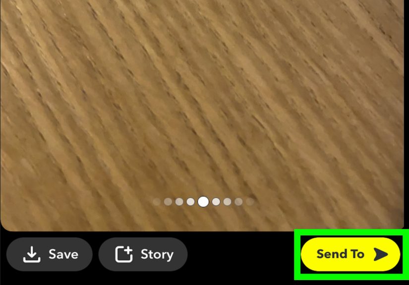
6. Save or Send
When everything looks right, post the Snap to your Story, send it to a friend, or save it to Memories. Congratulations. Your caption is now officially more stylish than it was three minutes ago.
What Counts as a “Caption” on Snapchat?
This is where a lot of people get confused. On Snapchat, the word caption can mean a few different things:
- Regular text you type onto a photo or video
- Styled text layers with different fonts or outlines
- Automatic captions or subtitles generated from spoken audio in a video Snap
- Chat colors in conversations, which are a separate feature and not the same as Snap captions
If your goal is to change the color of text you manually typed on a Snap, the color slider is the main tool. If your goal is to style video subtitles, you may need to use Snapchat’s caption or Timeline Editor tools instead. And if you are trying to recolor a chat conversation, that is not a caption setting at all.
Why the Color of Snapchat Captions Matters
Changing caption color is not just about making things look cute. It affects readability, mood, branding, and how much attention your Snap gets. A white caption on a bright beach photo might vanish completely. A dark outline or bold red text might suddenly make the same message readable in half a second.
Color also changes tone. Red feels urgent. Blue feels calm. Yellow feels playful. Green can feel fresh or chaotic depending on how aggressively you use it. When used well, caption color helps your text support the image instead of fighting it.
If you post Stories regularly, consistent caption colors can even become part of your personal visual style. That does not mean you need a brand guide for your lunch photos, but it does mean people start recognizing your content faster.
Best Colors to Use for Snapchat Captions
Not every color works on every background. Here are some reliable options:
White
Great for dark photos, nighttime videos, and busy backgrounds when paired with an outline or shadow. White is the reliable best friend of Snapchat text.
Black
Best for bright images, daytime content, and pastel backgrounds. Black text can look clean and sharp, especially for simple captions.
Yellow
Ideal for dark blue, black, or purple backgrounds. Yellow stands out fast, but on light backgrounds it can disappear like your motivation on a Monday morning.
Red
Strong, attention-grabbing, and useful for emphasis. Great for reaction captions, warnings, or dramatic storytelling.
Blue or Teal
Useful for calm, polished content and often easier on the eyes than bright red or hot pink. These tones work especially well on neutral or warm-toned images.
Pink or Purple
Popular for playful, stylish, or personal posts. These shades can make captions feel more expressive, but readability depends heavily on the background image.
How Text Style Affects Caption Color
One reason Snapchat caption color can feel inconsistent is that the app offers multiple text styles. The style you choose can affect how the color appears and what other formatting options are available.
Default Caption Bar
This is the classic Snapchat text look: a simple bar across the image. It is clean and familiar, but it may offer fewer resizing options than free-floating text styles.
Free-Floating Text
This style gives you more freedom. You can usually resize, rotate, and reposition it more easily. It is ideal when you want to place text in a specific part of the image without blocking the main subject.
Outlined or Highlighted Styles
These help readability on cluttered backgrounds. In some cases, the outline or highlight treatment is automatic and cannot be customized as much as the text color itself.
That means if your caption color looks “off,” the issue may not be the color picker. It may be the style you selected. Try switching fonts or text styles before assuming Snapchat is misbehaving again.
How to Change Color for Video Captions and Subtitles
If you are making a video Snap, you may have more than one text option. You can still add ordinary text the regular way, but Snapchat also supports caption tools for spoken audio in some workflows.
When working with video captions:
- Add your video or record it in Snapchat.
- Open the caption or subtitle option if available.
- Edit the text layer.
- Apply a style and choose the color if the tool allows it.
- Drag the caption layer in the timeline if you want it to appear only during certain moments.
This is especially useful for voice-over clips, mini tutorials, reaction videos, or anything people might watch on mute. In other words, basically the entire internet.
How to Edit Caption Color on Saved Snaps or Camera Roll Photos
You do not have to take the perfect photo inside Snapchat to use its text tools. If you are editing a saved image or a photo from your camera roll, you can usually still add text and change the color with the same slider.
That is handy if you took a better photo in your phone’s camera app and want to post it through Snapchat without giving up the familiar caption tools. You may lose access to some location-based features, but text editing usually remains available.
Why You Might Not Be Able to Change Caption Color
If the color slider is missing or your caption refuses to change color, a few things may be going on:
You Are Not in Text Edit Mode
The color slider usually appears only while the text is actively selected. Tap the caption again to reopen the editor.
You Picked a Style With Limited Customization
Some Snapchat text treatments prioritize a preset look. Try changing the text style or font and then rechecking the color controls.
Your App Version Is Different
Snapchat updates can shift menus, icons, and control placement. If the steps seem slightly off, update the app and look for the same core tools under a different layout.
You Are Confusing Chat Colors With Snap Captions
Changing the color of chat messages is a separate Snapchat+ customization feature. It does not control the color of text placed on a photo or video Snap.
You Need to Restart the App
If controls are missing after an update, close and reopen Snapchat. That simple step solves a surprising number of app problems, which is both comforting and mildly insulting.
Tips for Making Snapchat Captions Easier to Read
- Use high-contrast text against the background.
- Place captions away from overly busy parts of the image.
- Try outlined or highlighted styles for bright photos.
- Keep your caption short when possible.
- Use line breaks for longer thoughts instead of one giant block of text.
- Resize and reposition text so it does not cover faces or key details.
A good caption color is not necessarily the flashiest one. It is the one people can read instantly without squinting like they are decoding an ancient prophecy.
Creative Ways to Use Caption Colors on Snapchat
Match the Mood of the Photo
Use warm colors for sunsets, cooler tones for travel shots, and bold shades for funny or chaotic moments.
Color-Code a Story Series
If you post multiple Snaps in sequence, use one caption color for setup, another for commentary, and another for punchlines or key points.
Highlight Important Words
Some text styles and editing workflows make it easier to emphasize parts of a message. Even when full per-word styling is limited, you can split text into multiple layers and color them differently.
Build a Personal Style
Maybe you always use white text with a black outline. Maybe you live for electric blue. Maybe every caption is pink because subtlety is not your ministry. Consistency can make your Snaps feel more polished.
Common Mistakes to Avoid
- Using light text on light backgrounds
- Making captions too large for the screen
- Placing text over faces or important objects
- Using too many colors in one Snap
- Assuming every text style supports the same color behavior
- Forgetting that subtitles and chat themes are different features
In short, do not turn your caption into a visual obstacle course.
Final Thoughts
Changing the color of Snapchat captions is one of those tiny features that makes a big difference. It is easy enough for casual users, flexible enough for frequent posters, and powerful enough to rescue a caption from complete invisibility. Once you get comfortable with the text tool, color slider, and style options, your Snaps become faster to customize and far more fun to post.
The trick is not just knowing how to change the color. It is knowing why one color works better than another, when to switch styles, and how to make your text readable without making it look like a highlighter exploded on your screen. Start simple, test different combinations, and pay attention to what looks best on real photos and videos. Snapchat rewards experimentation, and luckily, changing caption color only takes a few seconds.
So yes, the feature is small. But sometimes small features do the heavy lifting. A better caption color can turn “nice photo” into “actually funny,” “barely readable” into “instantly clear,” and “I guess I will skip posting this” into “okay, this one is definitely going on my Story.”
Real-World Experiences Using Snapchat Caption Colors
Once people start using Snapchat caption colors regularly, they usually go through the same little evolution. At first, they just want the text to show up. Then they realize certain colors make the photo look better. Then, before they know it, they are making highly specific choices like “this sunset needs cream text, not white text” as if they are directing a tiny movie from their front-facing camera.
One common experience is discovering that your favorite color is not always your best caption color. A lot of people love bright yellow or pink text because it looks fun in the picker, but the second it lands on a pale selfie background or a washed-out sky, it vanishes. That usually leads to the first important lesson: readability beats personal preference. The best color is the one that people can read instantly, not the one that wins a beauty pageant in the slider.
Another thing users notice is that Snapchat caption colors behave differently depending on the type of Snap. On low-light videos, white text often works beautifully, especially with a darker outline. On daytime shots, black or dark blue text can look cleaner and more intentional. On busy street scenes, people often end up moving the caption around more than changing the wording, because placement matters almost as much as color. The funniest caption in the world will not help if it is sitting directly on top of someone’s forehead.
People who post Stories often also develop habits without realizing it. Some use one caption color for jokes and another for updates. Some always put explanatory text in white and emotional reactions in red. Others use color to separate speakers in conversation screenshots or to guide viewers through a mini story. After a while, those choices stop feeling random and start feeling like a style. That is when caption color becomes less of a feature and more of a visual language.
There is also a very real trial-and-error phase. Users tap, drag, resize, rotate, hate everything, delete the text, type it again, choose a new color, and suddenly love it. That is normal. Snapchat editing is fast, but it is not always graceful. The good part is that experimenting only takes seconds. You can try a bold red caption, decide it looks like a fire drill, switch to a softer blue, and move on with your life.
Probably the most relatable experience, though, is realizing that a tiny caption tweak can completely change the mood of a Snap. The same picture with white text can feel calm and polished. With neon green text, it becomes absurd. With red text, it feels dramatic. With pastel purple, it feels playful. That is why the feature matters. It is not just decoration. It changes the tone of the message, the speed of readability, and the overall feel of the post. Once people notice that, they rarely go back to ignoring caption color altogether.