Table of Contents >> Show >> Hide
- What Is an S Curve in Excel?
- Before You Start: Prepare Your Excel Data
- Method 1: Create an S Curve Pattern Using Cumulative Data
- Method 2: Create an S Curve Pattern Using a Logistic Formula
- Method 3: Create an S Curve Using NORM.DIST
- How to Format Your S Curve Chart Professionally
- Planned vs Actual S Curve: Why It Matters
- Example: Building a Simple Project Progress S Curve
- Common Mistakes When Creating an S Curve in Excel
- Best Practices for a Better Excel S Curve
- Experience Notes: Practical Lessons from Creating S Curves in Excel
- Conclusion
Creating an S curve pattern in Excel sounds like something that belongs in an advanced statistics lab, right next to a whiteboard covered in mysterious Greek letters and someone whispering, “Trust the model.” Thankfully, it is much easier than that. In Excel, an S curve is simply a smooth, cumulative line that starts slowly, rises faster in the middle, and then gradually levels off near the end. It looks like the letter “S,” which is convenient because calling it “the sleepy snake of spreadsheet progress” probably would not fit on a chart title.
An S curve chart is commonly used in project management, construction planning, budgeting, forecasting, product adoption, learning curves, and growth analysis. It helps show how progress accumulates over time. For example, a project may begin slowly during planning, accelerate during execution, and slow down again near completion. Excel is a great tool for building this visual because it lets you combine dates, cumulative percentages, formulas, and smooth line charts without needing special software.
In this guide, you will learn how to create an S curve pattern in Excel step by step. We will cover the simple project-tracking method, the formula-based method, common mistakes, formatting tips, and practical examples. By the end, your spreadsheet will look less like a random number jungle and more like a dashboard that knows what it is doing.
What Is an S Curve in Excel?
An S curve in Excel is a chart that displays cumulative data over time. The horizontal axis usually represents time, such as days, weeks, months, or project phases. The vertical axis represents cumulative progress, cost, revenue, units completed, percentage complete, or another running total.
The curve typically has three stages. First, it rises slowly because activity is just beginning. Second, it climbs more sharply as work gains momentum. Third, it flattens as the project approaches completion or the growth limit. This makes the S curve especially useful when you want to compare planned progress against actual progress.
Common Uses of an S Curve Pattern
In project management, an S curve can show planned value, actual cost, earned value, cumulative labor hours, or percentage complete. In business analysis, it can show customer adoption, sales growth, production output, or market penetration. In education or training, it can represent learning progress over time. Basically, whenever something starts slowly, speeds up, and then levels off, the S curve enters the room wearing a tiny spreadsheet cape.
Before You Start: Prepare Your Excel Data
The quality of your S curve depends on your data structure. If your data is messy, the chart will not politely fix it for you. It will simply turn your confusion into a colorful confusion picture. Start with a clean table.
For a basic project S curve, create columns like this:
- Period: Week 1, Week 2, Week 3, or actual dates
- Planned Work: The amount of work planned for each period
- Actual Work: The amount of work completed in each period
- Cumulative Planned: Running total of planned work
- Cumulative Actual: Running total of actual work
- Cumulative Planned %: Planned running total divided by total planned work
- Cumulative Actual %: Actual running total divided by total planned work
Here is a simple example:
| Week | Planned Work | Actual Work | Cumulative Planned | Cumulative Actual |
|---|---|---|---|---|
| Week 1 | 5 | 4 | 5 | 4 |
| Week 2 | 10 | 8 | 15 | 12 |
| Week 3 | 20 | 18 | 35 | 30 |
| Week 4 | 30 | 28 | 65 | 58 |
| Week 5 | 25 | 30 | 90 | 88 |
| Week 6 | 10 | 12 | 100 | 100 |
Method 1: Create an S Curve Pattern Using Cumulative Data
This is the easiest and most practical method for project tracking. You do not need advanced math. You only need period-by-period values and cumulative totals.
Step 1: Enter Your Timeline
Open Excel and create a timeline in the first column. You can use weeks, months, dates, milestones, or project phases. For example, enter Week 1 through Week 12 in column A. If you are tracking a real project, dates are better because they make the chart easier to compare with schedules.
Step 2: Enter Planned Values
In column B, enter the planned work, budget, labor hours, or progress value for each period. The values should not be cumulative yet. They should represent only what is planned for that individual period.
For example, if your project budget is $100,000, you might enter the planned spending for each week. Early weeks may have smaller values, middle weeks may have higher values, and final weeks may drop again.
Step 3: Calculate Cumulative Planned Values
In column C, calculate the running total. If your first planned value is in B2, enter this formula in C2:
Then drag the formula down. The dollar signs lock the starting cell, while the second reference expands as you copy the formula. Excel will now calculate a running total. This is where the S curve starts to take shape.
Step 4: Add Actual Values
In column D, enter the actual work completed, actual cost, or actual percentage for each period. Actual data is usually updated as the project moves forward. If future periods are not available yet, leave them blank instead of entering zeros. Zeros can make your line dive dramatically, and your chart will look like it just received bad news.
Step 5: Calculate Cumulative Actual Values
In column E, use the same cumulative formula:
Drag the formula down only through the periods where actual data exists. This keeps your actual curve honest and prevents Excel from drawing misleading future performance.
Step 6: Convert Cumulative Values to Percentages
Percentages are often easier to read than raw values. If the total planned work is in cell C13, you can calculate cumulative planned percentage with:
For cumulative actual percentage, use:
Format these cells as percentages. A clean S curve usually starts near 0% and ends at 100%.
Step 7: Insert the Chart
Highlight your timeline and cumulative percentage columns. Go to Insert, choose Scatter Chart or Line Chart, and select a smooth line option. A scatter chart with smooth lines is especially useful when your timeline uses numeric intervals or uneven dates. A line chart works well when your periods are evenly spaced.
Excel will create a chart showing the cumulative planned and actual lines. If the shape rises slowly, climbs sharply, and levels off near the end, congratulations: you have created an S curve pattern without needing a wizard robe.
Method 2: Create an S Curve Pattern Using a Logistic Formula
Sometimes you do not have real project data yet. Maybe you are building a forecast, a sample model, or a clean theoretical curve. In that case, you can use a logistic formula. A logistic curve naturally produces an S-shaped pattern.
Use this formula:
In this formula:
- x is the time period or sequence number.
- k controls the steepness of the curve.
- midpoint controls where the curve accelerates most strongly.
For example, suppose column A contains numbers from 1 to 20. In cell B2, enter:
Drag the formula down. Then format the results as percentages and create a scatter chart with smooth lines. Increase the value of 0.5 to make the curve steeper. Decrease it to make the curve gentler. Change 10 to move the midpoint earlier or later.
When Should You Use the Logistic Formula?
Use the logistic formula when you need a model, not a report. It is useful for growth forecasting, adoption curves, theoretical progress patterns, and demonstrations. For real project control, use actual cumulative data whenever possible. A formula-based curve is elegant, but real data has receipts.
Method 3: Create an S Curve Using NORM.DIST
Another way to generate an S-shaped curve is by using Excel’s cumulative normal distribution function. This method is helpful when you want a smoother statistical curve.
If your x-values are in column A, use:
For example:
This returns a cumulative probability value. When plotted, the values form an S-shaped curve. The mean controls the center of the curve, and the standard deviation controls the spread. A smaller standard deviation makes the curve steeper; a larger one spreads it out.
How to Format Your S Curve Chart Professionally
A useful S curve chart should be easy to read at a glance. Nobody should need a treasure map and emotional support coffee to understand it.
Add a Clear Chart Title
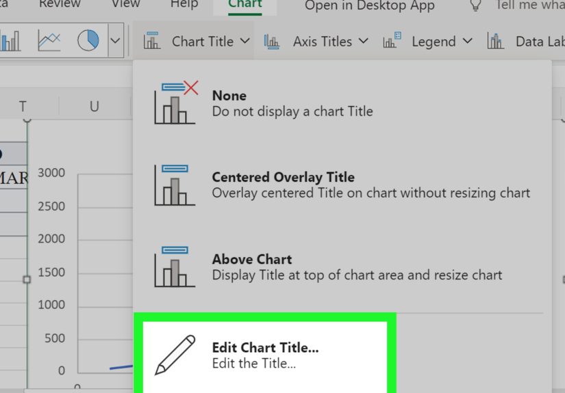
Use a specific title such as Project Progress S Curve, Planned vs Actual Completion, or Cumulative Cost S Curve. Avoid vague titles like “Chart 1,” which is the spreadsheet equivalent of naming your dog “Animal.”
Label the Axes
The horizontal axis should describe time, such as weeks, months, or project dates. The vertical axis should describe the cumulative measure, such as percentage complete, cost, work hours, or units produced.
Use Percentages for Progress
When tracking project progress, percentages make the chart easier to interpret. A project manager, client, or team member can quickly see whether the project is at 25%, 50%, 75%, or 100%.
Keep the Chart Clean
Remove unnecessary gridlines, avoid too many colors, and keep the legend simple. If you compare planned and actual progress, two lines are usually enough. Adding twelve lines may look impressive, but it often turns the chart into spaghetti with ambition.
Planned vs Actual S Curve: Why It Matters
A planned S curve shows what should happen according to the original schedule or budget. An actual S curve shows what has happened so far. Comparing the two curves helps you identify whether a project is ahead, behind, over budget, or under control.
If the actual curve is below the planned curve, the project may be behind schedule. If the actual cost curve is above the planned cost curve, spending may be higher than expected. If the actual progress curve rises faster than planned, the project may be ahead. Of course, faster is not always better if quality is suffering. Excel can draw the curve, but it cannot tell the team to stop rushing drywall installation. That part is still human.
Example: Building a Simple Project Progress S Curve
Imagine you are managing a website redesign project over eight weeks. Your planned completion percentages by week are:
Your actual completion percentages are:
Enter weeks in column A, planned cumulative percentages in column B, and actual cumulative percentages in column C. Highlight the table, insert a line chart or scatter chart with smooth lines, and add chart labels. You will immediately see that actual progress trails planned progress during the middle weeks but catches up by the end.
This is the real power of an Excel S curve. It does not just show numbers. It tells a story about momentum, delay, recovery, and completion.
Common Mistakes When Creating an S Curve in Excel
Using Period Values Instead of Cumulative Values
The most common mistake is charting weekly or monthly values instead of cumulative totals. An S curve must show accumulated progress. If you chart only individual period values, you may get a mountain, a wave, or something that looks like a nervous heartbeat.
Entering Zeros for Missing Actual Data
If future actual values are unknown, leave them blank. Do not enter zeros unless the actual value is truly zero. Otherwise, Excel may draw the line downward and make your project look like it fell into a trapdoor.
Mixing Units
Do not compare dollars on one line and percentages on another without making the axis clear. If you need different units, consider using a secondary axis or separate charts.
Forgetting to Format the Axis
If your vertical axis represents progress, format it from 0% to 100%. This makes the chart easier to understand and prevents Excel from choosing a strange scale that exaggerates minor changes.
Best Practices for a Better Excel S Curve
Use a structured table so your chart updates automatically when new data is added. Keep formulas consistent. Add a baseline curve before the project starts. Update actual progress regularly. Use clear chart titles and labels. Most importantly, review what the curve means instead of admiring its smoothness like it belongs in an art gallery.
If you are tracking a serious project, keep your source data separate from your chart area. This makes the workbook easier to maintain. You can also add columns for variance, such as:
Positive variance may indicate ahead-of-plan progress. Negative variance may indicate delay. Add conditional formatting if you want Excel to politely panic in red when performance falls behind.
Experience Notes: Practical Lessons from Creating S Curves in Excel
In real-world spreadsheet work, the hardest part of creating an S curve pattern in Excel is rarely the chart itself. The chart is actually the easy part. The real challenge is deciding what your data means. For example, “progress” can mean tasks finished, hours worked, dollars spent, materials installed, features shipped, or milestones approved. If you choose the wrong measurement, your S curve may look beautiful while telling a very suspicious story.
One useful habit is to define the unit before building the workbook. If the S curve tracks project completion, decide whether completion is based on equal task count or weighted value. Ten tiny tasks should not always equal ten large tasks. Painting a button blue and building an entire checkout system are both “tasks,” but only one of them makes developers stare quietly out the window. Weighted progress usually creates a more realistic curve.
Another lesson is to keep planned and actual data separate. Beginners often overwrite planned values with actual values because it feels convenient at the moment. Later, when someone asks, “Are we ahead or behind the original plan?” the spreadsheet suddenly develops selective memory. Always preserve the baseline. Your planned S curve is the promise. Your actual S curve is the diary. You need both to understand the plot.
It also helps to update the chart on a fixed schedule. Weekly updates work well for many projects because they are frequent enough to catch problems but not so frequent that the chart becomes a full-time pet. Daily updates may be useful for fast-moving construction, production, or operations work. Monthly updates may be enough for long-term budgets or strategic programs. The best update frequency is the one your team will actually follow.
When presenting an S curve, avoid overexplaining the math. Stakeholders usually care about three questions: Where did we plan to be? Where are we now? What happens if the current trend continues? A clean planned-versus-actual chart answers those questions quickly. Add a short comment below the chart, such as “Actual progress is 7% behind baseline due to delayed vendor delivery, with recovery expected by Week 9.” That sentence is often more useful than five extra chart decorations.
Finally, remember that smooth lines can make data look more certain than it really is. Excel’s smooth line option improves appearance, but it does not magically improve data quality. If your data is irregular, incomplete, or manually guessed, say so. A responsible S curve is not just attractive; it is honest. The goal is not to impress people with a graceful curve. The goal is to help them make better decisions before small problems become budget-eating spreadsheet monsters.
Conclusion
Learning how to create an S curve pattern in Excel is one of those skills that looks advanced but becomes simple once you understand the structure. Start with a timeline, add period values, calculate cumulative totals, convert them to percentages if needed, and insert a smooth line or scatter chart. For forecasting, use a logistic formula or cumulative normal distribution. For project tracking, compare planned and actual cumulative progress.
A good S curve chart turns a table of numbers into a clear visual story. It shows whether progress is slow, accelerating, flattening, ahead, behind, or behaving like a project that has discovered caffeine. With clean data, simple formulas, and thoughtful formatting, Excel can help you build an S curve that is practical, professional, and easy to explain.