Table of Contents >> Show >> Hide
- What iOS 18 Actually Changed
- Why This Tiny Change Feels So Big
- How to Customize the Lock Screen Camera Button in iOS 18
- The Best Thing About It: Camera Is Still Easy to Reach
- Why Third-Party Camera Apps Benefit the Most
- Real-World Examples of Why the Feature Is So Useful
- There Are Limits, and That Is a Good Thing
- What This Says About Apple’s Direction
- Final Verdict
- 500 More Words on Real Experiences With iOS 18’s Customizable Lock Screen Camera Button
If you have used an iPhone for years, you probably stopped noticing the little camera shortcut sitting in the bottom-right corner of the Lock Screen. It was always there, always useful, and always very Apple: elegant, predictable, and slightly bossy. Then iOS 18 showed up and said, “What if you actually got to decide what belongs there?” Suddenly, that familiar camera button stopped being just a button and became something much more interesting: a tiny gateway to how you actually use your phone.
That is why iOS 18’s customizable Lock Screen camera button feels so impressive. Technically, Apple did not merely “improve the camera.” It did something better. It handed back control. You can now replace the default camera shortcut, remove it entirely, or swap in another control that better matches your habits. For people who live inside camera apps, creator tools, timers, voice notes, or smart home controls, this change is surprisingly powerful. It is one of those features that sounds small in a keynote and then becomes weirdly life-changing five minutes after setup.
And yes, this is exactly the kind of feature Apple fans love to underrate at first and then become unreasonably passionate about by the weekend.
What iOS 18 Actually Changed
Before iOS 18, the two Lock Screen shortcuts at the bottom of the screen were basically fixed: flashlight on one side, camera on the other. They were useful, but they were also static. With iOS 18, Apple opened those spots up. You can now customize the buttons at the bottom of the Lock Screen and choose different controls from Apple’s controls gallery, including supported options from third-party apps.
That means the “camera button” is no longer locked into being the Camera app forever. If you want it to stay Camera, great. If you want it to launch another camera-related experience, even better. If you want that button to become a timer, voice recorder, scanner, home control, or something else that better reflects your daily routine, you finally can.
There is one important clarification here: this feature is not the same thing as the dedicated Camera Control hardware on newer iPhone 16 models. This article is about the software shortcut on the Lock Screen, the one that used to be fixed and now is customizable in iOS 18. Apple basically turned a previously permanent button into a personal workflow tool, and that shift matters more than it sounds.
Why This Tiny Change Feels So Big
The magic of the customizable Lock Screen camera button is not just that it exists. The magic is that it lives on the Lock Screen, which is the most immediate place on the iPhone. It is the first thing you see, the screen you touch dozens or hundreds of times a day, and the area where speed matters more than almost anywhere else in iOS.
In other words, Apple did not hide this customization in some deep submenu where only forum dwellers and caffeine-powered tinkerers would find it. It put flexibility right where muscle memory lives.
That is why the feature feels amazing in practice. It reduces friction. It turns a fixed shortcut into an intentional one. It makes the Lock Screen feel less like a default layout handed down from Cupertino and more like a toolset tuned to your real life.
For photographers, it is a quiet revolution
If you are a casual shooter, Apple’s built-in Camera app is already fast and good. But if you are serious about photography, “good” is often not enough. Some people want manual focus, exposure control, RAW workflows, quicker access to specific lenses, or a cleaner shooting interface. In iOS 18, supported third-party camera apps can plug into this experience more directly, which means power users are no longer stuck taking the long route through authentication and home screen taps just to launch the camera app they actually prefer.
That convenience matters. Street photography, travel photos, behind-the-scenes content, and fast candid moments all reward speed. A customizable Lock Screen camera shortcut means the best camera app for you can now be the one that appears first, not just the one Apple preselected.
For everybody else, it is about intent
Even if you do not care about advanced photography, the feature still makes sense. Maybe you open the camera only occasionally, but you use a timer constantly. Maybe you record voice memos before ideas vanish into the void. Maybe you scan codes, control smart lights, or open a social camera more often than Apple’s default one. The point is not that everyone should replace Camera. The point is that everyone now gets to decide.
And that simple choice changes the feel of the device. Your iPhone becomes a little more “yours,” and that is one of the best things iOS 18 does across the board.
How to Customize the Lock Screen Camera Button in iOS 18
The setup is refreshingly straightforward. Apple did not make this one of those “go to Settings, then Accessibility, then Somewhere Mysterious” features.
- Wake your iPhone and stay on the Lock Screen.
- Touch and hold the Lock Screen to enter customization mode.
- Tap Customize, then choose Lock Screen.
- Tap the camera shortcut to remove it.
- Tap the plus sign to choose a different control from the gallery.
- Tap Done when finished.
You still only get two bottom-corner controls, so this is not an invitation to turn the Lock Screen into a cockpit. Apple kept the experience focused. That restraint is probably smart. Freedom is nice; chaos is not. Also, if you create multiple Lock Screens for different Focus modes, you can tailor those controls to different situations, which is the sort of nerdy productivity feature that makes some people smile far more than they should.
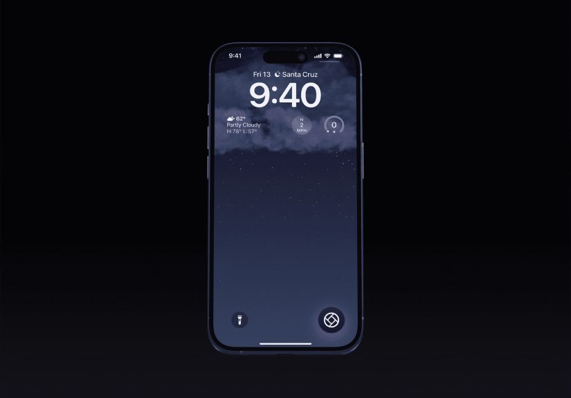
The Best Thing About It: Camera Is Still Easy to Reach
Here is the part that makes this feature even better: customizing the camera shortcut does not mean you are permanently abandoning quick access to Apple’s Camera app. Even after you replace or remove that button, you can still open the camera from the Lock Screen with the familiar swipe gesture.
That detail matters because it removes the psychological cost of customization. You are not making a dramatic break with the old workflow. You are simply assigning the prime real estate to something else while keeping the backup route intact. Apple basically says, “Sure, move the furniture around. The emergency exit is still exactly where you left it.”
That is a smart design decision. It gives users more flexibility without punishing them for experimenting. The result is that more people will actually try customizing the button, which is exactly what should happen.
Why Third-Party Camera Apps Benefit the Most
One of the most exciting parts of this change is what it means for third-party developers. Apple opened the door for supported apps to offer controls that can appear in the Lock Screen experience. For camera apps, that is a major quality-of-life leap.
For years, Apple’s Camera app had the home-field advantage. It launched instantly from the Lock Screen, while third-party apps often had to wait behind unlocking steps or indirect shortcuts. iOS 18 narrows that gap. With Apple’s framework for locked camera capture experiences, developers can build faster paths into their camera tools, and that makes the iPhone more useful for users who prefer specialized apps.
This is not just theoretical. Apps such as Halide gained the ability to live much closer to the Lock Screen camera experience, and even social platforms like Snapchat have used iOS 18’s updated control options to get to the Lock Screen faster. That means Apple is no longer saying, “Use your favorite app, but please take three extra steps.” It is finally saying, “Fine, put your favorite app where your thumb already goes.” Progress tastes sweet.
Real-World Examples of Why the Feature Is So Useful
The creator setup
A mobile creator might replace the default camera shortcut with a pro camera app for better manual control, while keeping the swipe gesture as a fallback for the stock Camera app. That is a cleaner workflow for anyone who shoots quick content, product photos, or social clips throughout the day.
The practical commuter setup
Someone who takes public transit may prefer a scanner, note-taking shortcut, or recording tool instead of the default camera. The Lock Screen becomes a faster utility panel, not just a place where the flashlight and camera live because that is what they have always done.
The minimal setup
Some users do not want either bottom-corner shortcut at all. They prefer a cleaner aesthetic and a less accidental-tap-prone screen. iOS 18 lets them remove the controls entirely, which is a tiny gift to anyone who values simplicity.
The social shooter setup
If your real camera habit is opening a social camera rather than Apple’s Camera app, then swapping the shortcut makes perfect sense. The first camera you reach should be the one you actually use.
There Are Limits, and That Is a Good Thing
Not every app deserves instant Lock Screen access. In fact, many do not. Just because you can place a control there does not mean you should. The best Lock Screen shortcuts are fast, purposeful, and useful without turning your phone into a cluttered vending machine of random actions.
If a control requires too much follow-up interaction, too much authentication, or too much thinking, it probably is not the right choice for that spot. The beauty of the camera button’s old role was speed. The best replacements honor that same principle.
That is why camera-related tools work so well here. They are immediate. They fit the Lock Screen’s natural rhythm. You tap, capture, and move on. No ceremony. No app safari. No wandering through folders wondering why you own 14 utilities with nearly identical icons.
What This Says About Apple’s Direction
iOS 18’s customizable Lock Screen camera button is part of a larger theme: Apple is slowly making the iPhone more personal without completely surrendering its polished structure. The company is still Apple, so nobody is getting a desktop operating system disguised as a phone. But the balance is shifting.
Home Screen placement is more flexible. Control Center is more customizable. The Action button became more useful. And now the Lock Screen controls are more open too. These are not random isolated changes. They are part of a bigger philosophy: let users shape the experience while keeping the interface clean enough that it still feels like iPhone.
That is why this feature lands so well. It is not customization for the sake of customization. It is customization at a pressure point where speed and convenience matter. Apple picked the right place to loosen the rules.
Final Verdict
Calling iOS 18’s customizable Lock Screen camera button “amazing” may sound dramatic until you actually use it. Then it feels almost understated. This feature takes one of the most familiar pieces of the iPhone interface and makes it personal, practical, and smarter. It respects long-time habits while making room for better ones. It helps photographers, creators, minimalists, and everyday users in different ways. It improves speed without adding complexity. That is excellent product design.
Best of all, it proves that small interface changes can have huge daily impact. You do not need a flashy redesign to make a phone feel better. Sometimes all you need is one little corner of the Lock Screen finally doing what you want instead of what it has been doing since forever. And honestly? It is about time.
500 More Words on Real Experiences With iOS 18’s Customizable Lock Screen Camera Button
The easiest way to understand why this feature feels so good is to think about the strange relationship people have with the iPhone Lock Screen. It is both intimate and automatic. You are there when you wake up, when you check the time, when you ignore a group chat, when you pretend you are not checking notifications during a movie, and when you need the camera in a hurry because your dog has suddenly decided to stand on a chair like a tiny, confused landlord. The Lock Screen is where life happens fast. That is why even a tiny shortcut change can feel surprisingly emotional.
Imagine the everyday user who used the default camera button mostly out of habit. They were not devoted to it; it was just there. Once iOS 18 lets them swap that button for something more relevant, the whole Lock Screen starts feeling less generic. That is the first real experience people describe: not just convenience, but ownership. The phone feels less prearranged and more responsive. It feels like a device that finally noticed who is holding it.
For photography enthusiasts, the experience is even more specific. Instead of launching into the stock Camera app and then bouncing around to get the features they really want, they can move closer to the tool they prefer from the start. That makes spur-of-the-moment shooting feel less compromised. There is less of that annoying internal dialogue: “I can capture this now, but not the way I actually want.” When the right camera workflow is one quick gesture away, the phone becomes more trustworthy in fleeting moments.
There is also a psychological benefit that people do not talk about enough: reducing tiny annoyances adds up. A phone is a high-frequency object. Small friction happens over and over. So when one of the most frequently visible shortcuts becomes more aligned with your habits, the improvement repeats itself all day long. It is not a one-time thrill. It is a steady background upgrade. That is often the difference between a feature that looks nice in marketing and one that actually changes user satisfaction.
Another real-world experience comes from people who enjoy cleaner interfaces. For them, the joy is not necessarily adding something new. It is removing what they do not need. A customizable Lock Screen camera button means the interface can be more intentional, less cluttered, and less likely to trigger accidental taps. That feels especially good for users who want their phones to be calmer instead of busier.
Then there are the playful experimenters, the people who change wallpapers every week, organize Focus modes with suspicious enthusiasm, and treat iOS updates like interior design opportunities. For them, this feature is simply fun. Different Lock Screens can reflect different moods and routines. One can prioritize productivity, another can prioritize creativity, and another can stay minimal. That flexibility makes the iPhone feel dynamic instead of frozen in one permanent arrangement.
In the end, the experience of using this feature is not about one button. It is about seeing Apple loosen its grip in a smart, useful way. The customizable Lock Screen camera button succeeds because it improves speed, reflects personal preference, and turns a default shortcut into a daily choice. That is why users respond so positively to it. It is practical, yes, but it is also oddly satisfying. And the best tech features usually are.