Table of Contents >> Show >> Hide
- Understanding the Original Wurster House
- The Design Challenge: Add Without Overpowering
- Transforming the Service Wing Into the Heart of the Home
- Why the Courtyard Matters So Much
- Material Honesty and Midcentury Warmth
- Preservation Without Costume Design
- Function: The Unsung Hero of Beautiful Renovation
- Indoor-Outdoor Living, the Wurster Way
- Energy, Comfort, and the Modern Renovation Mindset
- What Homeowners Can Learn From the Wurster House Addition and Renovation
- Why This Renovation Still Feels Relevant
- Design Analysis: Why the Project Works
- Experience Notes: Living With Lessons From the Wurster House
- Conclusion
Some houses ask for a makeover with a dramatic sigh. Others simply clear their throat, point politely at a cramped kitchen, and whisper, “Could we maybe get a little sunlight in here?” The Wurster House Addition and Renovation belongs to the second category: a thoughtful, respectful, and quietly brilliant transformation of a 1951 William Wurster-designed courtyard bungalow in San Francisco.
Renovated by Jennifer Weiss Architecture, the project is not the kind of remodel that stomps into a midcentury home wearing shiny new boots and shouting, “Look at me!” Instead, it behaves more like a good guest. It listens first. It studies the original structure. It notices the courtyard, the redwood walls, the human scale, the daylight, the garden view, and the understated modernist rhythm. Then it makes improvements so natural that the best compliment might be: “Wasn’t it always this way?”
That is exactly why this project is worth studying. The Wurster House Addition and Renovation shows how a modern home renovation can add space, light, function, and comfort without erasing architectural character. It proves that preservation and progress do not need to glare at each other across the dining table. They can actually share a very nice breakfast in a newly renovated kitchen.
Understanding the Original Wurster House
William Wurster was one of the defining figures of Bay Area modernism, known for residential architecture that favored livability over spectacle. His houses often used simple forms, natural materials, casual indoor-outdoor movement, and carefully framed views. Wurster’s work was modern, but not cold. Practical, but not dull. Elegant, but not wearing a tuxedo to buy groceries.
The San Francisco house at the center of this renovation was a compact, L-shaped courtyard bungalow built in 1951. Its plan was modest, human-scaled, and arranged to create a peaceful courtyard within the city. That courtyard was not just leftover outdoor space. It was the emotional center of the home: a private pause button in the middle of urban life.
One side of the courtyard already had a beautiful window wall opening into the living room. The other side, however, was less convincing. The service wing and kitchen area felt isolated, cramped, and functionally outdated. The oven reportedly had not worked for a year, which is a fairly persuasive architectural argument. Even the most patient homeowner eventually wants a kitchen that does more than provide moral support.
The Design Challenge: Add Without Overpowering
Renovating a Wurster house is not like remodeling a generic old box. The challenge is not merely to make the house bigger or brighter. The challenge is to understand what made the original architecture good, then extend that logic into the present.
In this case, the homeowners needed a more functional kitchen, better circulation, additional square footage, and a stronger relationship between interior rooms and the courtyard. But they also worried about losing the home’s original details, especially its vertical-board redwood walls and modest Wurster scale. That concern was well placed. Many midcentury renovations fail because they confuse “updating” with “replacing everything that has a soul.”
Jennifer Weiss Architecture approached the renovation with a lighter touch. The goal was not to freeze the house in 1951, as if everyone should still be wearing pressed slacks and listening to kitchen appliances hum suspiciously. The goal was to allow the home to function for contemporary family life while preserving the design intelligence already embedded in the original plan.
Transforming the Service Wing Into the Heart of the Home
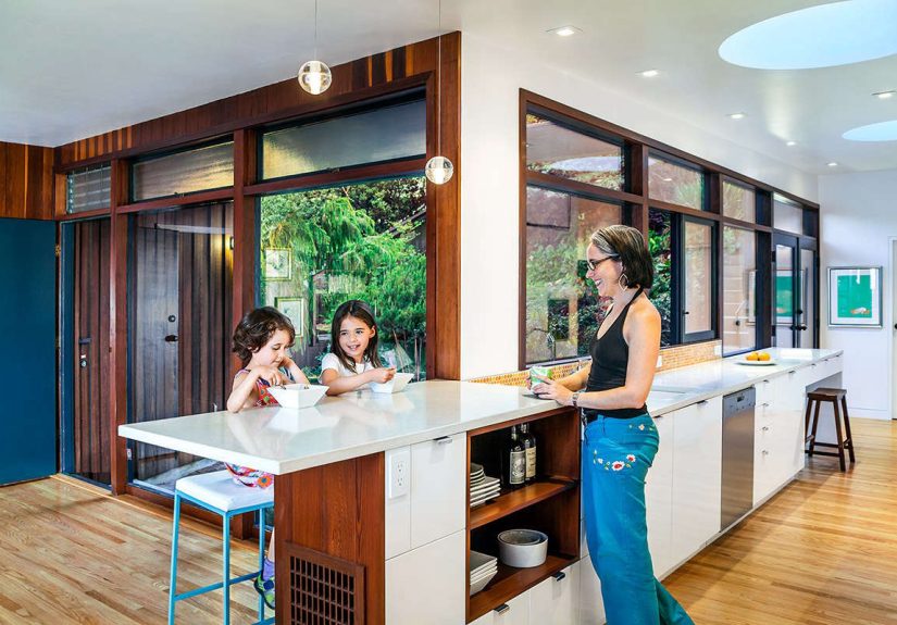
The most important move in the Wurster House Addition and Renovation was the reworking of the formerly cramped service wing. What had been secondary and disconnected became an expansive, light-filled center of daily life. The renovated kitchen no longer behaved like a backstage utility zone. It became a primary living space connected to the garden, the courtyard, and the rhythm of the house.
This is a powerful lesson for anyone planning a midcentury modern renovation. The best remodels do not simply chase square footage. They identify the weak link in the existing plan and turn it into an advantage. Here, the kitchen wall facing the courtyard was the weak link. By redesigning it with a more generous composition and a stronger indoor-outdoor connection, the architects completed the courtyard rather than merely adding a prettier kitchen.
A Wall of Glass That Feels Inevitable
One of the renovation’s most effective features is the new glass connection between the kitchen and courtyard. This move brought daylight deep into the home and gave the kitchen a visual relationship with the garden. It also balanced the courtyard composition by echoing the living room’s original connection to the outdoor space.
The result is not just brighter; it is more coherent. The courtyard now feels intentionally framed on more than one side. The kitchen participates in the life of the house instead of hiding behind a wall, sulking with outdated appliances. Morning coffee, family meals, casual conversations, and garden views all become part of the same architectural experience.
Why the Courtyard Matters So Much
Courtyard houses have a special talent: they make compact homes feel generous. Instead of relying only on interior square footage, they borrow space from the sky, the garden, and the changing light. In San Francisco, where lots can be tight and privacy is precious, a well-designed courtyard can feel like a small miracle wearing patio furniture.
Wurster understood this deeply. His architecture often framed everyday life rather than dominating it. In the renovated Wurster House, the courtyard remains the anchor. The addition and kitchen renovation do not compete with it. They strengthen it.
This is one reason the project feels so successful. The renovation respects the original organizing idea. The courtyard was already the central feature, and the new work makes it more useful, visible, and emotionally present. Instead of adding a room that feels attached from the outside, the design improves the whole home from the inside out.
Material Honesty and Midcentury Warmth
Midcentury modern homes can sometimes be misread as minimal white boxes. Wurster’s work, however, often had a warmer and more tactile quality. Wood, texture, proportion, and informality mattered. The Wurster House renovation honors that spirit through a careful relationship between old and new materials.
The original vertical-board redwood walls were an important character-defining feature. Preserving that sense of warmth helped the renovation avoid the common problem of making a historic modern home feel like a showroom. Nobody wants to live inside a museum display case, especially one where you are afraid to put down a sandwich.
At the same time, the renovated spaces feel fresh. Bright surfaces, clean detailing, updated fixtures, and contemporary functionality give the house renewed energy. The interior is described as vibrant and fresh, with bright color and rich textures. That matters because a successful renovation should not merely protect the past; it should make the house enjoyable in the present.
Preservation Without Costume Design
One of the smartest aspects of the Wurster House Addition and Renovation is that it does not imitate the original architecture in a cartoonish way. Good preservation is not costume design. A new addition should be compatible with the historic character of a building, but it does not have to pretend it was built decades earlier.
In practical terms, that means matching the spirit rather than copying every detail. Scale, proportion, rhythm, material warmth, and indoor-outdoor logic matter more than fake nostalgia. The renovation reads as contemporary, but it also feels deeply connected to Wurster’s original intentions.
This balance is especially important for homeowners renovating architect-designed houses. Too much contrast can make an addition feel rude. Too much imitation can feel dishonest. The sweet spot is design that is clearly new but emotionally fluent in the original architectural language.
Function: The Unsung Hero of Beautiful Renovation
Architectural writing can sometimes get carried away with phrases like “spatial dialogue” and “material poetics,” which are useful until someone asks where the recycling bins go. The Wurster renovation is beautiful, but its success depends just as much on practical improvements.
The kitchen became more usable. The entry sequence improved with a new foyer. Additional square footage helped the home support family life. The connection between dining, living, kitchen, and courtyard became clearer. These are not glamorous details, but they are the difference between admiring a house and actually enjoying one.
A good renovation solves daily annoyances so gracefully that people stop noticing them. Circulation feels easier. Storage appears where it is needed. Natural light lands where people gather. The home supports cooking, conversation, homework, entertaining, and quiet moments without making the family work around awkward old limitations.
Indoor-Outdoor Living, the Wurster Way
The phrase indoor-outdoor living gets used so often in California design that it risks becoming architectural wallpaper. But in this project, the idea is not a marketing slogan. It is the entire design engine.
The renovated kitchen looks toward the garden. The courtyard becomes more active. The living and dining areas feel more connected to the outdoors. Daylight improves the atmosphere of the home. The house feels larger, not only because space was added, but because the visual boundaries were softened.
This is a useful example for modern homeowners. Expanding a house does not always require a dramatic footprint increase. Sometimes the bigger opportunity is to improve sightlines, transparency, and access to outdoor rooms. A view into a garden can change the mood of a kitchen more effectively than another bank of cabinets. Although, to be fair, cabinets are also very persuasive when the cereal boxes are multiplying.
Energy, Comfort, and the Modern Renovation Mindset
A contemporary renovation must also think about performance. Light, insulation, ventilation, efficient fixtures, and durable materials all matter. The Wurster House project is primarily discussed as a design and preservation success, but its broader lesson fits today’s sustainable renovation priorities: reuse what is valuable, improve what is weak, and avoid unnecessary demolition.
Reusing an existing home is often a lower-carbon choice than tearing down and rebuilding, especially when the structure, foundation, and major materials can remain in service. For architecturally significant houses, the environmental argument and cultural argument often point in the same direction. Keep the good bones. Repair the awkward joints. Give the house better lungs and brighter eyes.
Daylighting also plays a role in comfort. Bringing sunlight into the home reduces dependence on artificial lighting during the day and makes rooms feel more inviting. In the Wurster renovation, the improved courtyard-facing glass does exactly that. It creates a kitchen that feels alive with natural light rather than trapped in the shadows of its former service-wing identity.
What Homeowners Can Learn From the Wurster House Addition and Renovation
1. Start With the House’s Best Idea
Every good house has a main idea. In this case, it was the courtyard. The renovation succeeded because it strengthened that idea instead of distracting from it. Before remodeling, homeowners should ask: What is the house already trying to do well? Then make that feature clearer, stronger, and more useful.
2. Do Not Confuse Bigger With Better
Additions should solve problems, not simply increase dimensions. The Wurster House renovation added space, but the more important achievement was improving relationships between rooms, light, and outdoor areas. A poorly planned addition can make a house larger and worse, which is quite an expensive way to lose.
3. Respect Original Materials
Materials carry memory. Redwood walls, wood floors, glass walls, and simple detailing help define the character of a midcentury home. Keeping original materials where possible gives a renovation depth that new finishes alone cannot buy.
4. Make New Work Feel Calm
The best additions do not need to shout. A calm, well-proportioned intervention can be more powerful than a dramatic one. In this project, the new work supports the old architecture while improving the home’s usability. That is design maturity, not design shyness.
5. Design for Real Life
Wurster famously believed architecture was for people, life, work, and pleasure. The renovated house reflects that philosophy. It is not just a preserved object. It is a living home designed for family routines, meals, gatherings, views, and ordinary mornings that become better because the room finally works.
Why This Renovation Still Feels Relevant
The Wurster House Addition and Renovation remains relevant because it addresses a problem many homeowners face: how to modernize a beloved older house without stripping away the qualities that made it lovable in the first place.
Across the United States, midcentury homes are being renovated for contemporary lifestyles. Families want open kitchens, better storage, improved energy performance, larger windows, and smoother connections to outdoor living. But many also want authenticity, warmth, and architectural character. This project shows that those desires can coexist.
It also offers a quiet rebuttal to the tear-down mentality. Not every old house needs to be replaced by a bigger one wearing black metal windows and an expression of expensive indifference. Sometimes the better answer is more careful: study the house, repair the weak parts, preserve the good ones, and add only what improves the whole.
Design Analysis: Why the Project Works
From a design standpoint, the renovation works because it solves several problems at once. It improves function, strengthens the courtyard, adds natural light, respects original materials, and creates a more generous kitchen without overwhelming the home’s modest scale.
The project also understands hierarchy. The courtyard remains the star. The kitchen becomes a supporting lead. The living room, dining area, foyer, and garden views all join the same ensemble. Nothing feels random. Nothing feels like it was added simply because there was room on the plan.
The architecture is also refreshingly human. Many renovations chase drama through oversized openings, extreme contrast, or luxury finishes that make a home feel like it is applying for a magazine cover every morning. The Wurster renovation is more subtle. It is about proportion, light, use, and comfort. In other words, it remembers that houses are not built for drone shots. They are built for people who need somewhere pleasant to find the coffee mugs.
Experience Notes: Living With Lessons From the Wurster House
The most valuable experience related to the Wurster House Addition and Renovation is learning to see a home before trying to change it. Many homeowners begin a remodel with a wish list: bigger kitchen, brighter rooms, better storage, open plan, new appliances, nicer floors, and perhaps a magical place where mail stops reproducing. Those goals are valid. But a meaningful renovation begins one step earlier. It asks what the existing house already knows.
In a Wurster-inspired home, the answer often lies in light, proportion, and connection to landscape. The house may not be large, but it may have a strong relationship to a courtyard or garden. It may not have flashy details, but it may have beautiful wood, calm geometry, and a scale that feels comfortable. When planning a renovation, the first experience should be observation. Spend time noticing when rooms feel best. Watch where morning light enters. Notice which doors stay open, which corners become clutter traps, and where people naturally gather. The house will usually reveal its problems with surprising honesty.
Another lesson is that the kitchen is rarely just a kitchen. In older homes, kitchens were often treated as service spaces. In modern family life, they are command centers, conversation pits, snack laboratories, homework stations, and occasional emergency bakeries. The Wurster renovation recognized this shift. By turning an isolated kitchen/service wing into a light-filled center of the home, the design responded to real behavior rather than abstract style.
Homeowners can apply the same thinking even without owning a famous architect-designed house. If a room feels disconnected, the solution may not be more decoration. It may need a better opening, a clearer view, improved circulation, or a stronger relationship to an outdoor space. A window placed well can be more transformative than a wall of expensive tile. A better path from kitchen to dining area can change daily life more than a trendy fixture. Design is not only what the camera sees; it is what your elbows, feet, eyes, and patience experience every day.
The project also teaches restraint. Restraint is not the same as doing less. It is doing the right things with discipline. Keeping original wood walls, respecting the courtyard, and making the new work compatible required confidence. It is tempting during renovation to keep adding features until the house becomes a greatest-hits album of design trends. But trends age quickly. A thoughtful relationship between old and new lasts much longer.
Finally, this renovation reminds us that comfort is an architectural achievement. A bright kitchen, a peaceful courtyard, a warm material palette, and rooms that flow naturally are not minor luxuries. They shape the way people live. The best home renovation does not simply impress visitors. It improves Tuesday morning, Saturday lunch, rainy afternoons, and the five minutes of quiet before everyone asks what is for dinner.
Conclusion
The Wurster House Addition and Renovation is a beautiful example of how to renew a midcentury modern home with intelligence, warmth, and restraint. Jennifer Weiss Architecture did not treat the original 1951 Wurster bungalow as a problem to erase. Instead, the renovation studied its best qualities: the courtyard, the human scale, the indoor-outdoor spirit, and the material character.
By transforming a cramped service wing into a bright, connected kitchen and living hub, the project made the house more functional without sacrificing its architectural soul. It is a reminder that the best renovations are not loud. They are clear, careful, and deeply livable. Like a well-made chair or a perfectly placed window, they make daily life easier while quietly improving the mood of everyone inside.
For homeowners, architects, and design lovers, the lesson is simple: renovate with respect, add with purpose, and never underestimate the power of a courtyard to make a modest house feel like a small private universe.