Table of Contents >> Show >> Hide
- Why a TIME Magazine Cover Is Perfect Material for Visual Satire
- The Real Cover Behind the Edit
- What the Shark Changes
- The Red Border Is Doing More Work Than People Think
- Visual Satire in the Fast-Scroll Era
- Editing Ethics: Parody Is Not the Same as Deception
- Why the Edit Still Works Years Later
- Lessons for Designers, Bloggers, and Digital Artists
- Experience: What Editing a TIME-Style Cover Teaches You
- Conclusion
Some magazine covers politely ask for your attention. A TIME magazine cover, with that famous red frame, tends to walk into the room, clear its throat, and behave as if history has already reserved it a chair. That is exactly why a smart visual edit of a TIME cover can travel so quickly online: the design is familiar, the message is compressed, and the audience understands the joke before the coffee has cooled.
The phrase “I’ve Edited The New Time Magazine Cover” points to a simple but surprisingly effective act of digital remixing: taking a serious political magazine cover and adding one sharp visual twist. In this case, the edited image riffs on TIME’s April 2018 “Stormy” cover featuring Donald Trump in rising water, then adds a massive shark approaching from below. Suddenly, the cover is no longer only about scandal, pressure, and political weather. It becomes a punchline with teeth. Literally.
That is the beauty of a great cover edit. It does not need a paragraph to explain itself. It takes an existing image, preserves enough of the original meaning, and adds a new layer that makes viewers say, “Okay, I see what you did there.” The shark does not whisper. The shark signs the argument in bold letters.
Why a TIME Magazine Cover Is Perfect Material for Visual Satire
TIME covers have a rare kind of cultural shortcut built into them. Even people who do not read the magazine every week recognize the red border, the bold masthead, and the single-image storytelling style. Since its early 20th-century beginnings, TIME has used covers to turn complicated public events into symbolic portraits: leaders, crises, wars, movements, inventions, and occasionally a face that seems to say, “Yes, I am the news cycle, unfortunately.”
That strong design language gives satirists a gift. When a visual identity is this recognizable, even a small edit can change the entire mood. Add a shark, a speech bubble, a cracked frame, a tiny crown, a storm cloud, or a misplaced prop, and the cover instantly moves from journalism to commentary. The audience already understands the format. The edit only has to redirect the meaning.
This is why magazine cover parody works so well on the internet. It is neat, square, shareable, and instantly legible on a phone screen. Unlike a long political cartoon, a fake or edited cover can communicate its idea in one glance. It behaves like a meme wearing a tie.
The Real Cover Behind the Edit
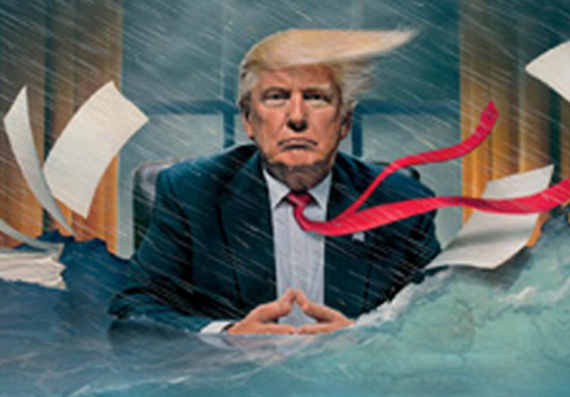
The original TIME cover that inspired the edit was the April 23, 2018 issue titled “Stormy.” Created by illustrator Tim O’Brien, the image showed Donald Trump seated in the Oval Office as rain poured down, papers flew, and water rose around him. The cover was part of a visual sequence that used storm and flood imagery to represent turmoil surrounding Trump’s presidency.
The “Stormy” title carried an obvious double meaning. It referred both to the chaotic atmosphere around the White House and to the public scandal involving Stormy Daniels, Michael Cohen, and questions about hush-money payments. TIME’s cover did what strong editorial illustration often does: it avoided showing every detail and instead built one memorable metaphor. The White House was not just busy. It was flooding.
The edited version takes that metaphor and pushes it from political weather into pop-culture disaster. By inserting a shark below the waterline, the image borrows the suspense language of “Jaws.” The result is funny because it feels exaggerated, but it also works because it completes the visual logic. If the water keeps rising, of course something is lurking underneath. In the world of satire, consequences rarely arrive with a polite appointment request. They breach the surface.
What the Shark Changes
The original cover suggested a president surrounded by chaos. The edited cover suggests a president surrounded by chaos and unaware of a much larger threat. That is a major shift. One image says, “The room is flooding.” The other says, “The room is flooding, and something with several hundred teeth has joined the meeting.”
It Turns Atmosphere Into Action
Rain, water, and floating papers create mood. A shark creates movement. The viewer’s eye travels from the TIME masthead to Trump’s face, then down into the blue water, where the punchline waits. That movement gives the edit its rhythm. It is not just a picture; it is a tiny story with a beginning, middle, and “please swim faster.”
It Keeps the Original Design Grammar
The edit works because it does not destroy the original composition. The red border remains. The masthead remains. The cover line remains. Trump remains centered. The added shark fits into the water space already built by the illustration. A weaker edit would have thrown in five jokes and ruined the balance. This one understands restraint, which is ironic considering the shark has the subtlety of a kitchen blender full of knives.
It Adds a Pop-Culture Shortcut
Sharks in cinema and advertising have become shorthand for danger approaching from below. The image does not need to name “Jaws” directly. Viewers recognize the visual grammar: deep water, vulnerable subject, predator rising. That shared memory lets the edited cover do more with less. It is a meme, a parody, and a design lesson all at once.
The Red Border Is Doing More Work Than People Think
TIME’s red border is one of the strongest pieces of magazine branding in American publishing. It frames the subject like an exhibit, a warning label, and a historical marker at the same time. When something appears inside that frame, it feels selected, elevated, and judged. That is why parody versions of TIME covers are so common: the frame itself carries authority.
In a normal cover, the red border tells readers, “This matters.” In an edited parody, it tells readers, “This joke matters enough to pretend it matters.” That tension is what makes the format so useful. Satire borrows authority and then bends it until it squeaks.
The shark edit benefits from that borrowed authority. Without the TIME frame, the image might just be a funny Photoshop gag. With the frame, it becomes a fake historical artifact from an alternate newsroom where the art director apparently said, “More shark. The democracy beat needs more shark.”
Visual Satire in the Fast-Scroll Era
Digital audiences move quickly. A headline has seconds to earn attention. An image has even less. That reality has changed how political humor travels. The most successful visual jokes are not always the most detailed; they are the clearest. They have one central idea, one clean composition, and one emotional payoff.
The edited TIME cover succeeds because it understands the fast-scroll rule: do not make viewers solve a puzzle before they can laugh. The water is already there. The subject is already there. The shark simply tells the audience what kind of story this remix wants to be.
Good satire also needs a target. The target here is not merely one politician. It is the dramatic machinery of political media itself: the cover story, the crisis metaphor, the breathless public reaction, and the internet’s irresistible urge to say, “Nice, but what if it were more absurd?” That is how remix culture works. It sees a finished object and treats it as the first draft of a joke.
Editing Ethics: Parody Is Not the Same as Deception
There is an important difference between a clearly satirical cover edit and a misleading fake presented as real news. Journalism has strict standards for image integrity. News organizations generally reject photo manipulation that adds, removes, or changes factual content in a way that misrepresents reality. That standard matters because images shape memory. A manipulated news photo can mislead people faster than a correction can chase it.
Parody operates in a different lane when it is clearly framed as commentary. A satirical edit is not trying to fool readers into believing a shark actually visited the Oval Office, which would raise several urgent questions for both marine biologists and the Secret Service. Instead, it uses exaggeration to make a point. The ethical line becomes much clearer when creators label their work as parody, avoid presenting it as authentic reporting, and make sure the audience understands the intention.
For creators, this distinction is crucial. A clever remix should punch up, comment, critique, or transform. It should not impersonate a news organization in a way that spreads false information. The best visual satire is honest about being dishonest. It says, “This did not happen, but doesn’t it explain the feeling perfectly?”
Why the Edit Still Works Years Later
The reason this edited TIME cover still feels memorable is that it combines three powerful elements: an iconic media brand, a politically loaded original image, and a universally understood movie-monster metaphor. That combination gives it staying power beyond the specific news cycle of 2018.
Some political jokes expire quickly because they depend on tiny details from a particular week. This one has a broader visual logic. Public figures under pressure, scandals rising like water, unseen consequences circling below: those ideas remain easy to understand. The shark is funny because it is ridiculous, but the structure of the joke is durable.
It also shows how internet users participate in media criticism. They do not only consume covers; they respond to them, remix them, caption them, and send them back into the conversation. A magazine cover used to be the final statement. Online, it becomes raw material.
Lessons for Designers, Bloggers, and Digital Artists
Anyone creating visual commentary can learn from this edit. The first lesson is to respect the original composition. A parody works better when viewers can still recognize the source. If the edit buries the original idea under too many effects, the joke becomes visual soup. And nobody wants visual soup unless it comes with crackers.
The second lesson is to add one decisive twist. The shark is not one of many jokes; it is the joke. That gives the image clarity. Online audiences reward clarity because they are usually scrolling between messages, headlines, snacks, and at least one app they opened by accident.
The third lesson is that context matters. The edit lands because the original cover already had water, tension, and political drama. A random shark pasted onto a calm portrait might be funny, but it would not feel inevitable. The best edits make viewers feel as if the new element was secretly waiting there the whole time.
The fourth lesson is to label satire responsibly. If a design uses a real publication’s branding, it should be clear that the work is a parody or commentary. That protects the audience, respects the original publisher, and helps the creator avoid turning a joke into misinformation.
Experience: What Editing a TIME-Style Cover Teaches You
Editing a TIME-style cover is a strange little design workout because the format looks simple until you try to touch it. At first glance, it seems easy: red border, big masthead, serious person, dramatic caption, done. Then you open the file, start moving elements around, and realize the design is balanced like a dinner plate on a broomstick. One wrong shadow, one clumsy crop, one oversized joke, and the whole thing stops feeling like a magazine cover and starts feeling like a flyer for a suspicious local magic show.
The first thing I notice when working on this kind of edit is hierarchy. TIME covers usually know exactly where your eye should go. The masthead gives authority, the portrait gives emotion, and the cover line gives interpretation. If I add something new, I have to ask whether it supports that hierarchy or fights it. In the shark edit, the added creature works because it lives in the lower portion of the image. It creates a second beat without stealing the first one too early. You see the scene, then you discover the joke.
The second challenge is texture. A good parody must feel like it belongs inside the same visual universe. If the original image is painterly, glossy, grainy, or cinematic, the added element needs to speak the same visual language. Otherwise the edit looks like a sticker slapped on a refrigerator. Matching color temperature, contrast, water haze, and lighting direction matters more than people think. Comedy may be loud, but the craftsmanship behind it is often quiet.
The third lesson is restraint. The temptation is always to add more: bigger teeth, brighter blood, a speech bubble, a tiny boat, maybe a dramatic subtitle like “Democracy Needs a Lifeguard.” Some of those ideas might be funny, but they would weaken the image. Strong editorial art usually chooses one metaphor and commits. The shark is enough. Once the audience gets the joke, extra jokes become clutter.
The fourth lesson is emotional tone. A cover edit can be funny, angry, absurd, or critical, but it should know what it wants the viewer to feel. This one feels playful and pointed. It exaggerates danger without needing a long caption. That is difficult to achieve. Many political edits become either too bitter to enjoy or too silly to matter. The sweet spot is where humor sharpens the argument instead of replacing it.
Finally, editing a recognizable cover teaches respect for visual literacy. People understand more than creators sometimes assume. They recognize symbols, framing, irony, and references at remarkable speed. The job of the editor is not to explain everything. It is to arrange the clues so the viewer experiences the discovery. In that sense, “I’ve Edited The New Time Magazine Cover” is more than a one-off joke. It is a reminder that a small visual change can transform a public image into a new conversation.
Conclusion
“I’ve Edited The New Time Magazine Cover” works because it understands the power of a simple visual idea. The original TIME “Stormy” cover used water to symbolize pressure and political chaos. The edit added a shark and turned that pressure into suspense, comedy, and cultural commentary. It is a small change with a big effect, which is exactly what strong parody is supposed to do.
The image also reveals why magazine covers remain powerful in the digital era. A cover is not just decoration; it is an argument in visual form. When the public remixes that argument, the conversation expands. Sometimes it becomes deeper. Sometimes it becomes funnier. And sometimes, if the water is high enough, it grows fins.
Note: This article is an original analysis based on public information about TIME magazine cover design, the 2018 “Stormy” cover, visual satire, remix culture, and image-editing ethics. It is written for web publication without source-link placeholders.