Table of Contents >> Show >> Hide
- Why Monitor Calibration Actually Matters
- Before You Calibrate: Set the Stage
- How to Calibrate Your Monitor in Windows
- How to Calibrate Your Monitor on macOS
- The Settings Most People Should Aim For
- Software Calibration vs. Hardware Calibration
- Common Calibration Mistakes to Avoid
- How Often Should You Recalibrate?
- Extra Tips for Better Results
- Conclusion
- Real-World Experiences With Monitor Calibration
- SEO Tags
If your screen makes every sunset look radioactive, every spreadsheet look vaguely sad, and every photo print come out darker than your mood on a Monday morning, your monitor is probably begging for calibration. The good news is that monitor calibration is not reserved for photographers wearing black turtlenecks and whispering about color spaces. It is a practical, useful skill for anyone who edits photos, designs graphics, watches HDR content, games, shops online, or simply wants the screen to stop lying.
At its core, monitor calibration is the process of adjusting your display so brightness, contrast, gamma, white balance, and color output are more accurate and consistent. In plain English, it helps your screen show a more honest version of what is actually there. That means skin tones look human, white backgrounds stop looking blue or yellow, and the image you send to another device has a fighting chance of looking similar somewhere else.
Why Monitor Calibration Actually Matters
A badly tuned monitor can quietly mess up a lot of things. If the display is too bright, you may edit photos that print too dark. If it is too cool, white pages can look icy blue. If contrast is cranked to “dramatic soap opera,” shadow detail disappears and highlights get blasted into oblivion. And if you use two monitors side by side, mismatched color can make one screen look like reality and the other look like it was raised by neon signs.
Calibration matters most for photographers, video editors, designers, and anyone doing color-critical work, but it is also useful for regular users. A calibrated monitor can make long workdays more comfortable, help movies look more natural, and reduce the guesswork when comparing products, editing content, or presenting visuals to clients. In short, calibration is less about making the image look fancy and more about making it look right.
Before You Calibrate: Set the Stage
1. Let the monitor warm up
Do not calibrate a monitor that just woke up five minutes ago. Give it about 30 minutes to warm up so brightness and color stabilize. Think of it as letting your display drink its coffee before taking the test.
2. Use the native resolution
Always set the monitor to its native resolution before you begin. Calibration on the wrong resolution is like tailoring a suit while the person is wearing someone else’s shoes. You might finish, but the results will be weird.
3. Control the room lighting
Ambient light matters more than many people realize. Calibrate in a room with steady lighting and as little glare as possible. Direct sunlight, a lamp blasting one side of the screen, or calibrating at noon and editing at midnight will all throw off your perception. The more stable your environment, the more reliable your result.
4. Reset the monitor if needed
If your monitor has been through years of enthusiastic tweaking, it may help to reset it to factory defaults before calibrating. That gives you a clean starting point instead of building accuracy on top of old chaos.
5. Write down your current settings
Before making changes, note your current picture mode, brightness, contrast, and color settings. This is not paranoia. This is wisdom. If you hate the result or click the wrong thing at 1:14 a.m., you will be glad Future You left a breadcrumb trail.
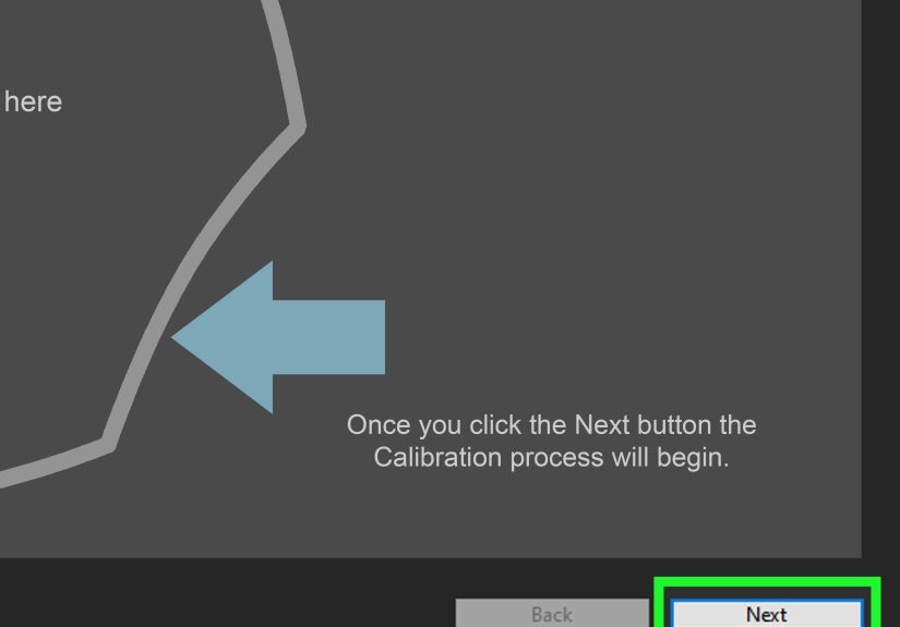
How to Calibrate Your Monitor in Windows
Windows includes a built-in calibration tool, which is a solid starting point for most users. It will not replace a hardware colorimeter for professional work, but it is free, built in, and far better than randomly dragging sliders like a caffeinated raccoon.
- Open Settings and go to System > Display.
- Select the correct display if you have more than one monitor connected.
- Open the color profile or calibration option, then launch Calibrate display or search for Calibrate display color from the Start menu.
- Follow the wizard to adjust gamma, brightness, contrast, and color balance.
- Save the newly created color profile when you finish.
The Windows wizard walks you through visual examples for each setting. During gamma adjustment, aim for the point where the dot pattern in the sample image is least visible. For brightness, keep dark clothing and shadow details visible without washing out the background. For contrast, preserve highlights and detail instead of turning white areas into featureless snowbanks. For color balance, try to make neutral grays look truly neutral, without red, green, or blue tint.
If you use Windows 11 with an HDR display, there is also a dedicated HDR Calibration app. That tool helps improve color accuracy and consistency for HDR content and lets you tune how vivid HDR and SDR material appear when HDR is enabled. If you watch a lot of HDR video or edit HDR footage, this is worth the extra step.
How to Calibrate Your Monitor on macOS
Mac users get a built-in option too. Apple’s Display Calibrator Assistant creates a custom color profile and guides you through the process in a more refined, less “1998 utility panel” kind of way.
- Open System Settings or Displays, depending on your macOS version.
- Go to the display’s Color Profile area.
- Choose Customize and open the Display Calibrator Assistant.
- Follow the steps to create a calibrated display profile.
The exact screens may vary by Mac model and macOS version, but the idea stays the same: adjust the display, save the result, and let macOS apply the custom profile. If you own Apple’s higher-end displays or compatible ProArt-style gear, you may also have access to more advanced calibration workflows, including fine-tuning based on measurements from a hardware instrument.
The Settings Most People Should Aim For
There is no single perfect setting for every human, room, and monitor, but some targets are widely used because they work well for general content and creative workflows.
- White point: D65, or 6500K, is a common target for natural-looking whites.
- Gamma: 2.2 is the usual target for most modern computer work.
- Brightness: For photography-oriented indoor work, many calibration workflows aim for around 100 cd/m², though the right level depends on your room lighting.
- Contrast ratio: Native is often the safest choice during serious calibration.
If that sounds technical, here is the easy version: aim for whites that look neutral, shadows that still have detail, highlights that are bright but not blown out, and colors that look believable rather than aggressively sponsored by a candy company.
Software Calibration vs. Hardware Calibration
Here is the honest truth: built-in software tools are good for everyday correction, but hardware calibration is the real deal for serious color accuracy. A hardware tool such as a colorimeter or spectrophotometer measures what your screen is actually displaying, then builds a custom profile based on data instead of eyeballing it.
This matters because your eyes are wonderfully adaptable and occasionally very wrong. Sit in a warm-lit room for an hour and your brain may decide yellow is white. Use a super bright display long enough and your dim laptop suddenly looks broken. Instruments do not have those emotional swings. They measure, record, and build profiles with much greater precision.
Hardware calibration is especially useful for photographers, designers, video professionals, print workflows, and dual-monitor setups. Some higher-end monitors even support hardware calibration that stores adjustments in the monitor’s own lookup table, which can preserve smoother tonal transitions and better color depth than simple graphics-card tweaks. For basic office use, the built-in operating system tools are usually enough. For client work, print matching, product photography, or color grading, a hardware device is a smart investment.
Common Calibration Mistakes to Avoid
Using the wrong picture mode
Many monitors ship in vivid, gaming, cinema, or store-demo modes that are designed to grab attention, not tell the truth. Start with the most neutral mode available, often called Standard, Custom, sRGB, or User.
Calibrating only one monitor in a multi-monitor setup
If you use two screens, calibrate both. Otherwise, you will spend half your day wondering whether the photo is warm, cool, bright, dark, or cursed.
Ignoring the ICC profile
After calibration, make sure the operating system actually uses the new profile. Creating a profile and then forgetting to apply it is like buying glasses and wearing them on your forehead.
Chasing perfection on a limited panel
Some inexpensive displays simply cannot hit pro-grade color accuracy. Calibration can improve them, but it cannot turn every budget monitor into a studio reference display. Better is possible. Magic is not guaranteed.
How Often Should You Recalibrate?
Monitors drift over time. Backlights age, components warm differently, and what looked spot-on six months ago may slowly wander off course. A practical habit is to recalibrate every few months if color matters to your work. Some manufacturer guidance for embedded calibrator workflows recommends recalibrating around every six months to maintain accuracy. If you do professional editing, print matching, or client deliverables, recalibrating more regularly is even smarter.
Extra Tips for Better Results
- Use the monitor straight on, not at an angle, especially with lower-quality panels.
- Turn off features that artificially boost color, blue light, dynamic contrast, or “enhancement.”
- Match your calibration to your real workflow. Photo editing, gaming, office work, and HDR video may not all need the exact same setup.
- Test with familiar images after calibration. Skin tones, grayscale ramps, and photos you know well are especially useful.
- If your monitor came factory calibrated, treat that as a great starting point, not a lifetime guarantee.
Conclusion
Calibrating your monitor is one of those rare tech chores that pays off almost immediately. Colors look more believable, contrast becomes more useful, and you stop editing in the dark, figuratively and sometimes literally. You do not need to be a color scientist to benefit. Even a simple pass through Windows or macOS tools can improve accuracy. And if your work depends on precise color, a hardware calibrator can take you from “pretty close” to “confidently correct.”
The goal is not to make your monitor dramatic. It is to make it dependable. Once your display stops freelancing, every photo, video, design, and spreadsheet gets easier to trust. That is a beautiful thing, even if spreadsheets will never be truly glamorous.
Real-World Experiences With Monitor Calibration
One of the most common experiences people have after calibrating a monitor is mild disbelief. At first, the calibrated screen can seem less exciting because many displays are shipped far too bright and overly saturated. The default image often looks punchy in a store and exhausting at home. After calibration, colors may appear calmer, whites more neutral, and contrast more controlled. Some users think, “Wait, did my screen get worse?” Then they use it for a day or two, compare it with a phone, another monitor, or a print, and realize the calibrated version is simply more honest. It is the visual equivalent of turning off a karaoke echo effect and hearing the real voice underneath.
Photographers often describe the biggest improvement in print consistency. Before calibration, they may edit on a bright screen and unknowingly make photos too dark. Then the prints arrive looking muddy, and everyone involved begins blaming the printer, the paper, the lab, Mercury in retrograde, or all of the above. Once the monitor is calibrated to a sensible brightness and white point, the editing decisions become more reliable. Shadows are easier to judge, skin tones stop drifting strangely warm or cool, and the gap between “looks good on screen” and “looks good in print” gets much smaller.
Designers and video editors usually notice a different kind of relief: fewer surprises across devices. Brand colors look more consistent, neutral backgrounds stop picking up weird color casts, and collaborative work becomes less chaotic. When a client says, “Why does this gray look blue?” there is a much better chance the answer is “It doesn’t on a calibrated display,” instead of “Well, my monitor and your monitor are engaged in a private argument.” Calibration does not eliminate every difference between devices, but it reduces the nonsense.
Gamers and general users also have interesting reactions. Many discover that the brightest possible setting was never actually helping. After calibration, dark scenes can show more detail, bright areas stop looking harsh, and long sessions feel easier on the eyes. The image may look less like a billboard and more like an actual scene. People working with dual monitors often say calibration is the first time both screens seem like members of the same family instead of distant cousins with unresolved issues.
Another very common experience is that calibration teaches people how much environment matters. A monitor that looks perfect in a softly lit room may feel too dim in daylight. Someone editing photos at night under a warm lamp may prefer different brightness than someone working in a bright office. That is why the best calibration is not just about copying a target number. It is about matching the display to the real conditions in which you actually use it. Once people understand that, calibration stops feeling like a one-time ritual and starts feeling like a practical maintenance habit. That shift is where the real value lives.